Year
2023/2024
Team
1 Designer, 1 PM, 3 Engineers
Contribution
Product Designer — research, IA, UX/UI, specs & tickets, documentation
Giving the data a home - without building a lab
When I started, Rolla collected health signals - resting heart rate, HRV, sleep, steps, active calories - but the data had nowhere meaningful to live. It sat in the system the way receipts sit in a drawer: technically kept, practically unread. The brief was open: give this data a home.
The trap in that brief is that a designer who loves data will design for people who love data. Strava exists; it is excellent; it was exactly the wrong reference. Our user didn't want a performance lab. They wanted to know one thing: am I okay, and is it getting better?
First, deciding what not to build
Before a single screen, I mapped every health data point we could get against what each version of the module actually needed - an inventory that became the working spreadsheet the whole module was scoped from. Version columns weren't a roadmap decoration; they were the argument for shipping a small, legible MVP instead of a wall of graphs.
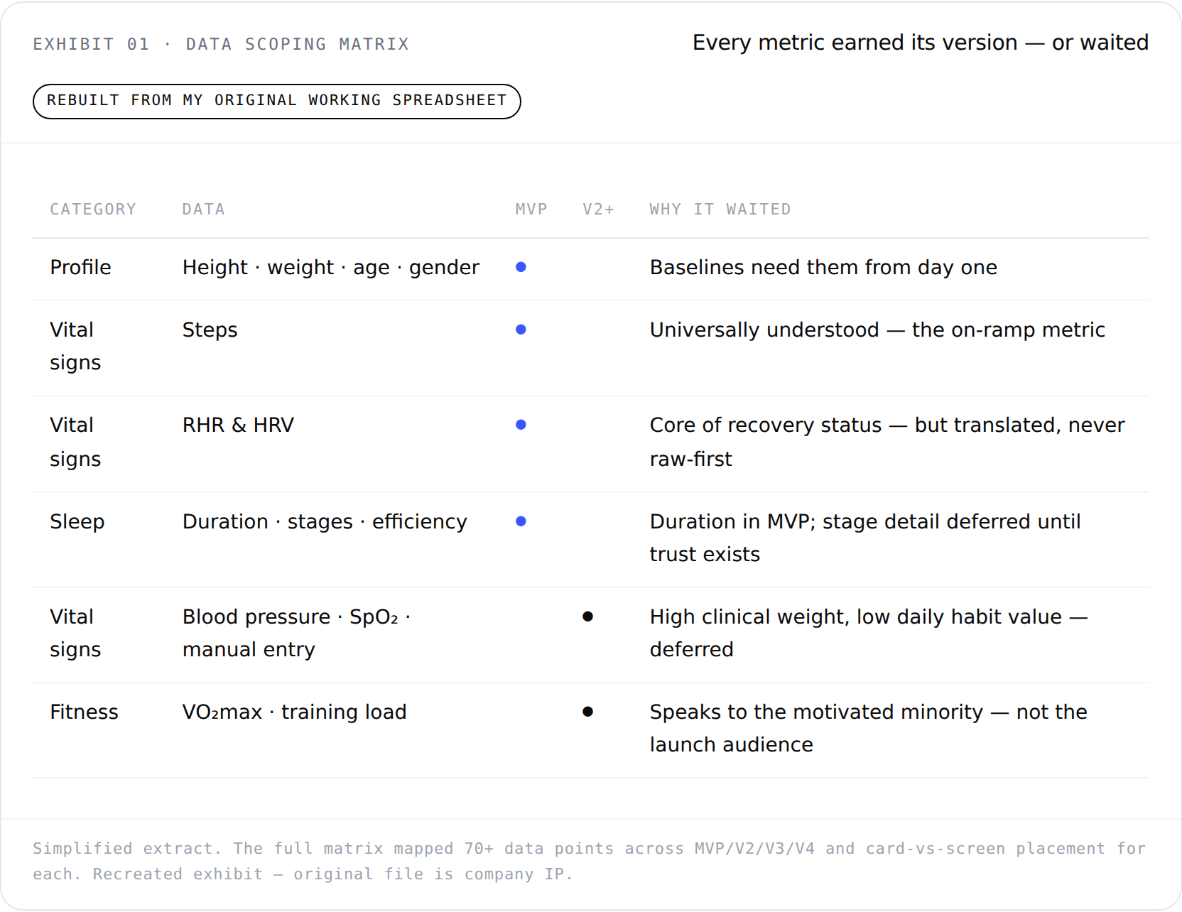
Exhibit 01 — Data Scoping Matrix: every metric earned its version, or waited
Three decisions defined the module
Translation over display. HRV is a number almost nobody can interpret - including, honestly, me before this project. So the module never leads with the raw value. It leads with what the value means: recovery status in plain language, with the number available underneath for whoever wants it.
Trends over snapshots. A single bad night of sleep is noise; three declining weeks is signal. Every metric visual was designed around the multi-week shape of the data rather than today's score - because a snapshot can make a casual user feel judged, but a trend can make them feel in progress. For the audience Rolla was betting on, that emotional difference is retention.
A component system, not screens. Health data types multiply. I designed the metric card as a tokenized, stateful component - loading, no-data, degraded-signal, normal - so adding a future metric was an assembly job, not a design project. On a small startup team, the design system is the headcount you don't have.
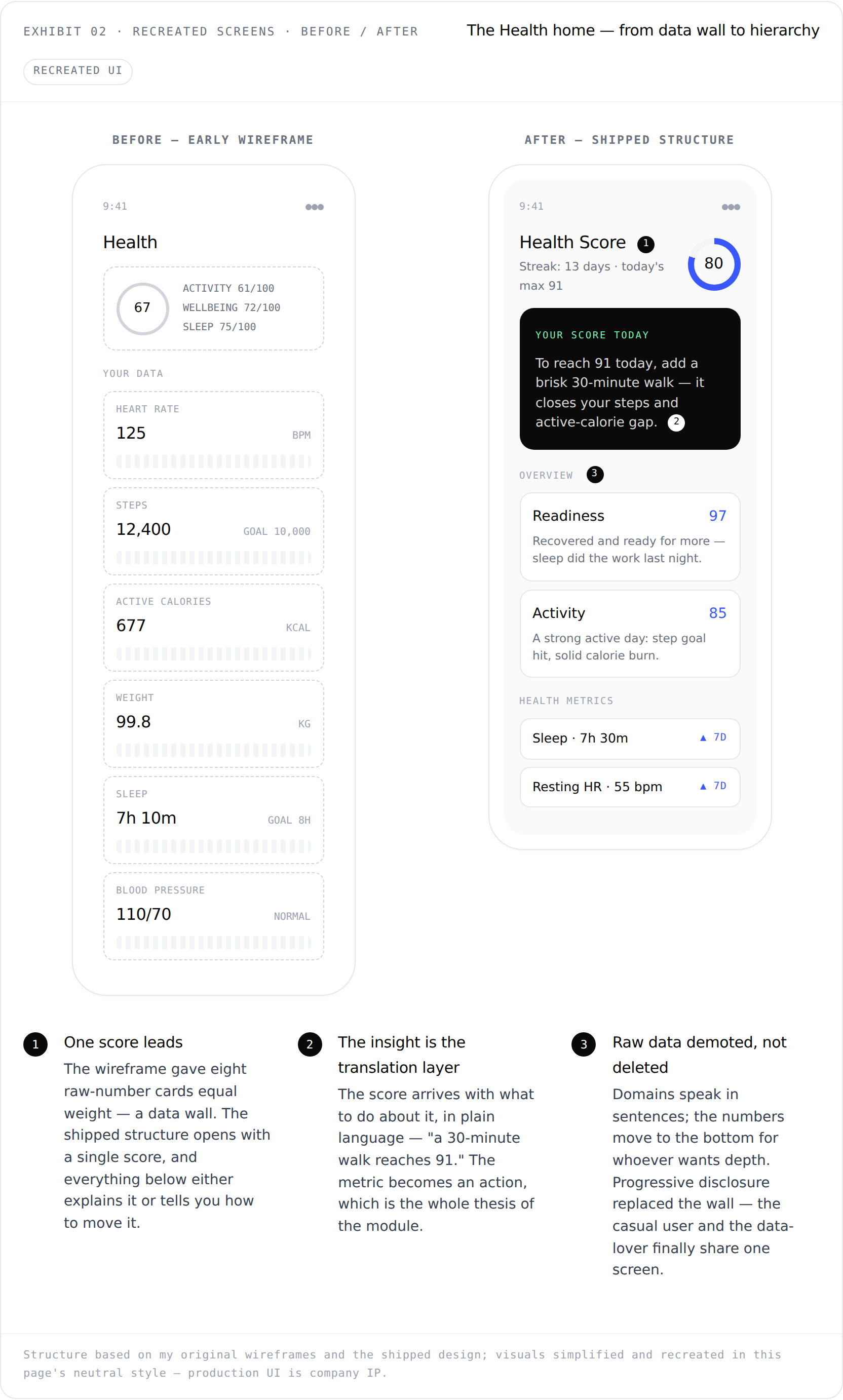
Exhibit 02 — Recreated Screens, Before / After: the Health home, from data wall to hierarchy
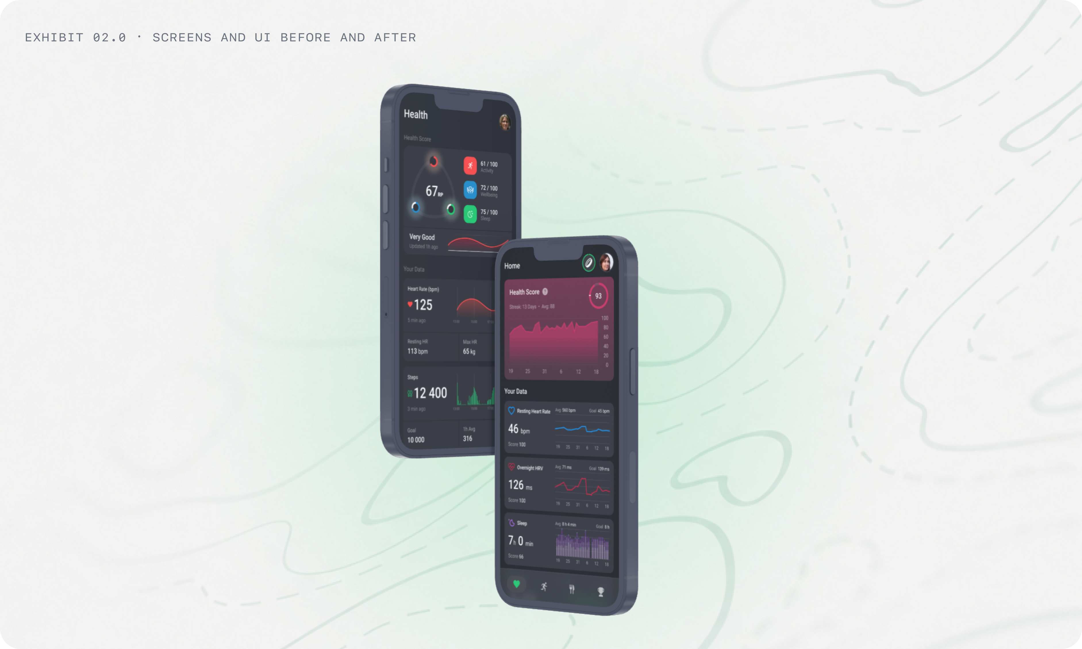
Exhibit 02.0 - Screens and UI, Before
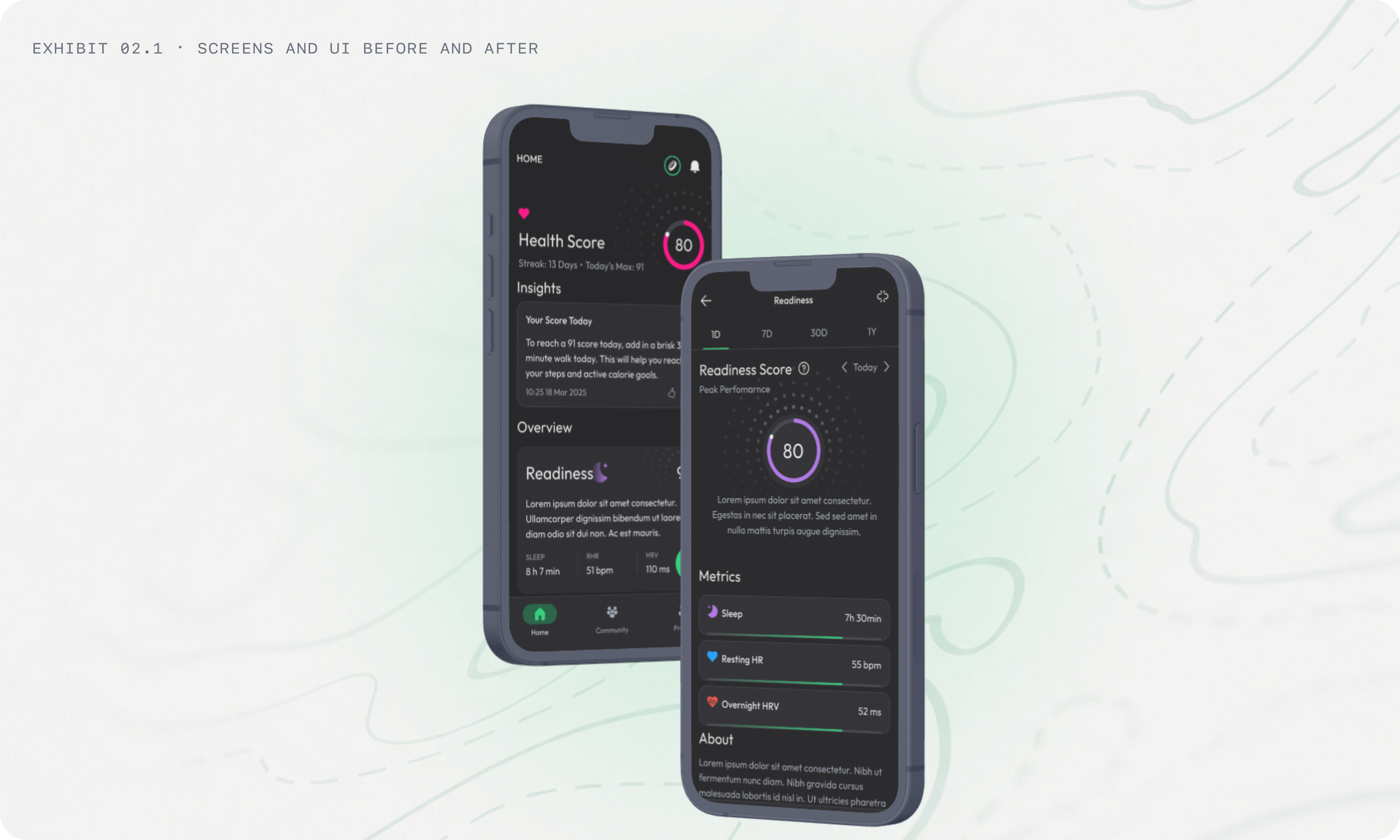
Exhibit 02.1 - Screens and UI, After
The Health Score: competing against yourself
The score that sat on top of the module was co-designed with the team's mathematician, and one mechanic mattered more than everything else: your baseline is yours. The system computes a personal 30-day rolling average per metric, and points are earned against that - not against a population norm, not against a fitter friend. Matching your own baseline already scores well; beating it by 10% maxes the category.
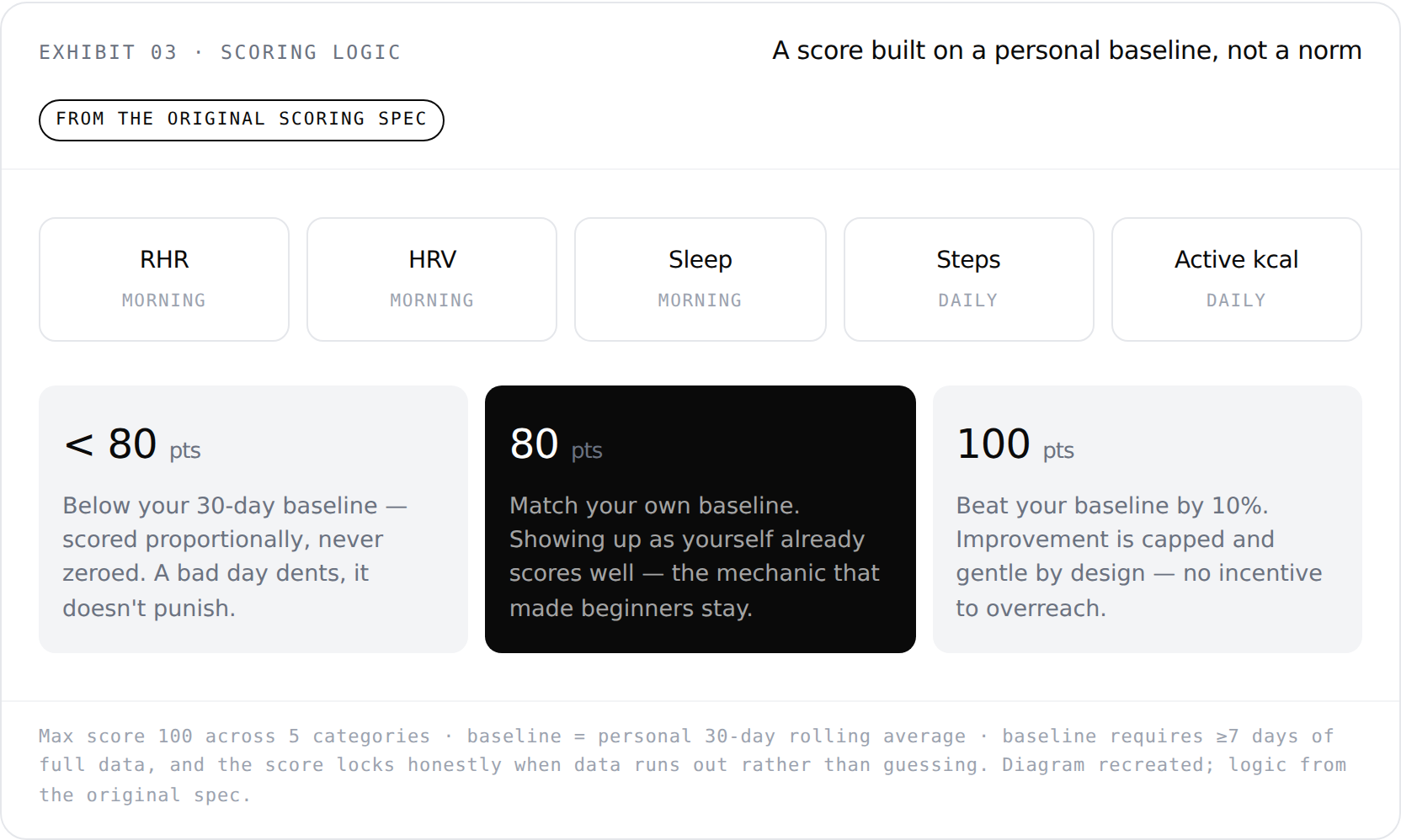
Exhibit 03 — Scoring Logic: a score built on a personal baseline, not a norm
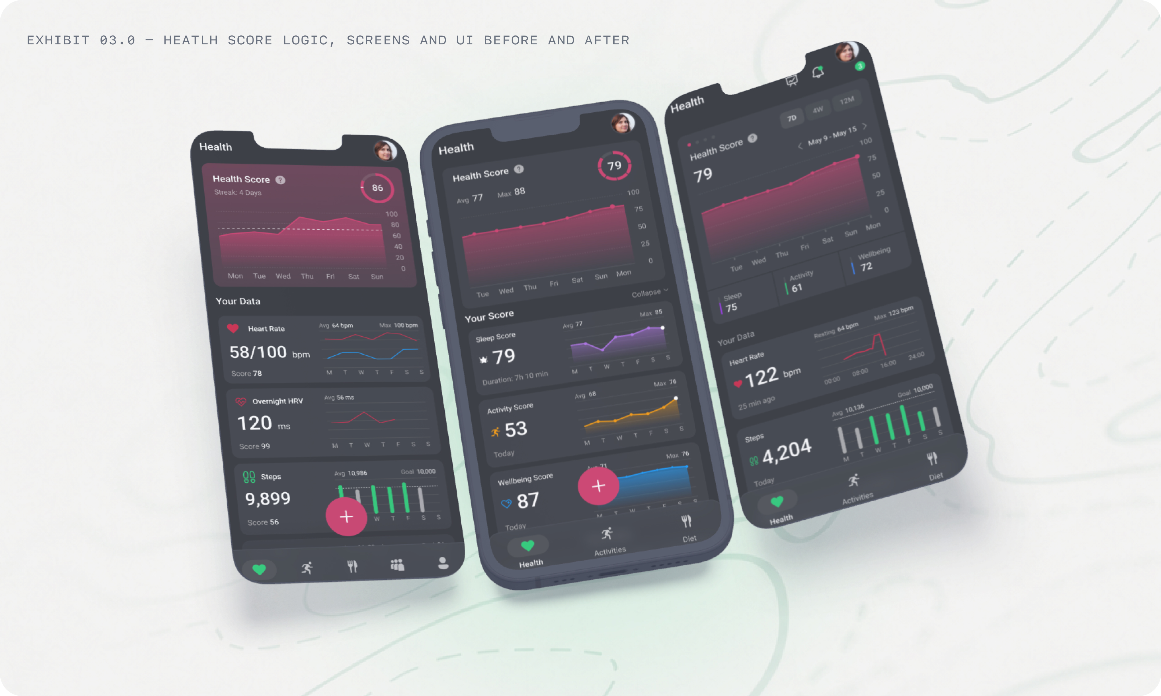
Exhibit 03.0 - Screens and UI, Before
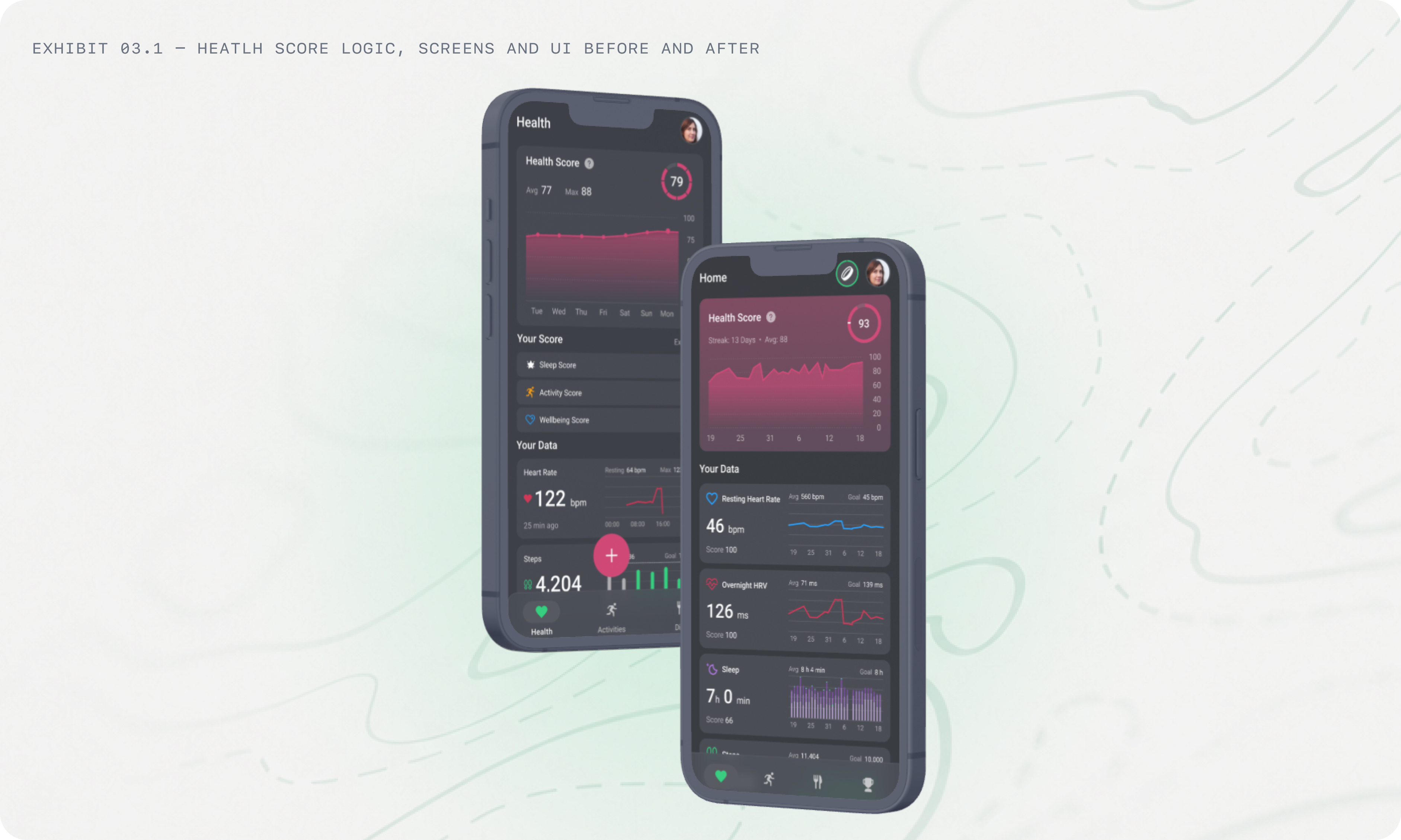
Exhibit 03.1 - Screens and UI, Before
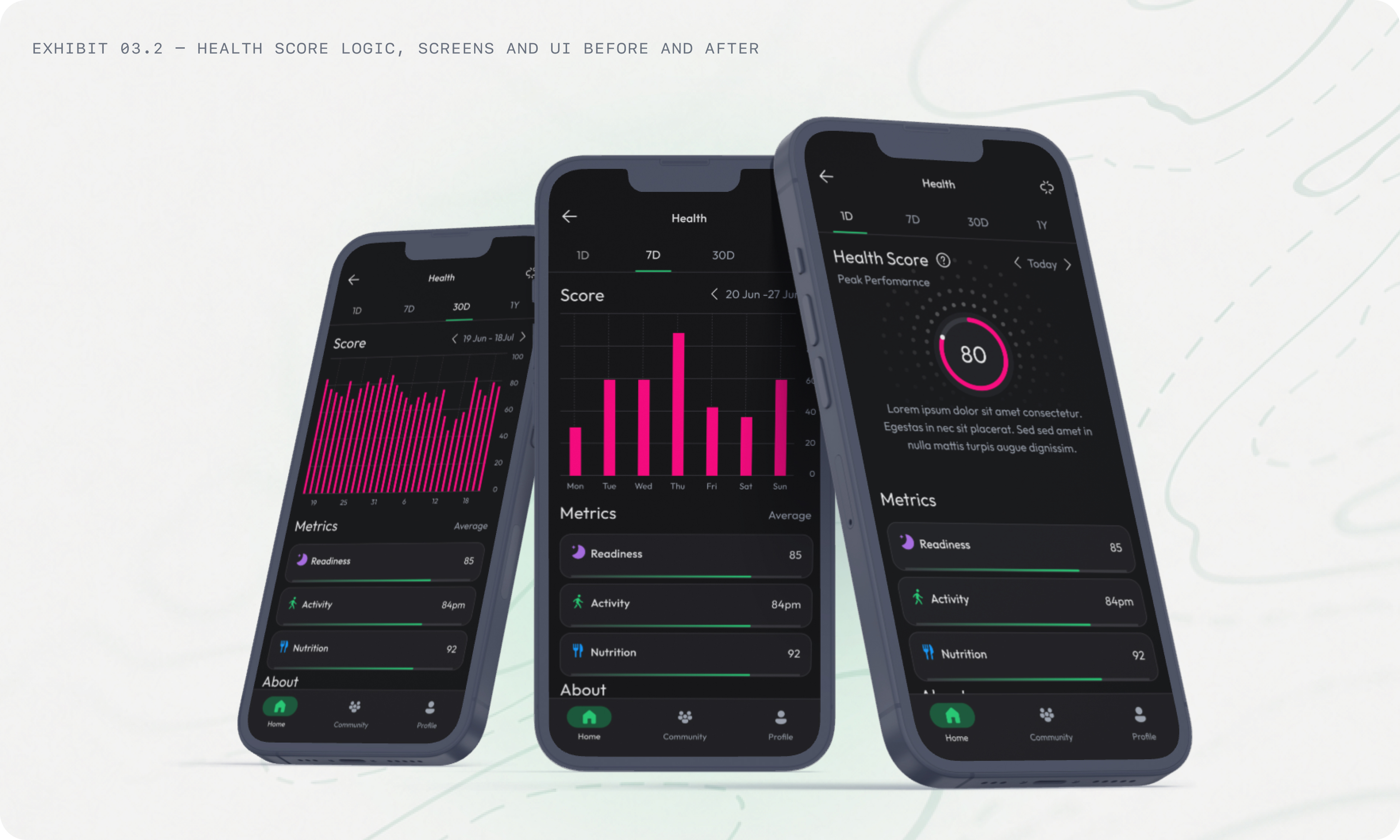
Exhibit 03.2 - Screens and UI, After
Two details of that spec I still defend in interviews: scoring below baseline is proportional, never punitive — a bad day dents the score instead of zeroing it, which is the difference between a nudge and a guilt trip for a casual user. And when a metric has no data, the score drops honestly and says why instead of quietly re-weighting around the gap - an honest number over a flattering lie.
Shipping was a hypothesis too
The module launched leading with 7-day views. Post-launch, watching how people actually read their data, we shipped a PRD that switched every default lens to 30 days - the score widget, every metric card, every detail page. The same PRD removed custom goals entirely and replaced them with auto-calculated targets, because users were setting goals that made their own scores impossible. The system now computes, per metric, the exact number that earns a perfect 100 - and sets that as the goal.
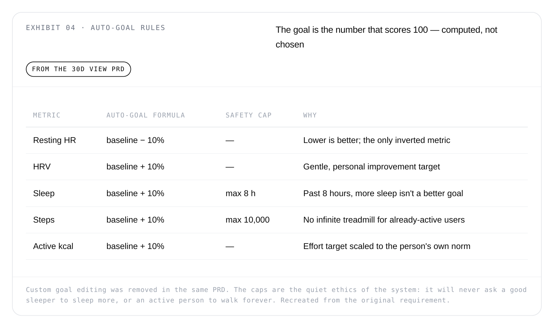
Exhibit 04 — Auto-Goal Rules: the goal is the number that scores 100, computed not chosen
It's a small iteration with a large lesson: the launch version of a 0→1 module is the first experiment, not the answer. The module shipped and served 10,000+ active users. But a health module is only as good as the data underneath it - which is where the Band comes in.
Part 2 · Rolla Band · The source of the metrics
A health module is only as honest as its wearable
The Rolla Band is the company's own wearable — the default source for everything the Health module displays: overnight resting heart rate and HRV, sleep, steps, and active calories. Working on the Band taught me a truth that never appears in a UI kit: for a data product, the worst failure state isn't a crash — it's a gap. A band that dies at 2 a.m. produces no sleep data; no sleep data dents the Health Score, breaks the streak, and quietly teaches the user that the numbers can't be trusted.
Battery UX is data-quality UX
The Band UX Improvement PRD I designed for started from exactly that failure: too many bands were powering off during sleep or mid-activity because users had no idea the battery was low. The redesign gave the band dashboard a full vocabulary of states — three battery ranges, searching, device-not-found, connection-failed, and not-connected — plus low-battery notices whose copy is written in consequences, not percentages.
That was the key design decision. "Battery at 18%" is a fact about the band; nobody acts on it. So the notices speak about the data the user is about to lose, and they change with the time of day: before noon they protect today's activity data, after noon they protect tonight's sleep tracking. A third variant fires when a user starts an activity on a low battery — warning them before the workout, not after the band dies during it.
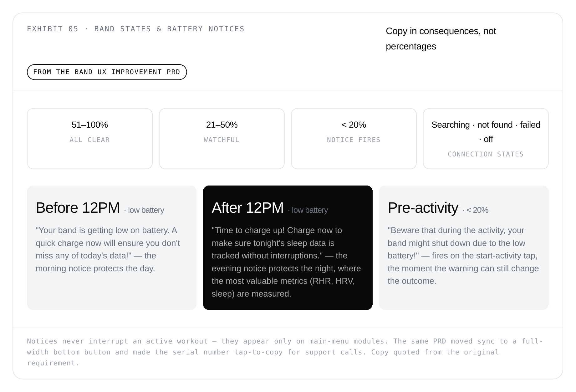
Exhibit 05 — Band States & Battery Notices: copy in consequences, not percentages
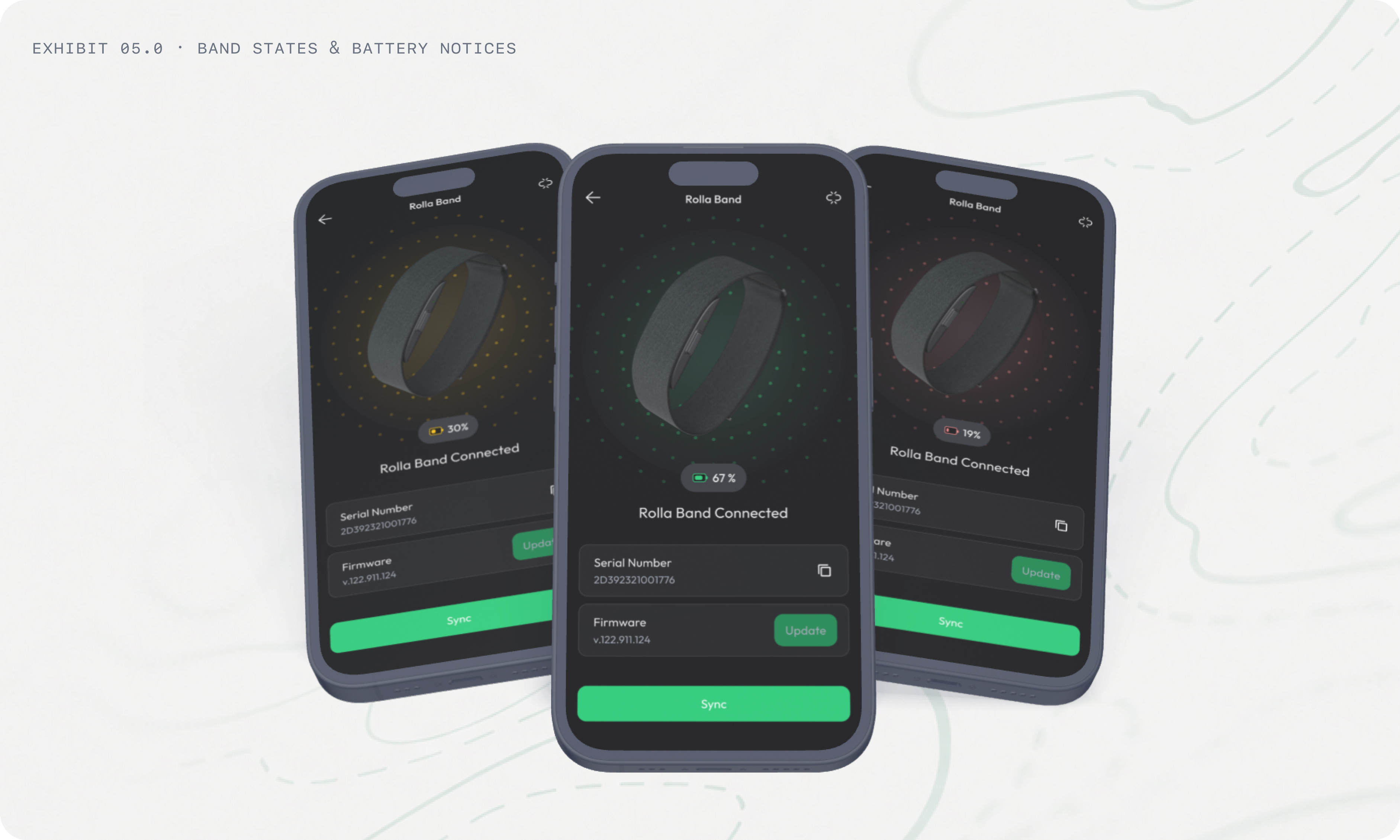
Exhibit 05.0 — Band States & Battery Notices
One body, two counters: merging active calories
A second data-integrity problem lived between modules. The band counts active calories all day; a tracked workout computes its own, richer calorie figure for the same time window. Counting both double-counts the workout; showing them separately makes the Health and Activity modules disagree with each other. The Active Calories Merge logic resolved it with one rule: whenever an activity was tracked, the activity's calories own that time window.
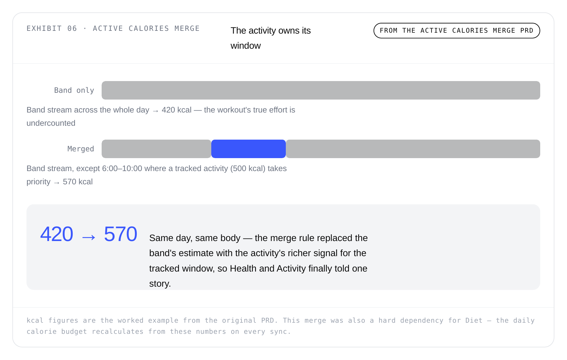
Exhibit 06 — Active Calories Merge: the activity owns its window
Designing trust when the numbers disagree
The Band was the default source, but never the only one - Garmin and Apple Health connected into the same module, with Rolla applying its own formulas on top of their raw streams. And the same body produced different numbers on different wrists: Garmin's high-end watches log multiple sleep sessions a night (we merged to the latest complete one); Apple's sleep start often follows the scheduled Sleep Focus rather than actual sleep onset; Apple's active calories run systematically higher than Garmin's or the Band's. Users noticed - and a user who thinks the numbers are wrong stops trusting all of them.
The answer wasn't a technical fix (there isn't one); it was an expectations design problem. We led with the trend within one source rather than absolute values across sources, and I contributed to the plain-language documentation explaining why platforms differ - turning a support-ticket generator into a moment of transparency. Even the scoring system had an honesty rule for hardware limits: some Garmin watches simply don't measure HRV, and the spec defines exactly how the Health Score behaves when a metric can never arrive. Designing what the product honestly says about its own data turned out to be as much my job as designing the screens.
Part 3 · Rolla Diet · Systems & sunset
Making a metabolic equation feel like a coach
Rolla Diet was a weight-management system built on a real metabolic model. Every day it computed a personal calorie budget - RMR + today's active calories − goal - projected an estimated weight from the principle that 7,700 kcal ≈ 1 kg, and ran a self-adjusting User Corrector that quietly recalibrated when logged meals and real weigh-ins drifted apart. The math was sound. My job was the layer where the math meets a human being who just wants dinner: three goal modes, a streak system that understands each of them, and logging fast enough to survive a lunch break.
Because the budget recalculates on every sync, the modules connect end to end: the Band measures active calories, the Health module merges and scores them, and Diet spends them - burn more, earn more budget, in real time. One body, one story, three modules.
Three goals, three psychologies
The user never picks a "mode." They enter a current weight and a goal weight, and the system infers the rest: more than 1% below current means lose, more than 1% above means gain, and anything within ±1% means the honest answer is maintain - a goal so close to where you are shouldn't pretend to be a transformation. Pacing came as three plans (easy, medium, hard) defined as a percentage of the user's own body weight per week, and suggested goal dates were anchored to dates that already mean something - New Year, a birthday, the first day of summer - because "in 11 weeks" motivates nobody.
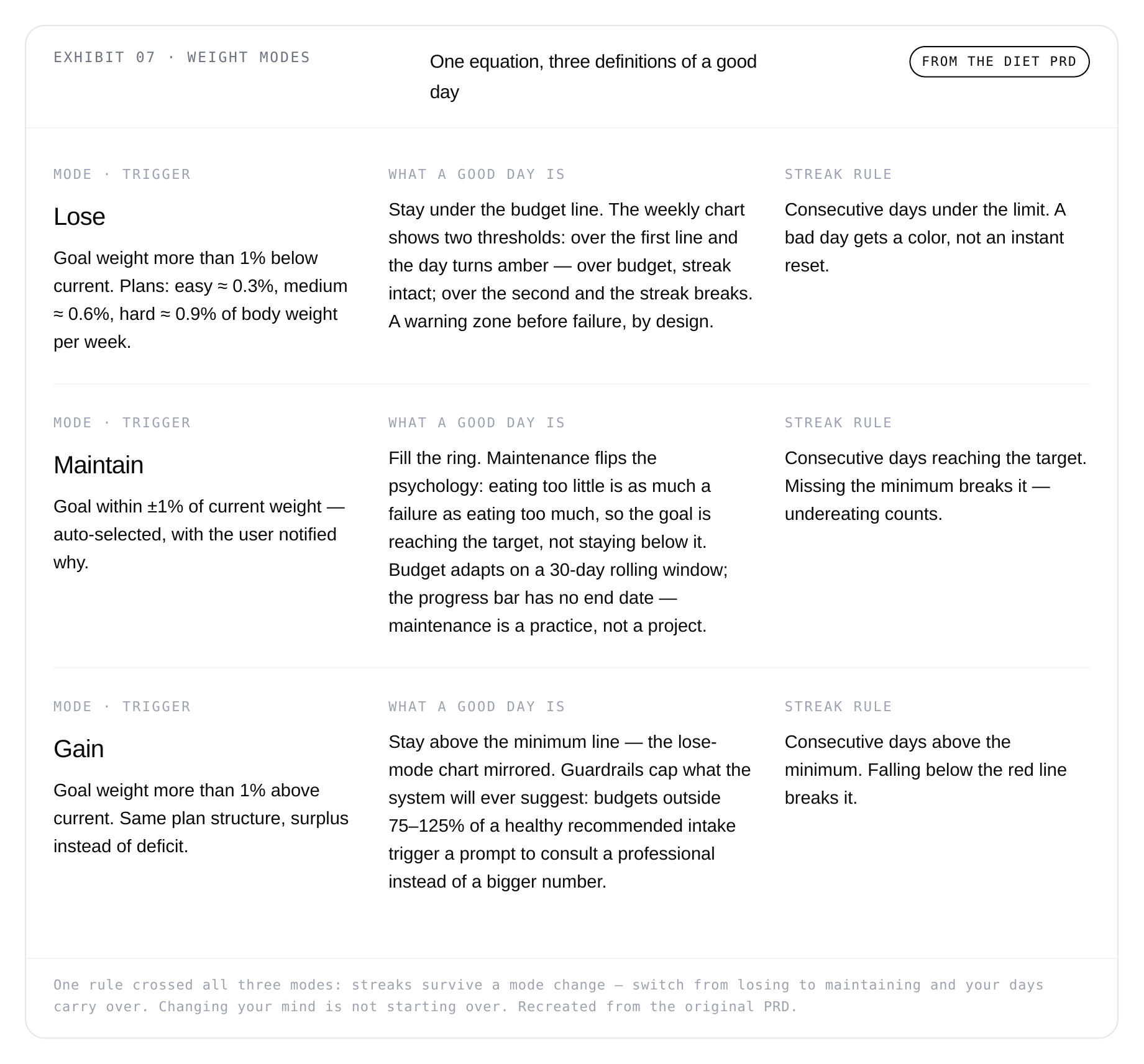
Exhibit 07 — Weight Modes: one equation, three definitions of a good day
Two systems details I'm still fond of. The User Corrector assumed the user would be imprecise - everyone underestimates portions - and instead of blaming them, it watched real weigh-ins drift from the estimate and adjusted the coefficient silently, within honest bounds. And the input validation caught the mundane disasters: a weight typed as 14 kg instead of 140 asked for confirmation instead of recalculating a life around a typo. Designing for fallibility, not compliance.
Logging: thirty seconds, three doors
Tracking systems die at the logging step - not because logging is hard, but because it's daily. Two later PRDs I designed attacked the two heaviest doors.
Search: history first, AI on request. The original text search generated AI meal suggestions on every keystroke - slow, expensive, and often wrong on half-typed words. The redesign made the search field default to the user's own meal history (most people eat the same twenty things) and moved AI generation behind an explicit AI button. Three wins in one change: performance, because API calls collapsed; relevance, because the AI only ever saw complete queries; and control, because the user always knows whether they're looking at their past or a machine's guess.
The AI Meal Scanner: teach the photo, don't swap the model. Scanner accuracy complaints traced back not to the AI but to the photos - wide, far, badly framed shots the model couldn't parse. The redesign kept the existing camera and fixed the inputs: a default zoom level that stops people photographing dinner from standing height, a first-time onboarding that teaches the shot (top-down, centered plate, minimal background), a help button to re-read it anytime, and gallery upload as an equal path. The entry screen was left deliberately modular - a barcode scanner slots in later without a redesign.
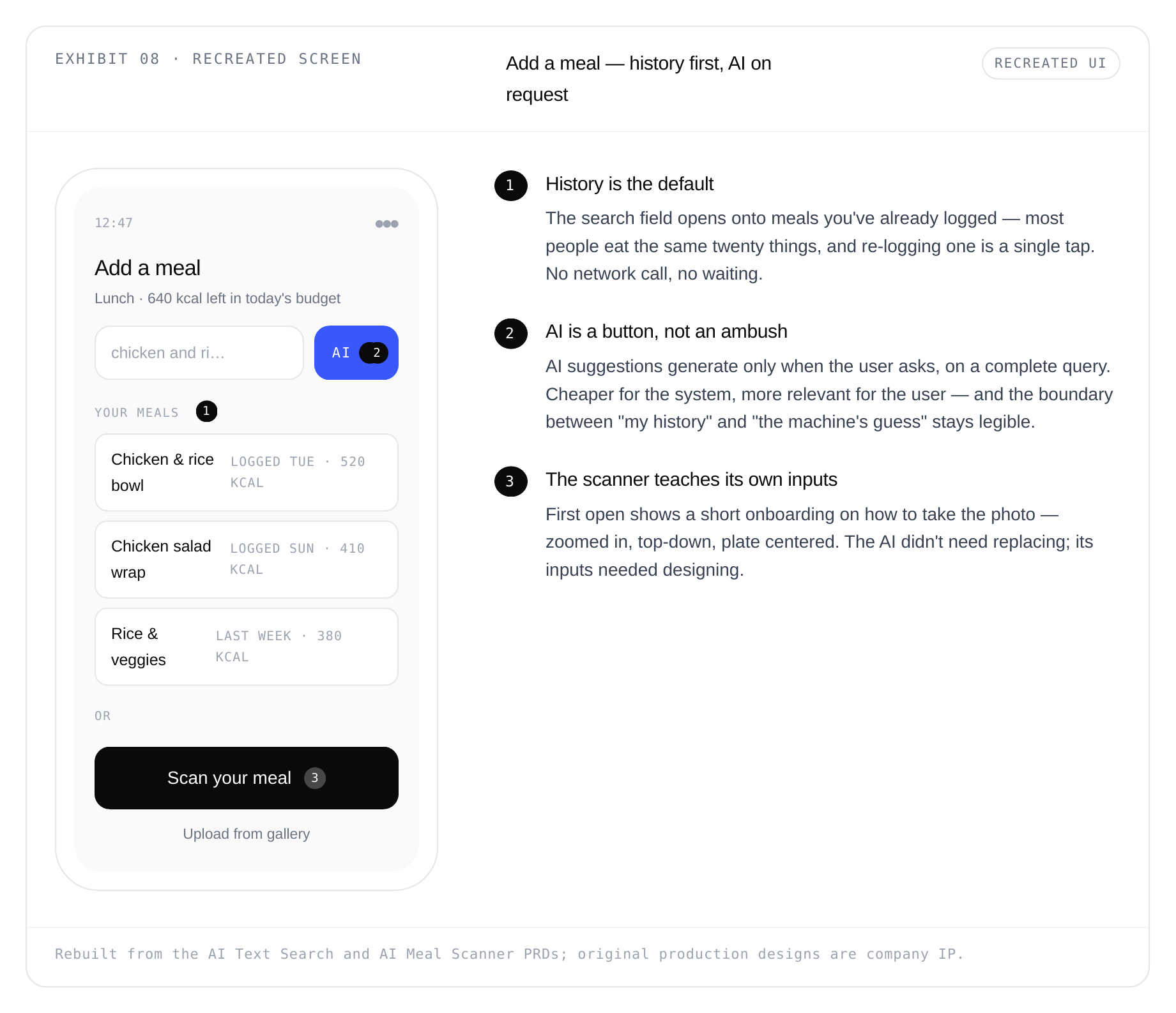
Exhibit 08 — Recreated Screen: add a meal, history first, AI on request
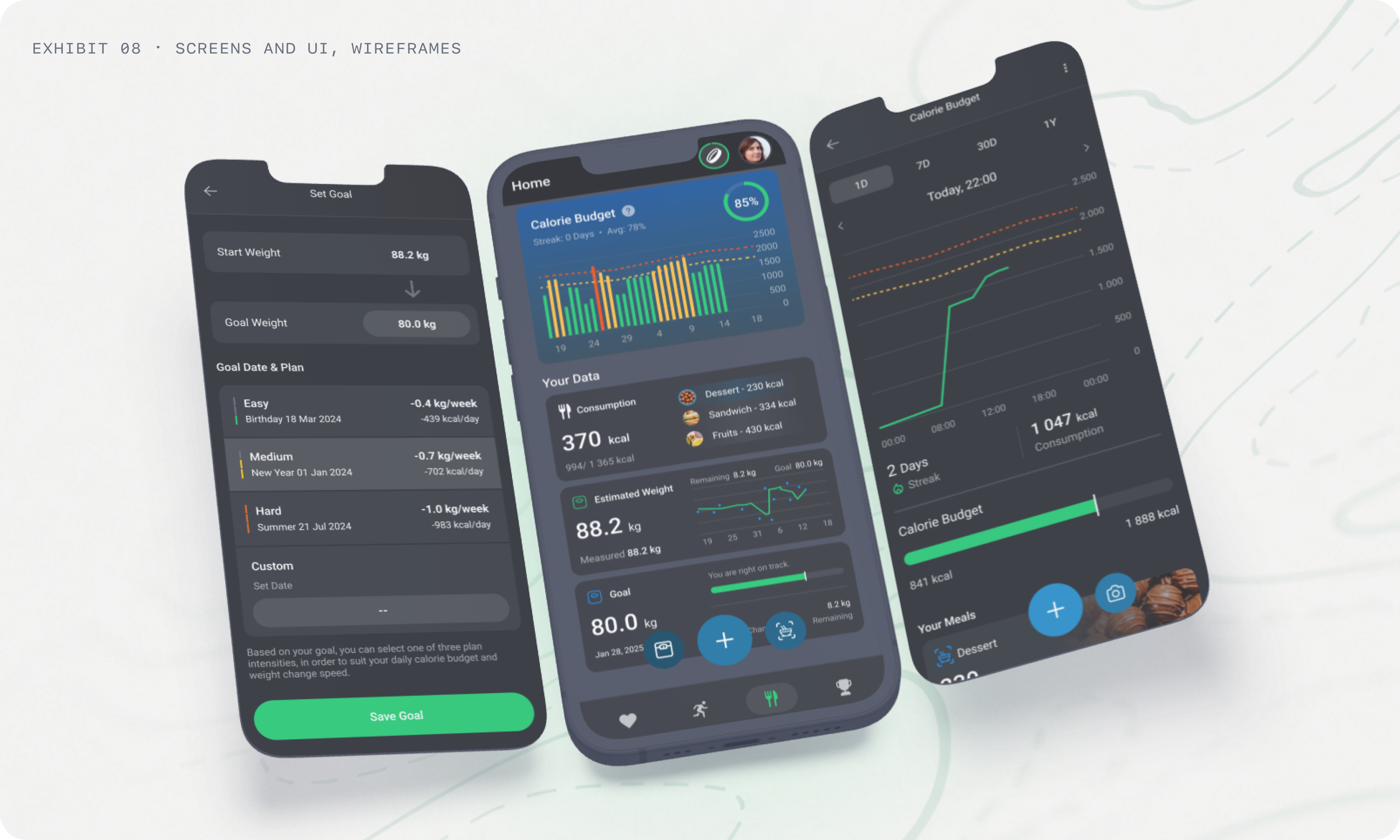
Exhibit 08.0 — Screens and UI, Wireframes
An honest ending
Rolla Diet was later discontinued. The systems held up - the modes, the corrector, the logging redesigns all shipped and worked as specified. What couldn't be sustained was the module itself: a metabolic model, a food database, an AI pipeline, and logging flows carrying dozens of edge cases that a small team couldn't responsibly cover while other parts of Rolla were creating more value for users. The company eventually applied at portfolio level the same principle I'd applied inside the module: cutting scope is strategy. Design can make a complex system humane. It can't always fix a product's cost of complexity - and learning to tell those two problems apart is what I carry from this project.
Part 4 · Rolla One · B2B
The same design, resold to employers
The Health Score I helped design became the currency of Rolla One, the B2B layer: gyms and companies ran year-long wellbeing programs where challenges were built around keeping scores above personal thresholds - consistency over raw output, so a beginner and a triathlete could meaningfully compete in the same program. Because baselines were personal, the mechanic was fair by construction, not by handicap.
On the B2B side I also designed the employee onboarding - joining a company team by code, connecting the Rolla Band, and per-module guides — with its own PRD trail: simplified account creation, error states for every way a team code can fail, and a skip path that never dead-ends the user. Unglamorous work, but B2B onboarding is where a deal's first hundred employees decide whether the platform is real.
Working inside a startup
Rolla's design team was small and PM support was thin, which meant owning the what and why, not just the how: writing the specs, cutting the tickets, documenting flows so engineers were never blocked on me, and defending scope decisions with data instead of taste. The PRDs from that period — Health, Band, integrations, Diet - list one designer next to the PMs, the engineers, and the mathematician; that ratio is the honest description of the role.
Cutting scope is strategy, not debt. Quality lives in protecting the load-bearing moments of a product - everything else is negotiable.
What I'd do differently
I'd instrument the beliefs we shipped on reasoning alone. The 30-day default lens, the consequence-first battery notices, the history-first search - each was argued well and measured thinly, and I most wish I had the numbers on whether the battery notices actually reduced dead-band nights. Strong reasoning deserves strong instrumentation.
And I'd push earlier for the employer-side reporting layer: Rolla One collected rich team health data that employers could see but not easily read - a gap I've been quietly building on ever since.