Year
2024
Team
Product Designer
Contribution
UX Design, Interaction Design, Prototyping
Overview
There's a moment in every project where the numbers stop being numbers and start being people. For me, it was reading a survey response from a single mother who had borrowed £500 from a friend to cover her nursery bill. Not a loan. Not a credit card. A friend. Because that was her only option.
That's the UK childcare market in one sentence. Average nursery costs of £14,300 a year against an average salary of £32,000 - nearly 45% of gross income, for one child. Costs rising 7 times faster than wages since 2008. Little Steps Financing was built to change that: a 0% interest, FCA-regulated platform that pays nursery fees directly and collects equal monthly repayments from parents over up to 4 years.
The idea was simple. The product was not.
This case study focuses on process, decisions, and design thinking. Original screens are confidential. The visuals here are my own recreations built to communicate the work accurately.
Process
Discovery
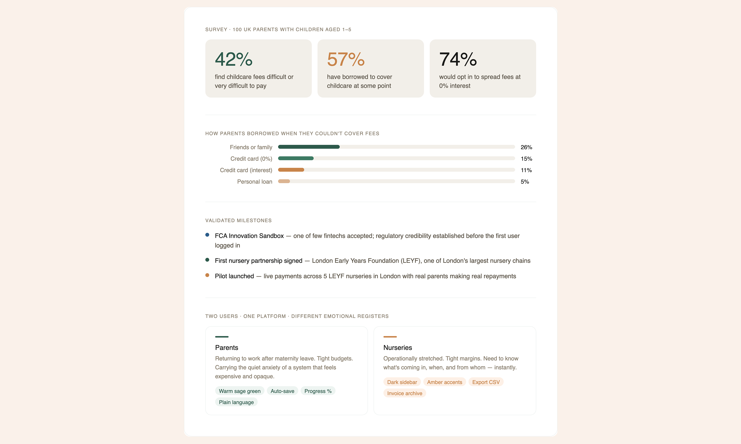
When I joined the project, LSF had already validated demand. A Pollfish survey of 100 UK parents confirmed what the founders suspected: 42% find childcare fees difficult or very difficult to pay. 57% had borrowed to cover costs at some point — a quarter of them from friends or family. When LSF tested the concept of spreading fees at 0% interest, 74% said they'd opt in.
The problem wasn't awareness. It was that no product like this existed. LSF was the first BNPL application on recurring childcare fees — and shortly into the project, one of the few fintechs accepted into the FCA Innovation Sandbox. That regulatory validation set a credibility bar before a single user had logged in, and it shaped every design decision that followed.
The Design Problem: Two Users, One Platform
LSF has two completely different users who never interact directly but are deeply dependent on each other. Parents need financing. Nurseries need to trust they'll be paid.
Most products in this space design for one side. I decided both deserved a first-class experience — and that meant resisting the temptation to build a single dashboard with a role switcher. The architecture diagram below shows the decision made concrete: two completely separate products, each with their own entry point, navigation, and emotional register, sharing one backend infrastructure underneath.
The orange branch is the parent product. The dark branch is the nursery product. They diverge immediately from the marketing landing page and never visually overlap — but they share the same status model, the same notification system, and the same payment logic. Same skeleton. Different skin.
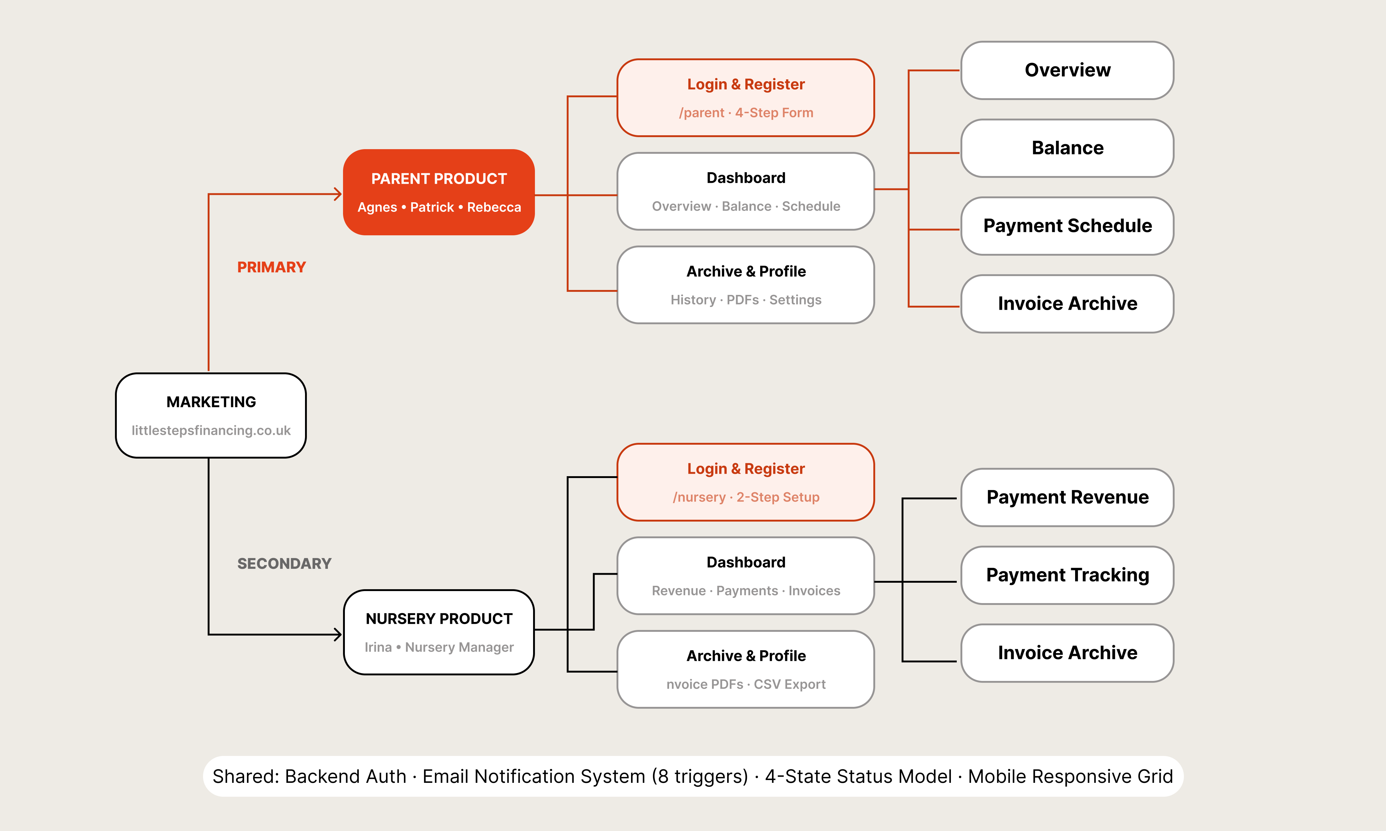
03 — UX Architecture: two products, one shared infrastructure
The parent experience is warm, calm, trustworthy. The nursery experience is operational and businesslike. Because a parent applying for childcare financing and a nursery operations manager reviewing their payment pipeline are not doing the same thing, even if they're technically in the same system.
The first real sign this was the right call came when LSF signed their first nursery partnership with LEYF — one of the largest nursery chains in London. Having a product that felt purpose-built for nurseries, not bolted on, helped build the trust to get that agreement signed.
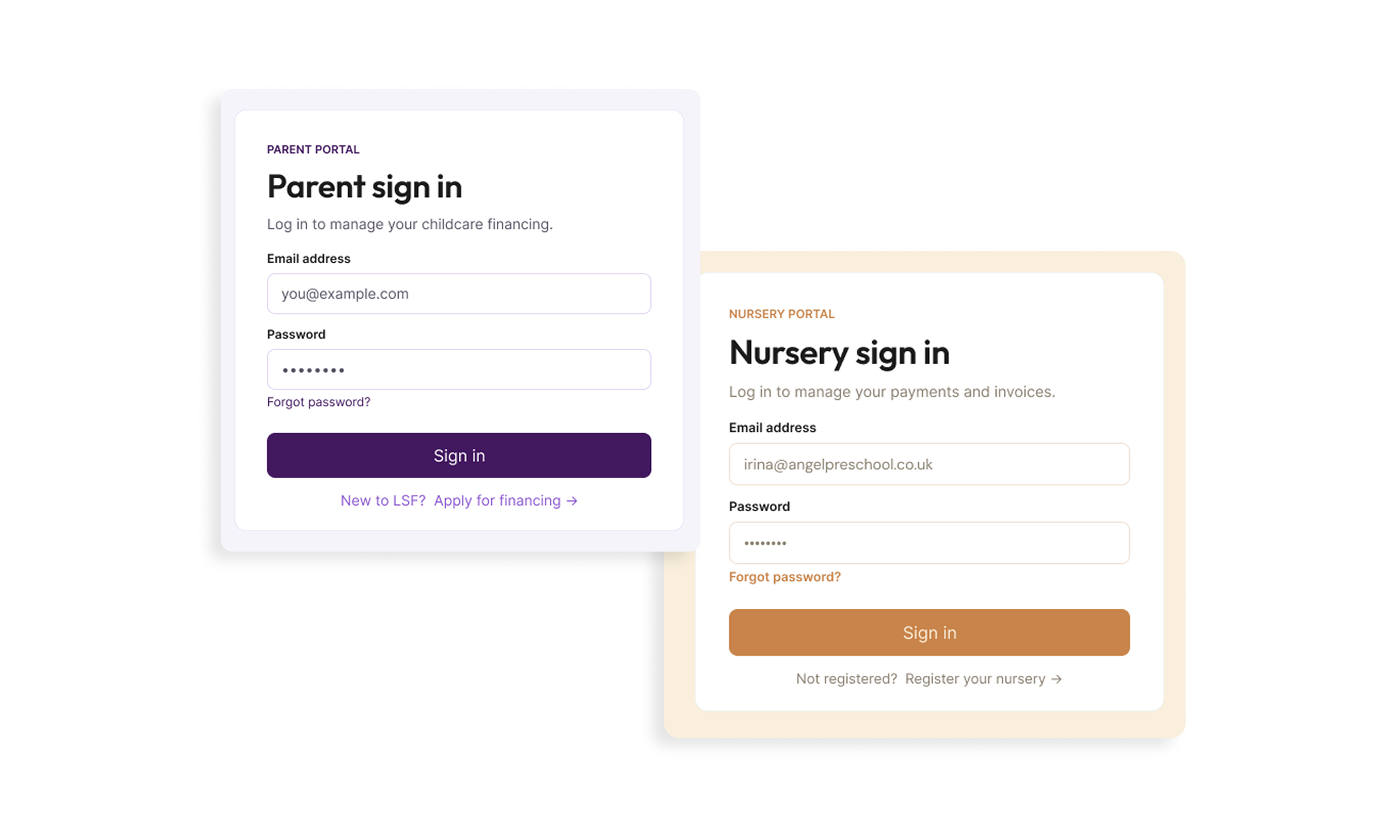
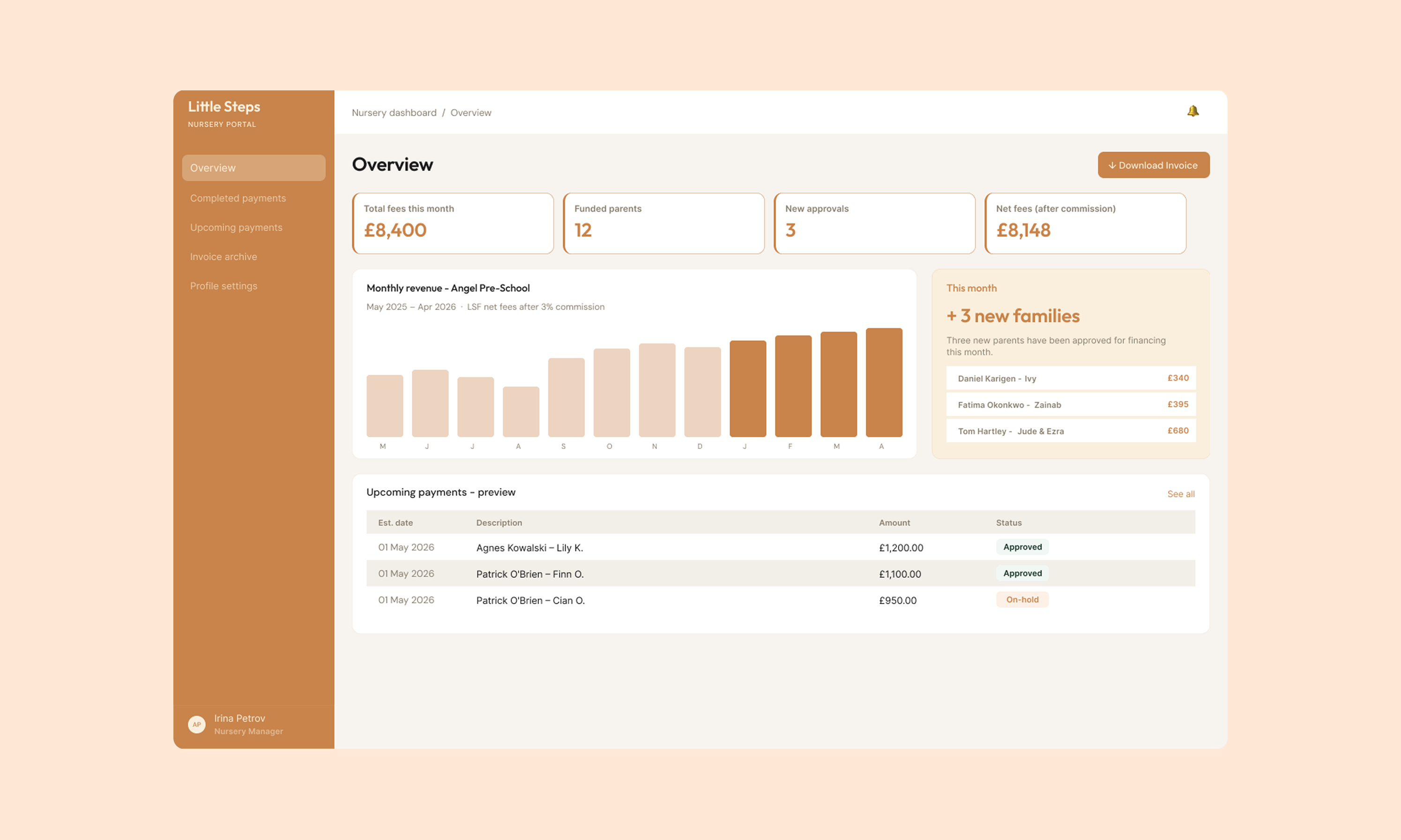
Parent dashboard (left) · Nursery dashboard (right)
THE APPLICATION FLOW
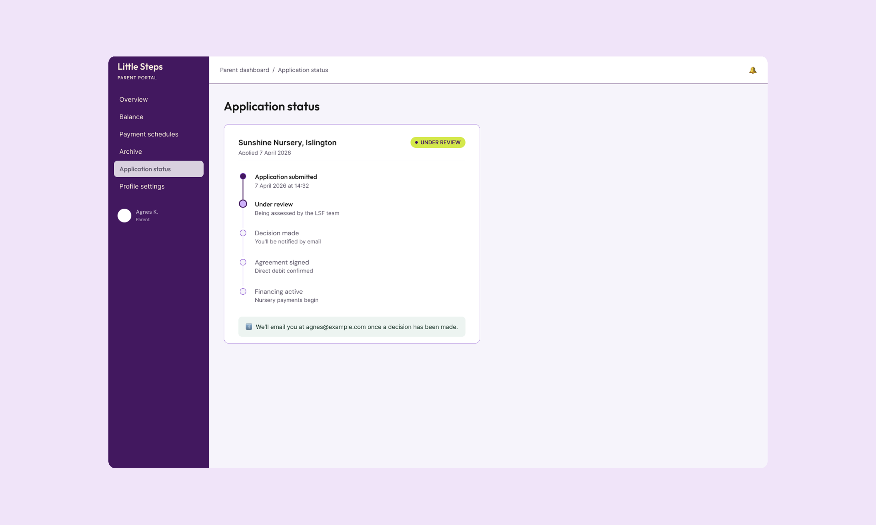
The parent application is where most of the design complexity lived — and where the most consequential UX decisions were made. Flow A shows the complete first-time journey: nine steps from marketing landing page to authenticated dashboard.
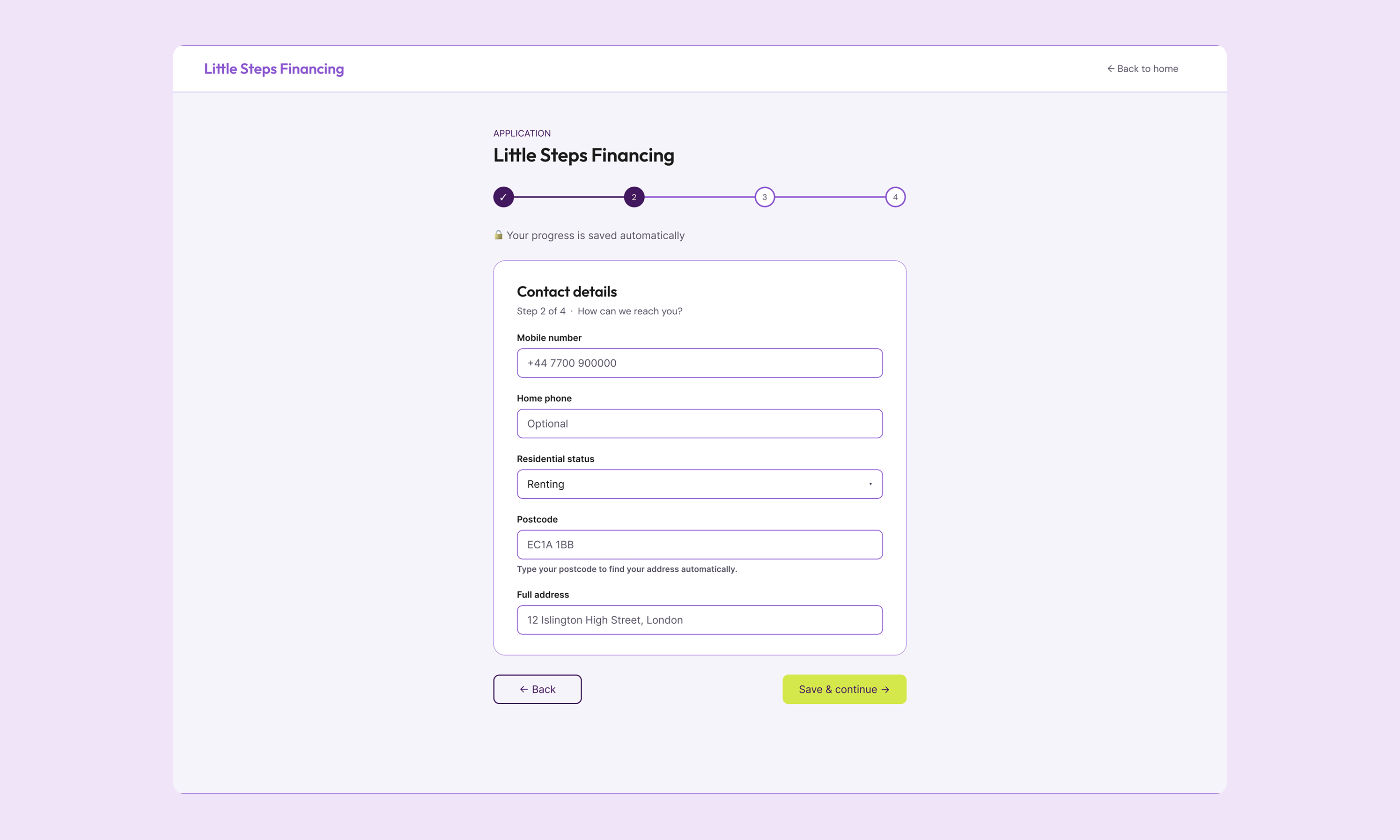
A parent applying for childcare financing is not relaxed. They're returning to work, managing tight budgets, and navigating a product that asks for their salary, bank details, and employer information. The instinct in fintech is to ask for everything upfront. I did the opposite.
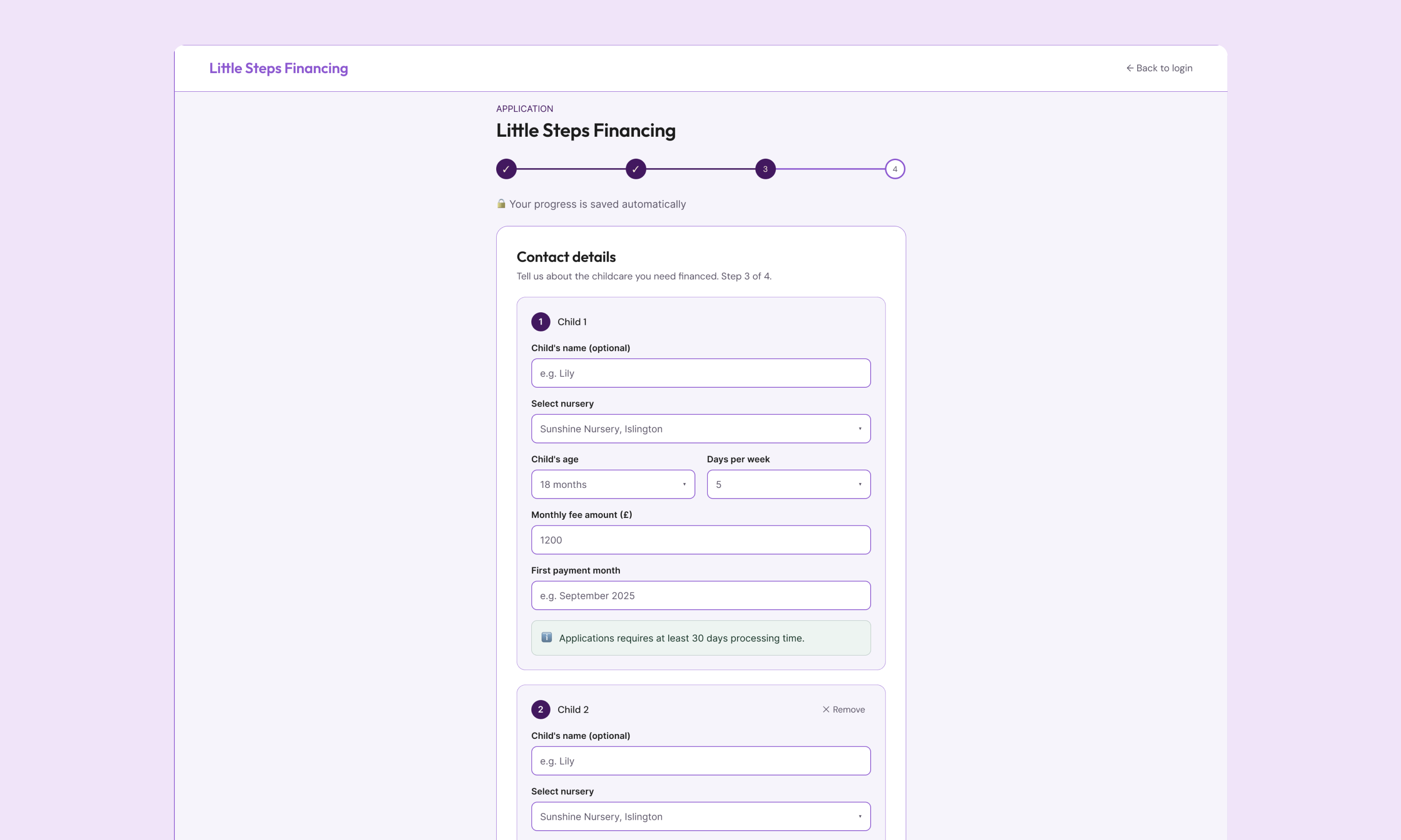
The four-step form is structured around deliberate emotional pacing. Steps A2 and A3 gather identity and contact — low stakes, fast to complete. A4 is the First Financial Ask: where the parent selects their nursery, their child, and the number of days they need financed. Only then, at A5, do we ask for salary and bank details. By that point, the parent already knows what the product is for and what they'll get from it.
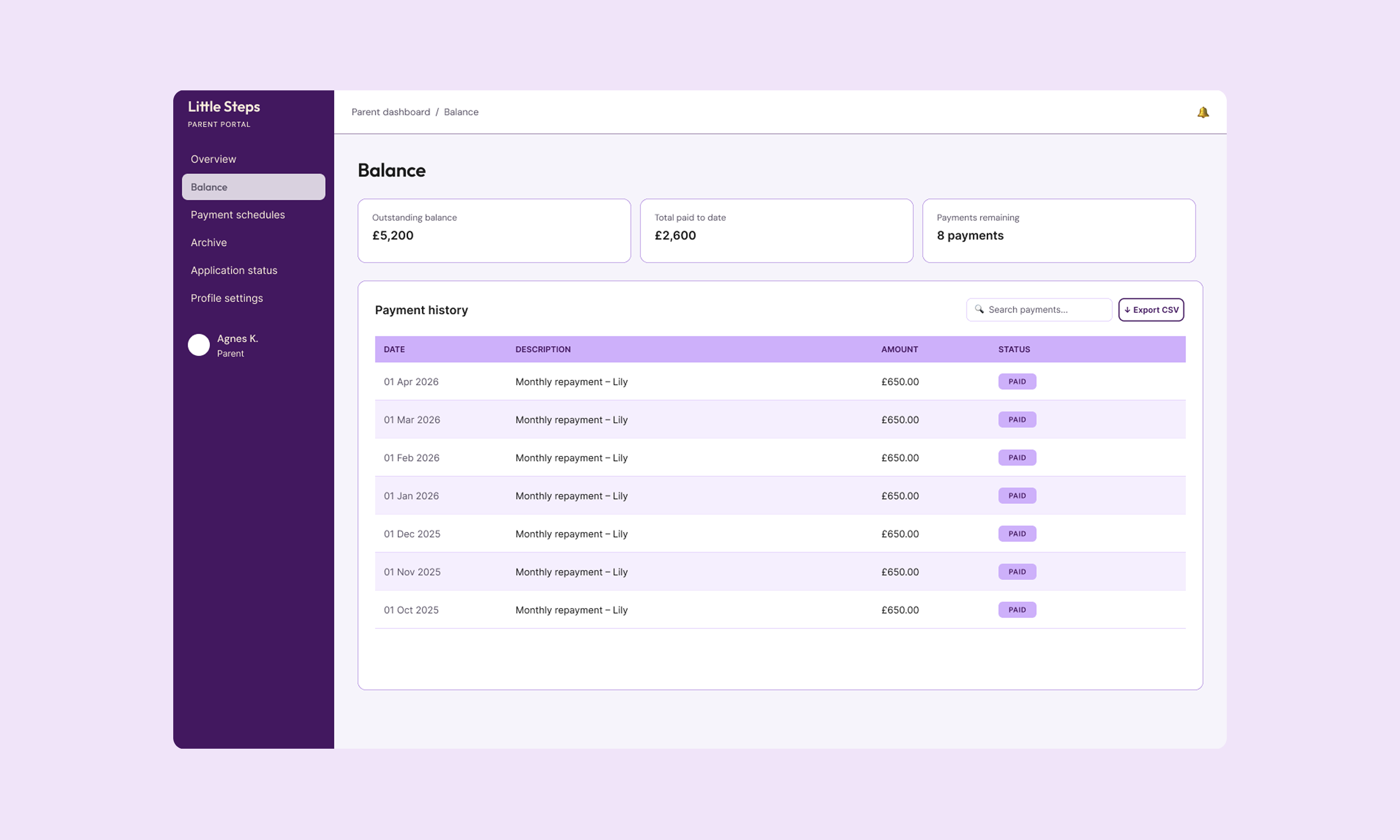
A6 — Review & Schedule — is the Key Trust Moment. This is where a stacked bar chart shows exactly how repayments break down month by month, per child. The total is visible before they commit to anything. Not on a confirmation screen. Not in a PDF sent afterward. Right there, before they click submit.
Every step auto-saves. If a parent gets interrupted — and they will — they return to a resume banner, not a blank form.
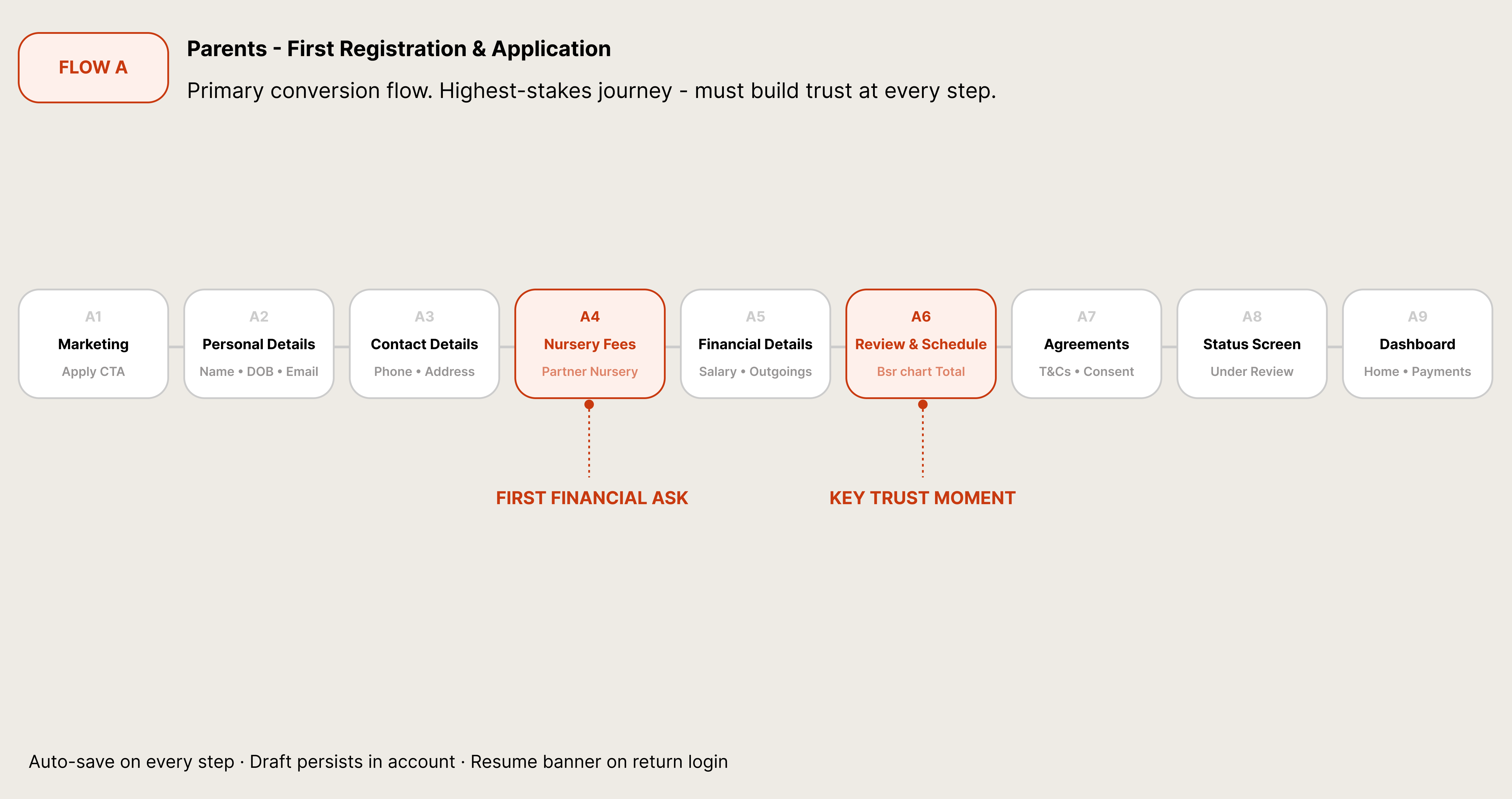
Flow A — First Registration & Application · 9 steps · Two key trust moments
THE RETURNING PARENT
Flow B addresses a problem most fintech products handle poorly: what happens on the second application.
For returning parents, the form is largely pre-filled — shown in the diagram with lighter-shaded boxes. Personal details and contact details come back automatically, editable but confirmed with a single tap. The nursery fees step, however, is always blank. A new month means new schedules, new children, potentially new nurseries.
The dashed box at Step 4 represents the financial details — pre-filled for the first and second applications, then cleared on the third and beyond. This was a deliberate policy decision, made visible through the UI rather than buried in terms. If a returning parent selects fewer financing days than their previous agreement, the system flags it with an inline warning before they advance. A nudge, not a blocker. Business rule made human.
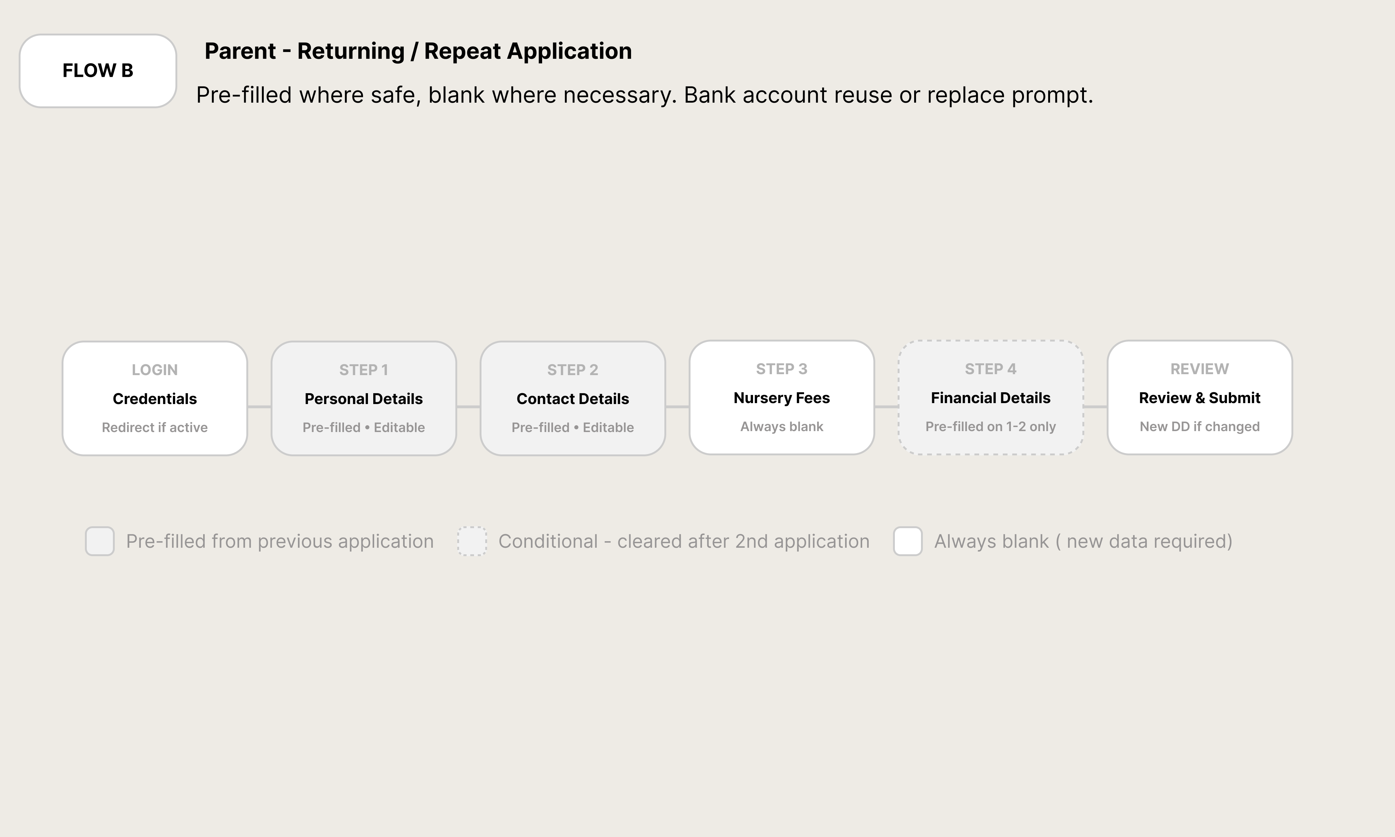
Flow B — Returning Application · Pre-filled state logic
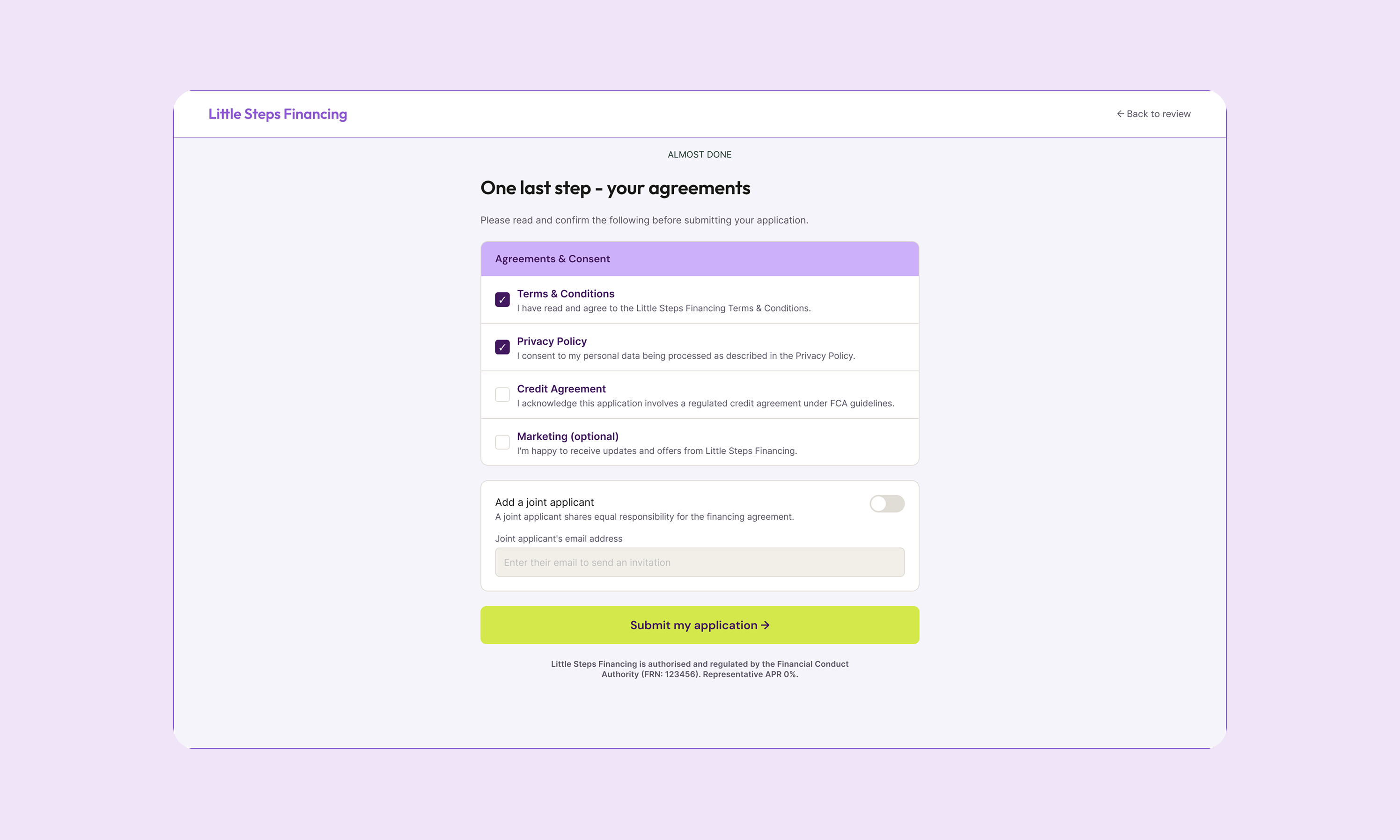
THE JOINT APPLICATION
Flow C is the most structurally unusual flow in the product, and the diagram shows why: it's the only one that branches.
When a parent selects "Joint applicant" and submits, their co-applicant receives a separate email with a unique link to their own form. The orange elbow connector in the diagram shows the moment the primary application forks — C2 triggers the system email, and two parallel processes begin.
The co-applicant path (C3 and C4) runs independently. The nursery section is read-only for the co-applicant: they can see exactly what they're signing up for, but can't change it. This protects both parties and prevents the quiet friction that happens when financial decisions get made for someone rather than with them.
C4 captures the co-applicant's bank account — used only as a fallback if the primary applicant's direct debit fails. The diagram shows this path reconnecting to C5 (Confirmation) once both parties have completed their forms. At that point, both accounts enter the same status simultaneously: Pending review. The shared status was intentional. It mirrors the shared commitment.
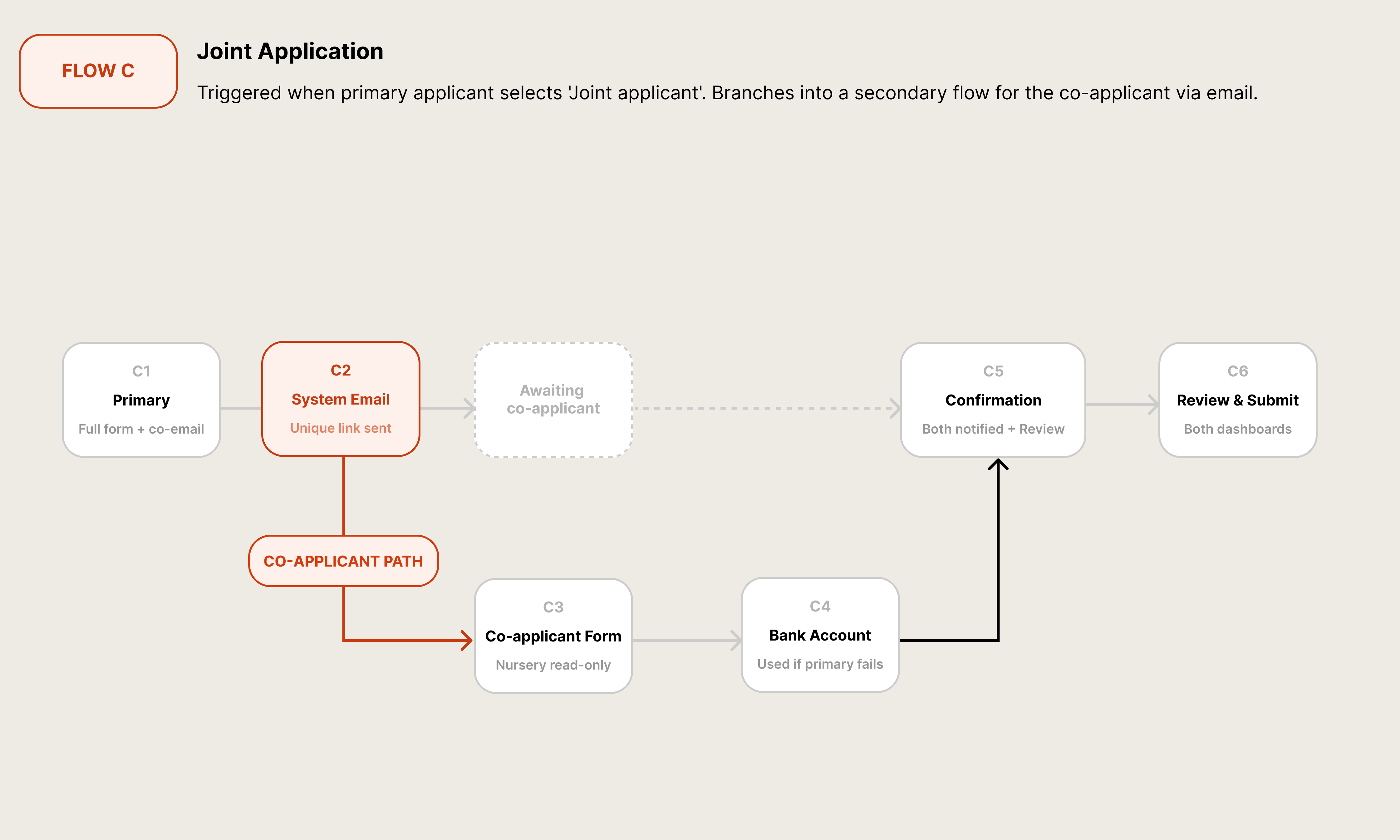
Flow C — Joint Application · Branching co-applicant path
Application screens — form steps, child card, repayment schedule, status screen
NURSERY ONBOARDING
Flow D sits on the other side of the platform entirely. Where the parent flow is built around trust and emotional pacing, the nursery flow is built around a hard operational reality: nurseries cannot self-activate. LSF completes the setup manually before login credentials are issued.
That creates D4 — the dead zone. A dashed box in the diagram, annotated as a manual handoff. A nursery that submits their registration form enters a holding state with no visible progress, no ETA, and no way to chase. The UX response was clear email communication at every transition and a holding state screen that tells the nursery manager exactly what happens next and when.
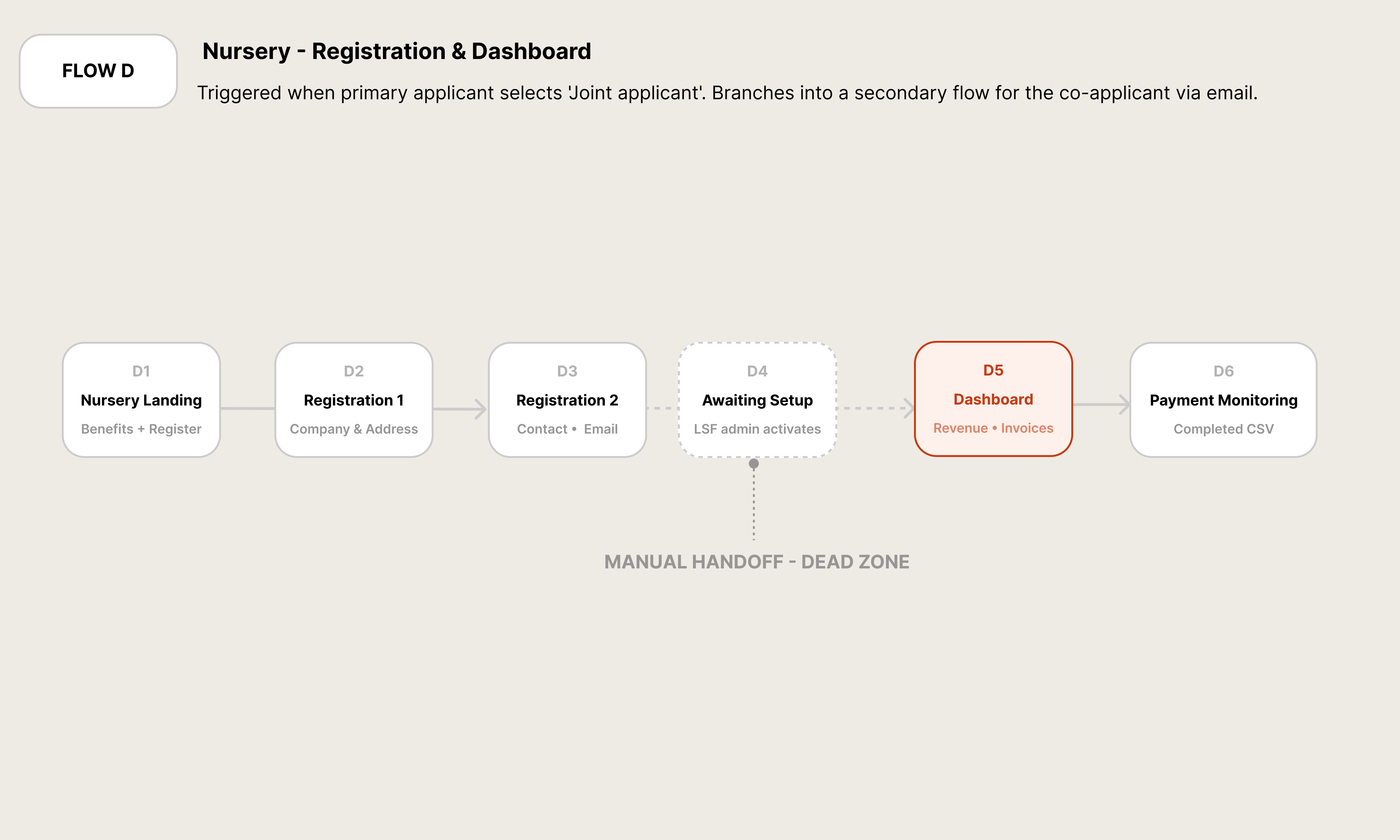
Flow D — Nursery Onboarding · Admin-assisted · D4 manual handoff
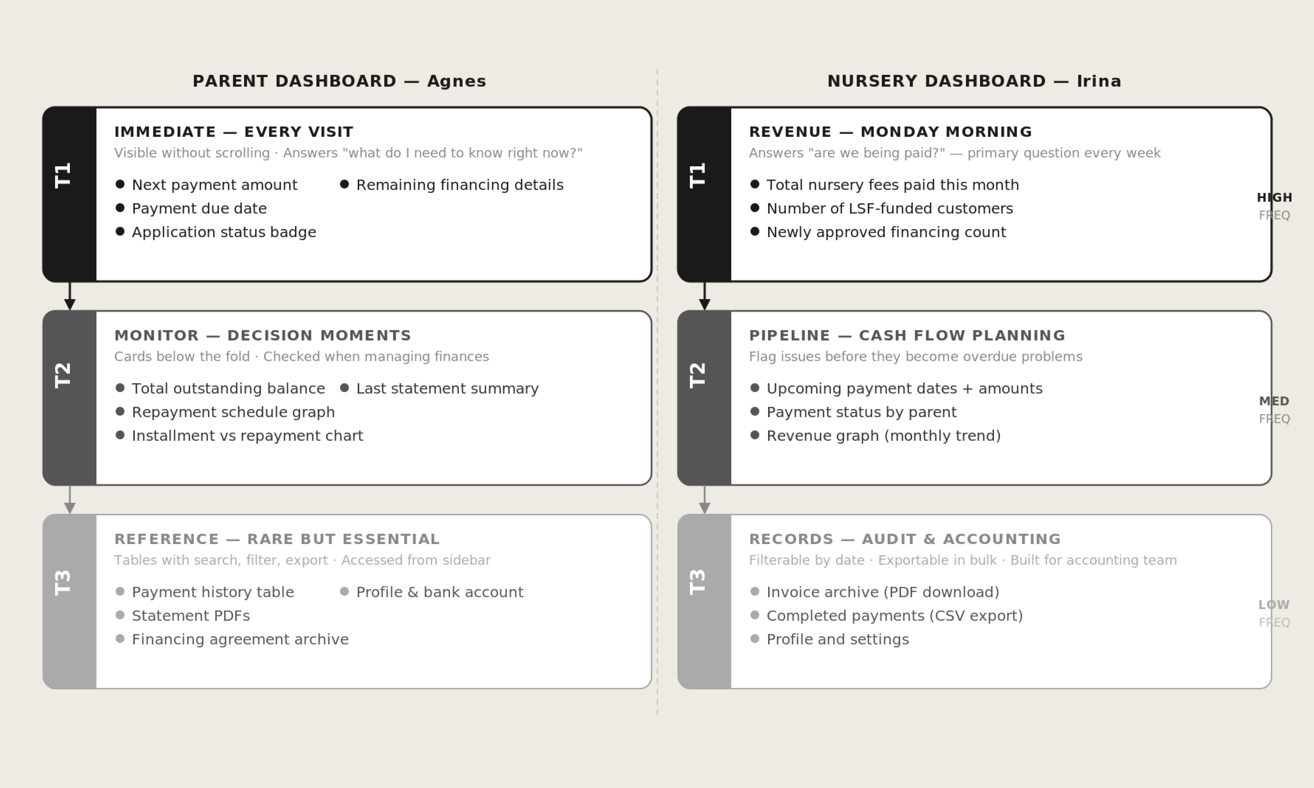
WHAT EACH USER NEEDS TO SEE
The hierarchy diagram shows how dashboard content was structured for both user types — not from what's technically easiest to surface, but from what each persona needs at different frequencies.
For Agnes (the parent), T1 is immediate: next payment amount, due date, application status badge. Visible without scrolling. T2 is the monitoring layer — balance, repayment schedule, installment chart — consulted when making financial decisions. T3 is the reference layer: history, PDFs, archive. Rarely needed, but must be findable.
For Irina (the nursery manager), T1 answers one question: are we being paid? T2 is cash flow planning: upcoming payment dates, parent-by-parent status, monthly trend. T3 is the accounting layer: invoice archives, CSV exports, settings.
Neither T3 layer is buried. But they don't compete for attention with the things people actually need every time they open the app.
05 — Information Hierarchy · Three tiers · Parent & Nursery dashboards
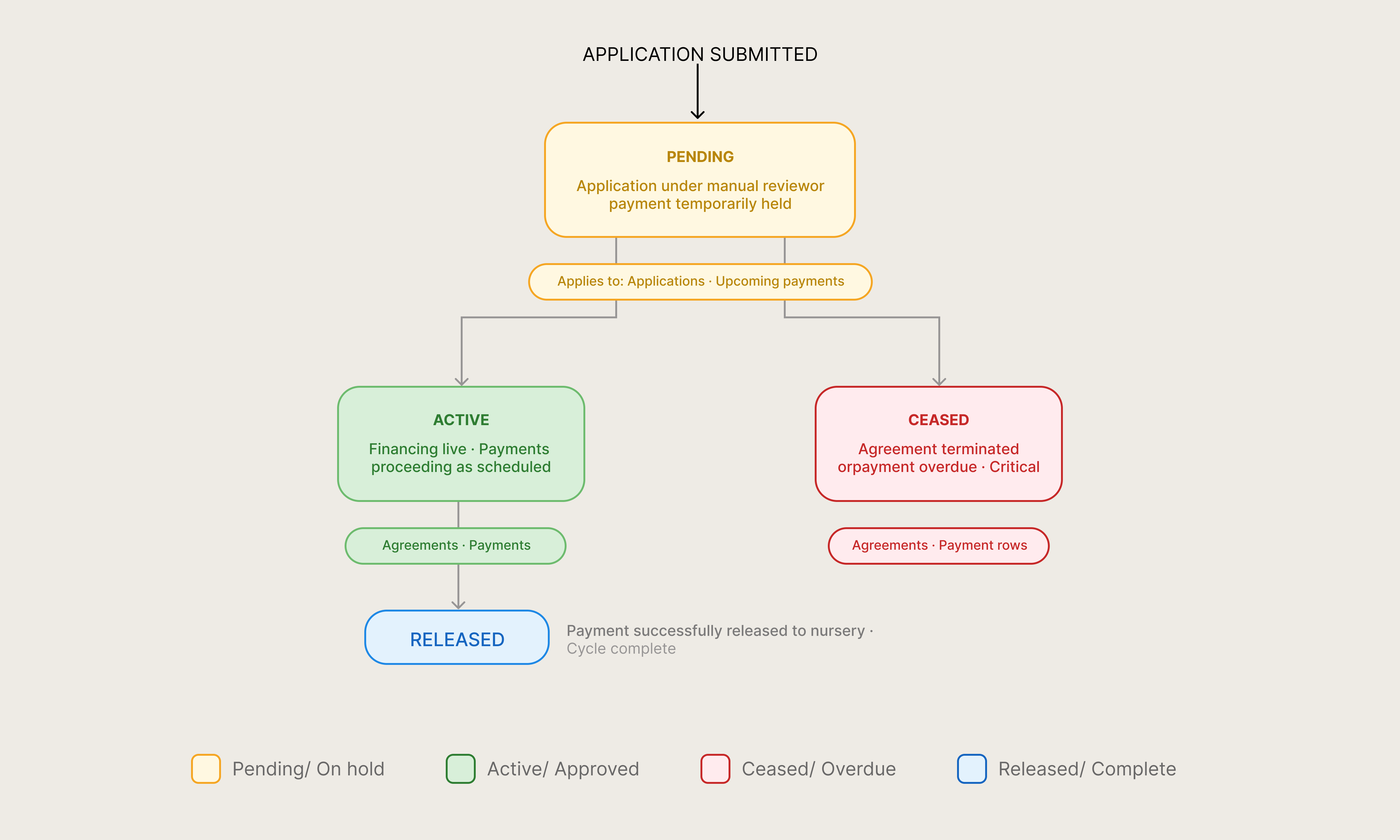
THE STATUS SYSTEM
Everything in this product — every agreement, every payment, every application — resolves to one of four states: Pending, Active, Ceased, or Released.
Every application enters as Pending. Manual review moves it to Active (approved) or Ceased (declined or terminated). Active agreements reach Released when payment completes the cycle.
Colour is used once and consistently: amber for Pending, green for Active, red for Ceased, blue for Released. Red appears here, and only here — it's not used for warnings, validation errors, or emphasis anywhere else. When a parent or nursery manager sees red, it means exactly one thing.
Both parents and nurseries see the same four states in their respective dashboards. When an LSF team member calls a nursery to discuss a payment, they're speaking the same language as the UI. Status is a shared vocabulary, not a technical artefact.
06 — Status System · 4 states · Consistent across both products
Outcome
What Shipped
By the time the pilot went live, LSF had real parents making real payments across 5 LEYF nurseries in London. That's the moment I think about when someone asks me what this project was. Not the design system. Not the component library. Not the Figma file. Real parents. Real nurseries. Real payments.
Getting there required a product that worked for both sides without either feeling like an afterthought. It required a registration flow that didn't lose people at the bank details step. It required a repayment calculator that updated in real time as families added children. And it required a joint application process that two adults could move through independently without it becoming a source of tension.
One component library, two products, one coherent experience — for the parent who just needs to know their next payment date, and for the nursery manager who needs to know Friday's collection will clear.