Year
2025
Role
Product Designer
Platform
Web-first, with mobile and AR/VR on the roadmap
Overview
Nearly half of people studying for professional certifications still fail. Not because they lack motivation — but because the tools they're using were designed for a different generation.
When I joined the project, that was the core tension I was handed: a Gen Z workforce entering professional life at scale, being forced to learn through platforms built for how Millennials studied in 2012. Dense text, linear modules, no feedback loop, no personalization. A system that delivers content and calls it learning.
Gen Z didn't grow up with that. They grew up with TikTok's algorithm knowing exactly what they want before they do. With Spotify's Discover Weekly feeling more personally curated than anything a teacher ever handed them. With YouTube where you can slow down, speed up, skip, rewind, and learn at your own pace with a creator who actually makes it interesting. The standard LMS was never going to hold their attention — and honestly, it shouldn't have to.
That was the real design brief: stop trying to make Gen Z fit the old model, and build something that actually fits them.
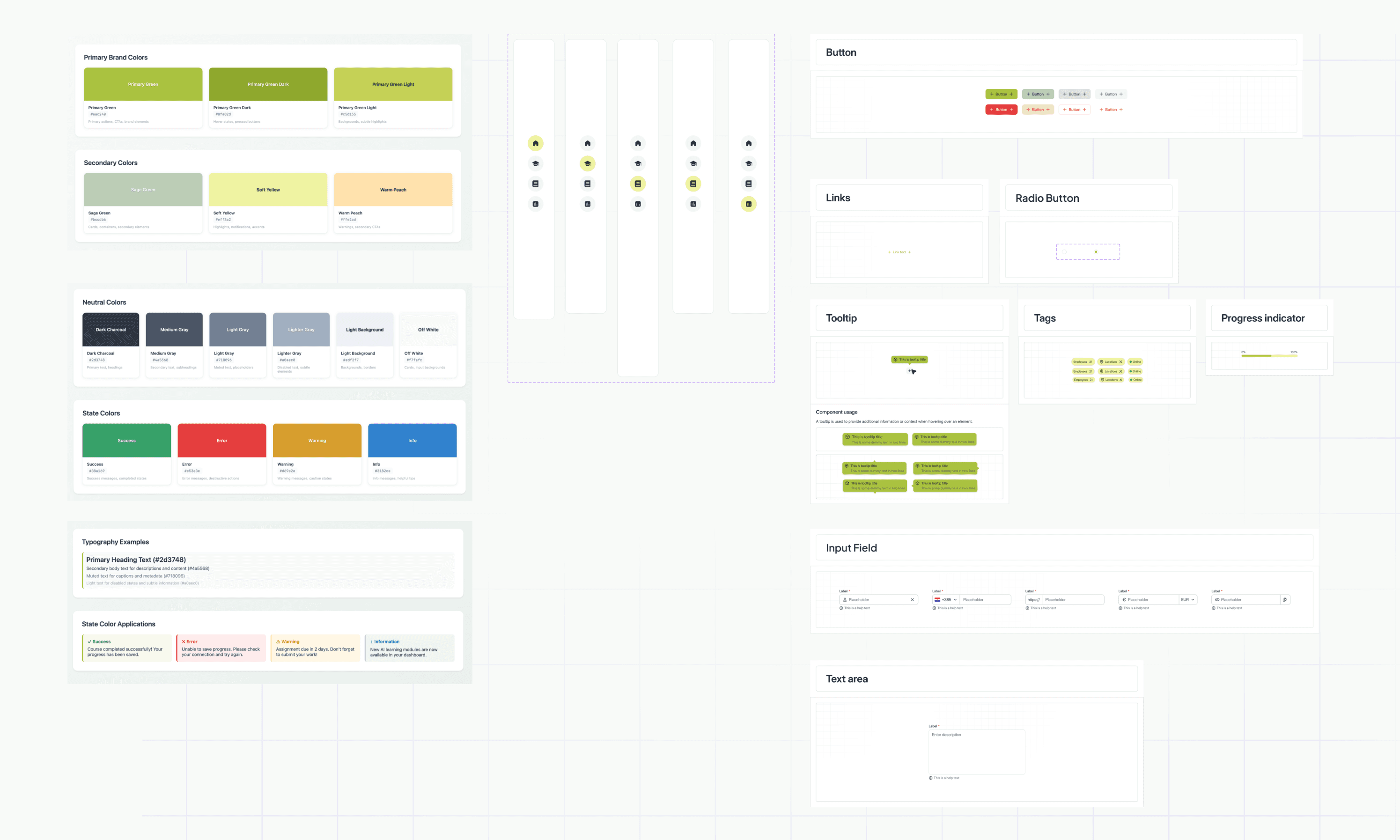
The visuals and layouts included here are my own re-creations of the project's design work. Due to confidentiality agreements, they are not the final production screens but conceptual representations used to illustrate the process and design thinking.
Process
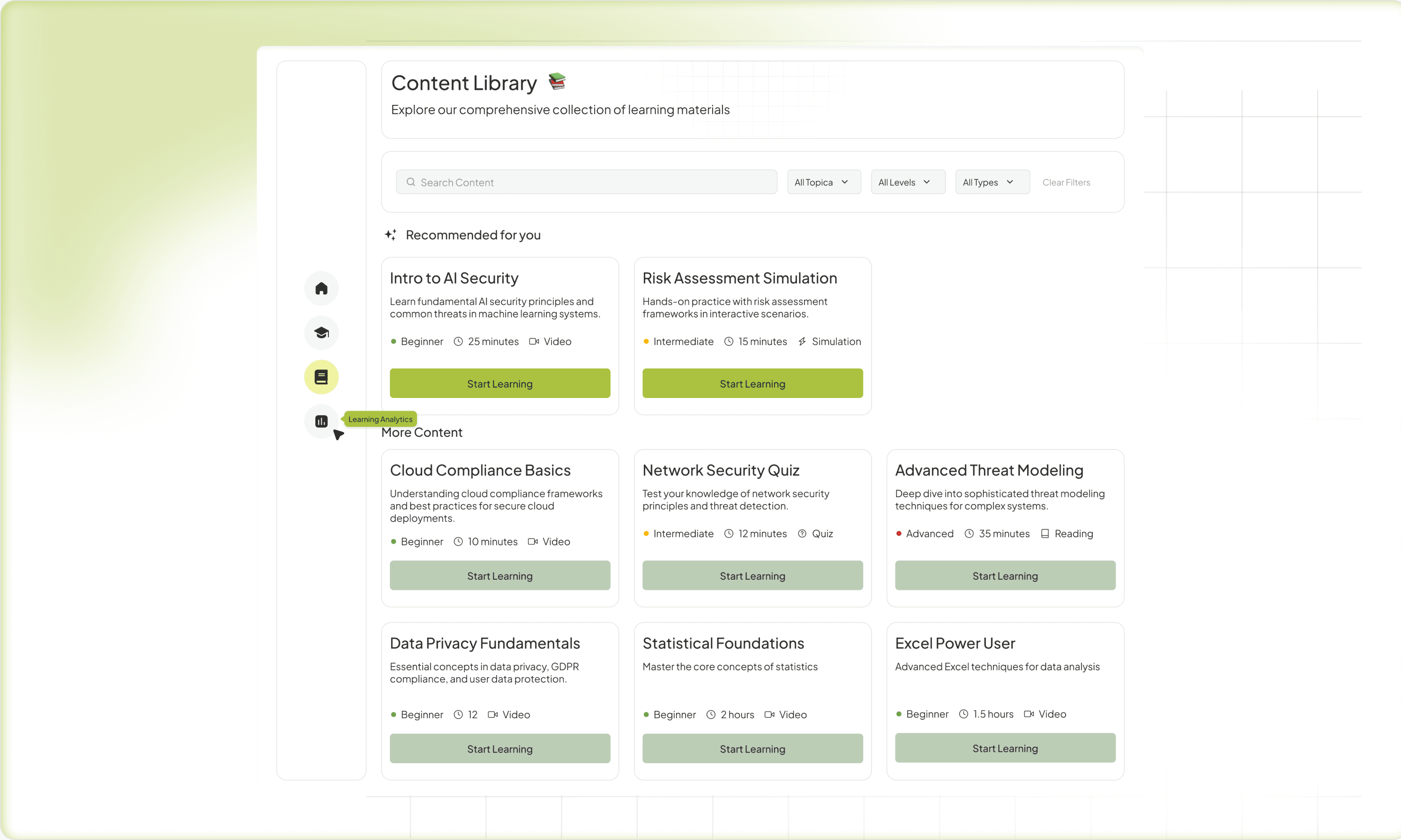
My starting point was understanding who we were designing for. The platform targets young professionals balancing work, study, and limited time — primarily Gen Z and Millennials, whose learning habits are radically different from traditional audiences. They seek short, interactive content, expect instant feedback, and prefer mobile-first experiences that feel intuitive and rewarding.
Research confirmed what we already sensed: • Over half of these learners use mobile devices as their main study tool. • They value clarity and visible progress — they want to know where they stand, what's next, and how close they are to mastery.
That insight became the backbone of the adaptive system and the visual language of progress across the platform.
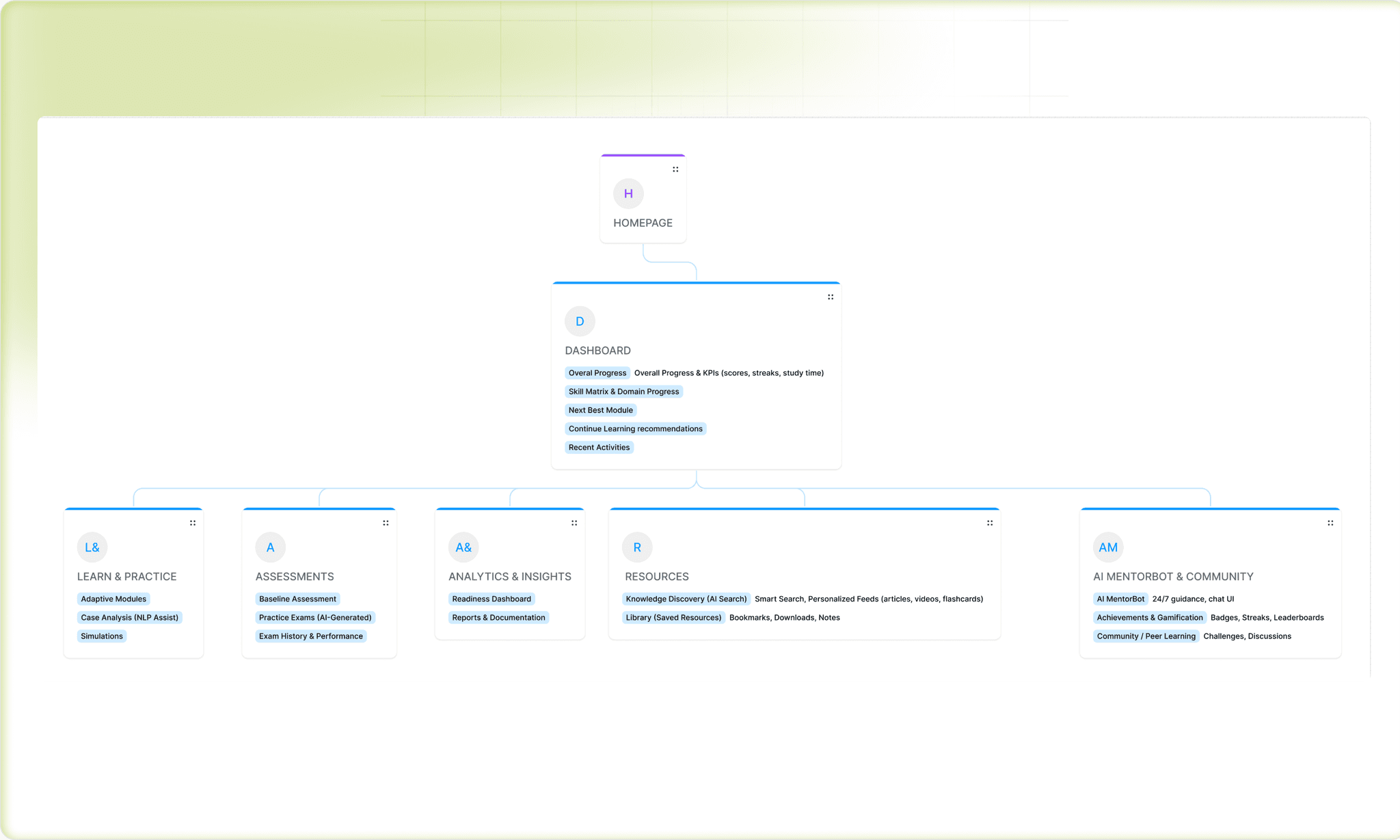
Designing the Experience: The Decisions That Mattered
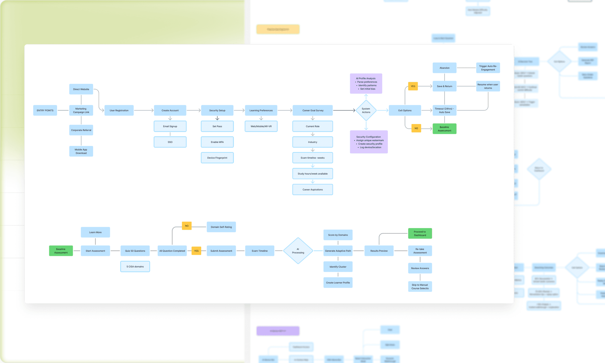
Smart Onboarding — Making the First 5 Minutes Count
Onboarding in most platforms is a formality. You set a username, pick a course, and suddenly you're inside a 40-module curriculum with no idea where to start.
I wanted our onboarding to feel like the first meaningful moment of the learning experience — not a registration form.
The approach was deliberately minimal at the surface but intelligent underneath. Two questions: What's your goal? and When do you plan to reach it? That's all the learner sees. But behind those two answers, the AI already has enough to start shaping a personalized schedule, set a study cadence, and calibrate expectations.
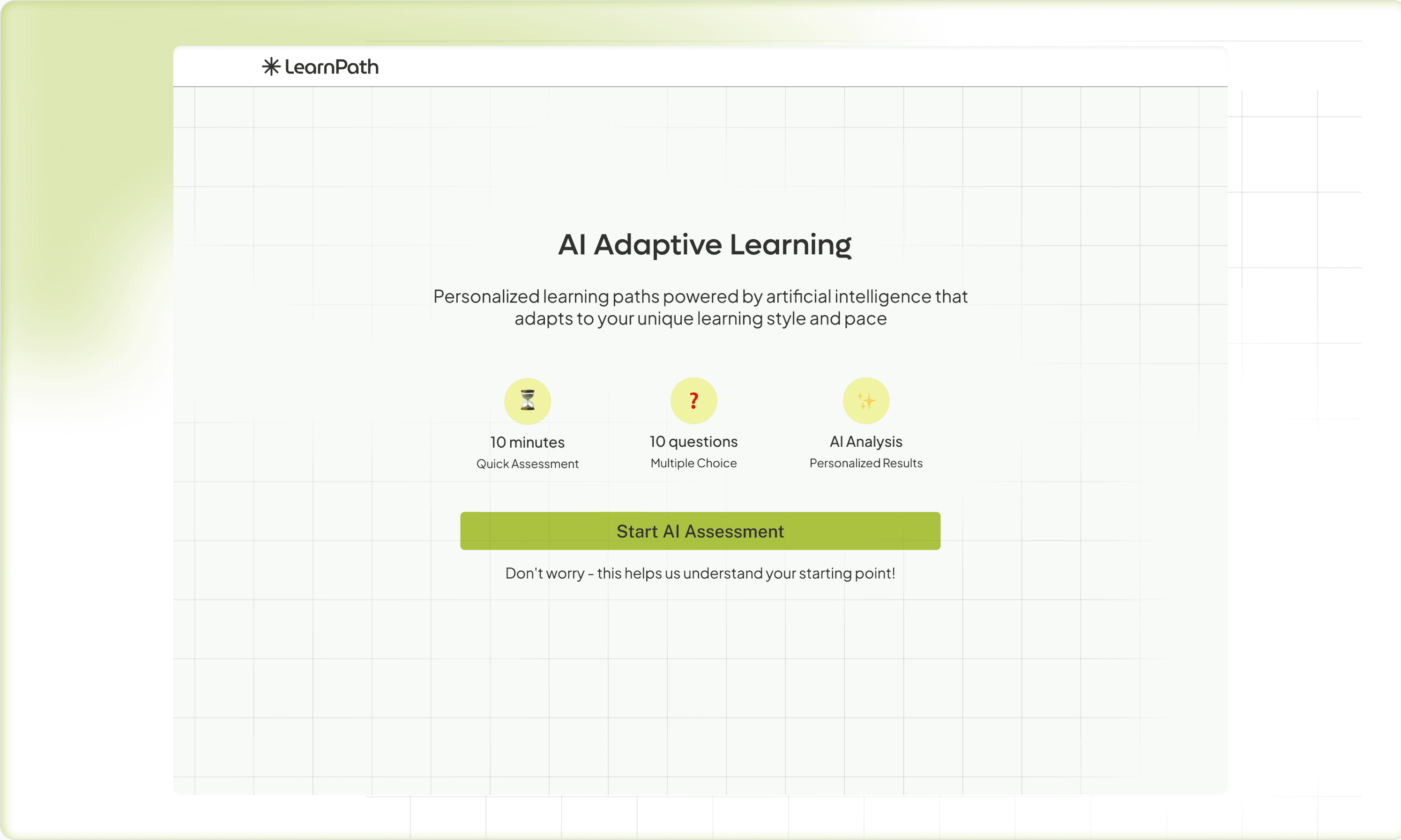
Then comes the baseline assessment — a short knowledge check across the core domains of their target certification. This wasn't busywork. The data from this moment powers the entire adaptive logic: where to start them, what to reinforce early, and which modules they can move through quickly. I designed this to feel more like a diagnostic conversation than a test — low stakes visually, high value functionally.
The design principle here: front-load intelligence, not complexity. The learner should feel welcomed and understood, not interrogated.
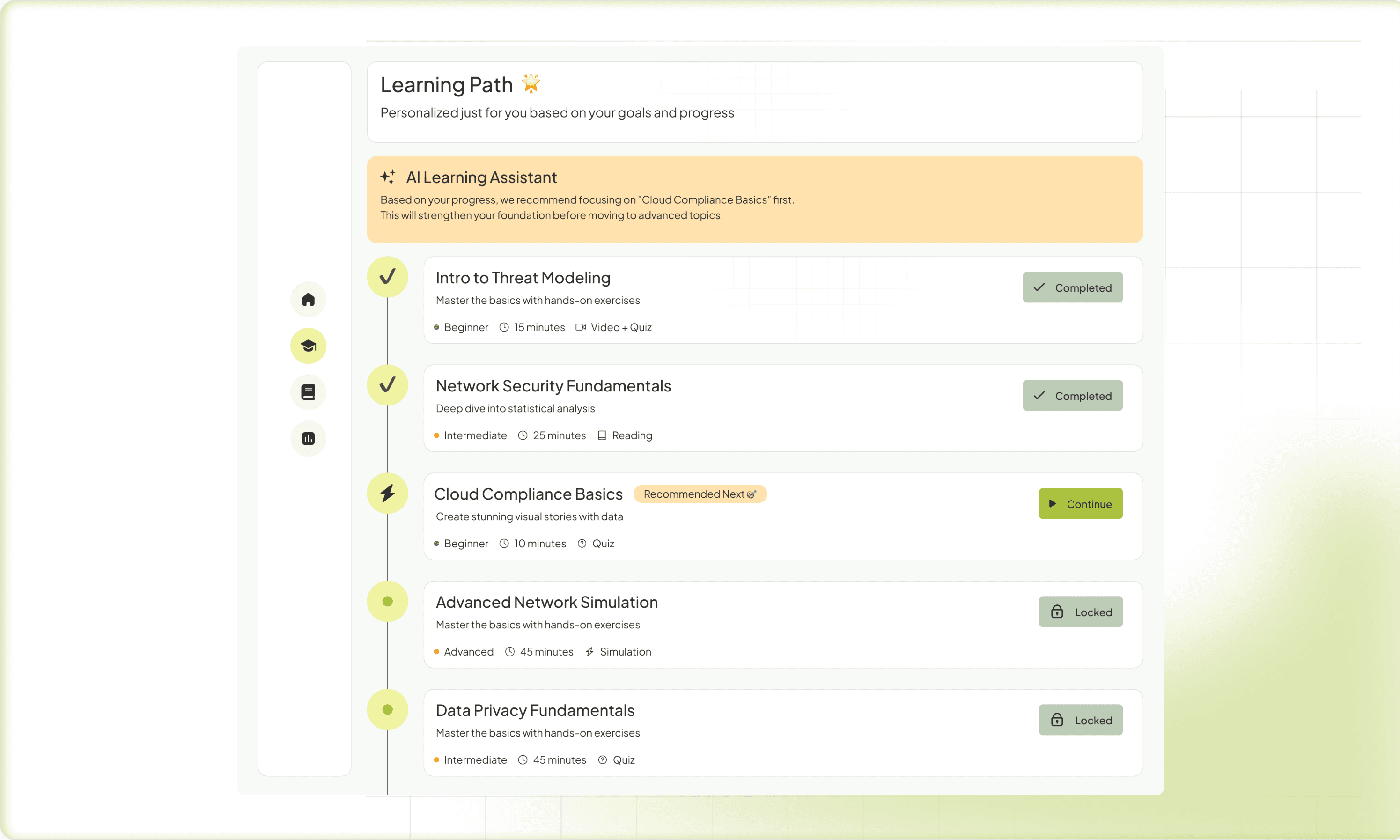
The Adaptive Path — Making AI Visible
The hardest UX problem in adaptive systems is trust. If the platform silently changes what you're learning and you don't understand why, it feels arbitrary and unsettling. Learners need to see and understand the logic — this module was prioritized because your assessment showed a gap here.
I worked hard on making the adaptive roadmap legible. The visual metaphor we settled on was a living path — not a locked linear list, but a dynamic structure where upcoming modules clearly responded to performance in previous ones. Think of it as a GPS that reroutes as you drive, but shows you the new route instead of just changing it silently.
This was also a direct response to one of the biggest complaints I saw in research about adaptive platforms: black-box syndrome. Learners disengage when they feel the system is doing something to them rather than with them. Transparency about the AI's reasoning wasn't just good UX — it was essential for maintaining learner agency and motivation.
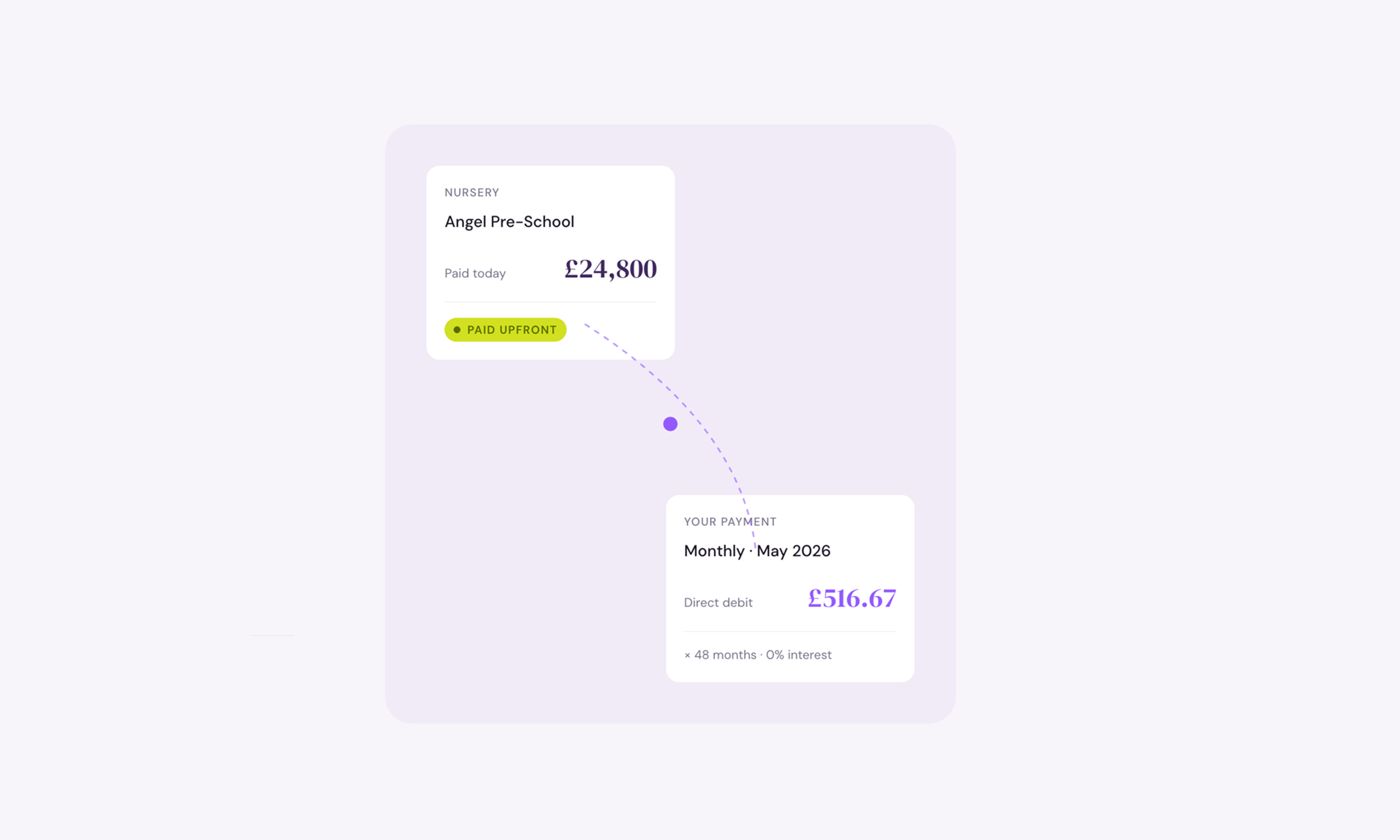
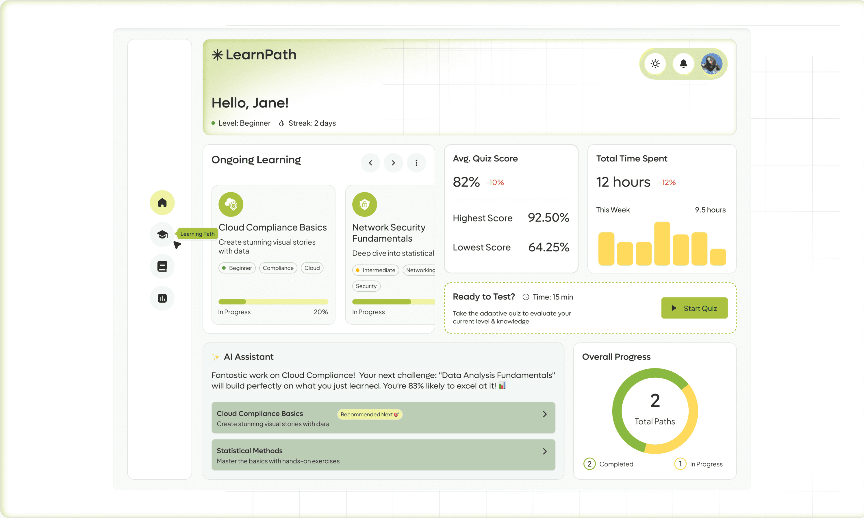
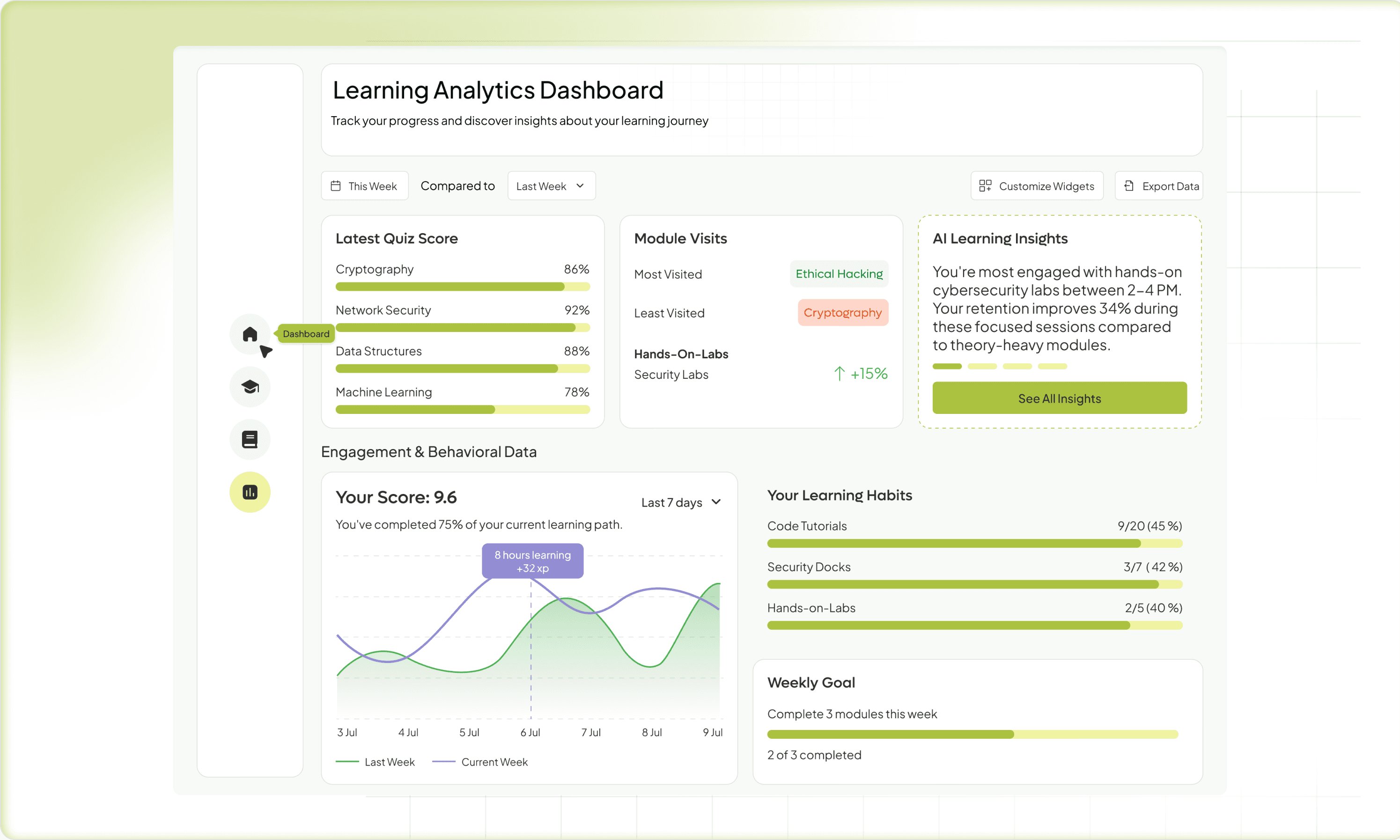
The Motivation Dashboard — Progress as a Design Element
There's a meaningful difference between a dashboard that shows your data and a dashboard that makes you feel something about your data.
Most LMS dashboards are reporting tools — completion percentages, time logged, quiz scores. Useful for the L&D manager. Not particularly motivating for the learner.
I designed the dashboard around readiness rather than completion. The distinction matters psychologically. Completion is backward-looking — you're measuring how much of the course you've consumed. Readiness is forward-looking — it's a live estimate of how prepared you are to succeed at the actual exam or task. That framing shifts the emotional experience entirely.
I drew heavily from how health apps like Oura or Whoop present personal metrics — not as raw numbers, but as interpreted signals that push you toward action. Your weak area is Domain 3 — here's a 12-minute session that targets it. Small wins, visible momentum, a sense that today's effort matters.
MentorBot — The AI That Doesn't Feel Like a Chatbot
The AI assistant was one of the features I was most careful about. Chatbots have earned their bad reputation — they're either useless or uncanny, and learners are quick to abandon them.
The design intent for MentorBot was specificity. It doesn't answer generic questions — it knows which module you're in, what you got wrong in your last quiz, and what your study history looks like. The interaction design focused on proactive nudges over reactive Q&A. Instead of waiting to be asked, MentorBot surfaces at the right moment: after a difficult quiz, before a long gap in study activity, when a learner is about to enter their toughest domain.
The language and tone design was deliberate — warm and direct, never corporate, never over-explaining. The aim was to feel like a knowledgeable study partner, not a help desk.
Outcome
What Prototyping Taught Me
Usability testing across low-fidelity prototypes surfaced two critical insights. Learners struggled to understand why content was changing — even when the adaptive logic worked correctly, users felt uncertain. This pushed me to add contextual cues like "Recommended based on your quiz performance" that explained the AI's reasoning in the moment. The baseline assessment was equally make-or-break: if it felt too long or clinical, users disengaged before the experience began. We iterated three times — cutting from 20 questions to 12, rewriting the framing, and adding a progress indicator — until beta users described it as "finally a study experience that feels alive and personal."
What This Project Taught Me as a Designer
Designing for motivation proved as complex as designing for information architecture — it draws from behavioral psychology, game design, and emotional storytelling, not just classic UX. The bigger lesson was about AI transparency: hiding the machine felt seamless in theory, but in an adaptive learning context, making the AI's decisions legible was the difference between a platform people trusted and one they abandoned. That principle, paired with the reality that Gen Z employees simply won't tolerate enterprise tools that feel like a step backward from the apps they live in, shaped every decision I made on this project.