Role
Product Designer (freelance, end-to-end): UX research, IA, interaction design, front-end prototype
Tools
Figma, Claude (AI-assisted prototyping), React
Timeline
Solo project, single sprint
Overview
A sports-data company needed a back-office tool for sportsbook operators: the people who create matches, set odds, and decide what players see. Operators aren't the end customer here; they're the ones running the machine behind the scenes. Nobody had designed for them yet.
I took this from a two-page written brief to a fully interactive, WCAG-conscious prototype: eight tools in one console, two core workflows with real business-logic constraints, a working light/dark design system, and a UX process I can actually defend in a design review — not just screens that look finished.
You can check Linedesk live on: https://linedesk.vercel.app/
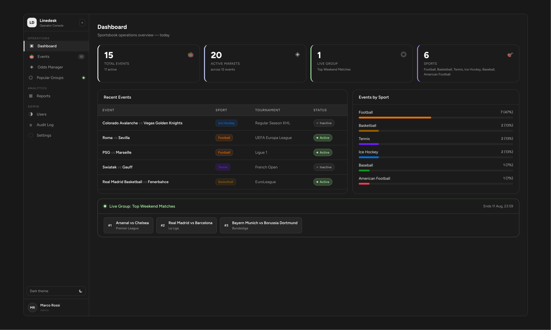
Linedesk's Dashboard - the operator's first screen of the day. Live event count, active markets, the currently-promoted group, and sport coverage at a glance.
The Problem
Sportsbook operators were working blind. Creating an event meant navigating a rigid hierarchy - sport, country, tournament, teams — with no system stopping them from selecting a football team for a tennis match, or activating two "featured" promotions at once when the business rule said only one could ever be live. The brief was explicit about this constraint, but a written rule and a rule the interface itself enforces are two very different things.
The real design problem wasn't "make it look nice." It was: can the interface make invalid states impossible, instead of just telling operators after the fact that they made a mistake?
Understanding the Domain First
Before any wireframe, I mapped the actual data hierarchy the brief described. This diagram is the foundation everything else was built on — every cascading dropdown and disabled field in the final product is a direct translation of this structure.
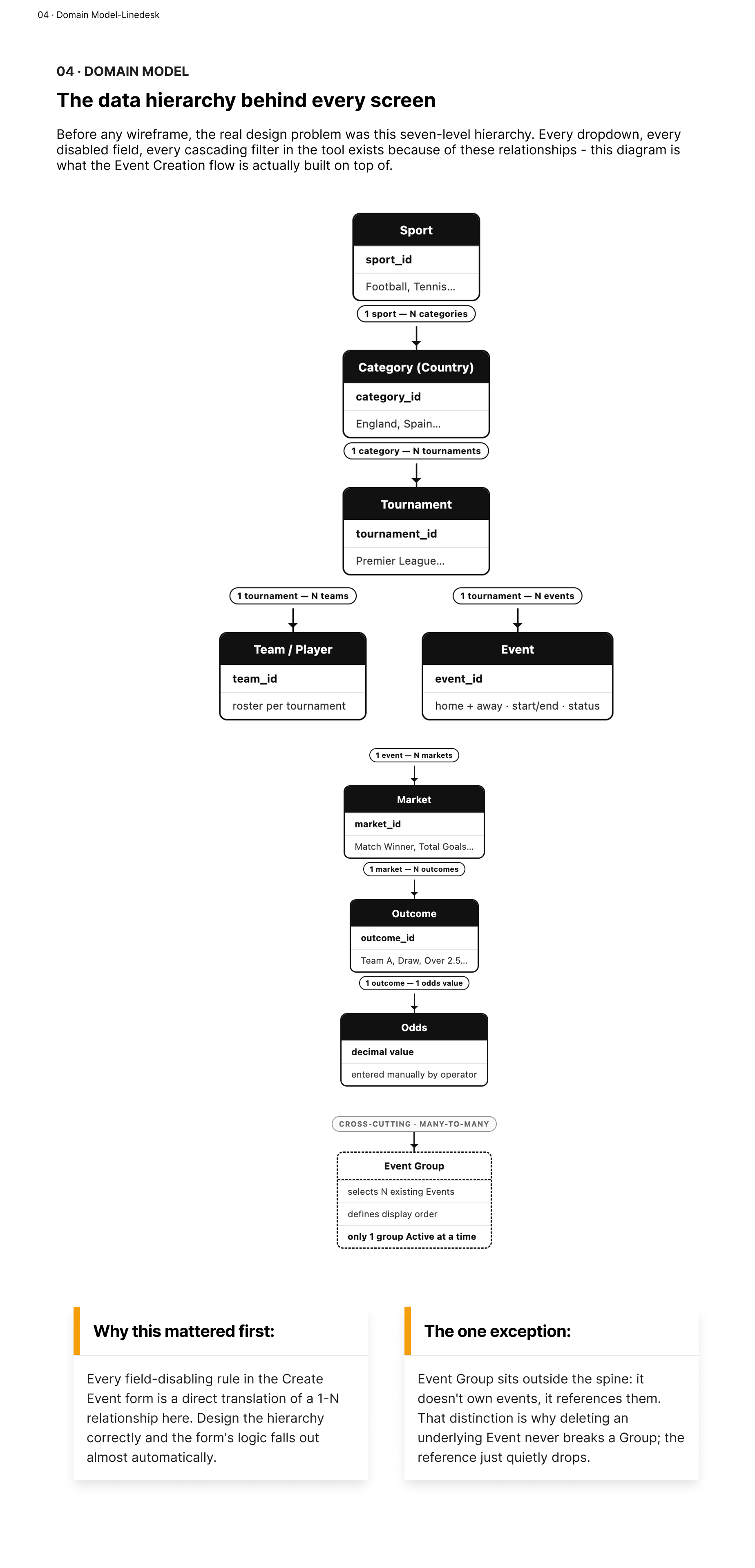
The seven-level domain hierarchy: Sport → Category → Tournament → Team/Event → Market → Outcome → Odds - with Event Groups deliberately modeled outside the main spine, since they reference events rather than own them.
That last detail mattered more than it looks: because a Group only references events instead of owning them, deleting an Event later never breaks a Group - it just quietly drops from the list. That's not an accident; it's a consequence of getting the model right early.
Structuring the Information Architecture
Operators think in three modes across a day: running today's operations, checking how things are performing, and administering the system. I grouped the eight tools by that mental model instead of by how the database happened to be organized.
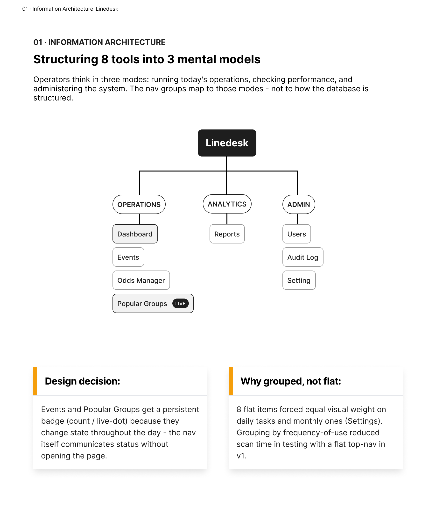
Three nav groups: Operations, Analytics, Admin - replacing a flat 8-item top bar that gave equal visual weight to daily tasks and once-a-month settings.
This is also where the UI shape itself changed. My first pass used a top navigation bar; once the tool grew past five sections, that stopped working - everything competed for the same strip of space. I moved to a collapsible sidebar that pins open with full labels or collapses to an icon rail, expanding again on hover.
Core Flow 1 - Event Creation
This was the hardest constraint in the brief: Sport → Category → Tournament → Teams isn't just a form, it's a dependency chain. Each level's valid options depend entirely on the level above it, and Markets only make sense once a Sport is known.
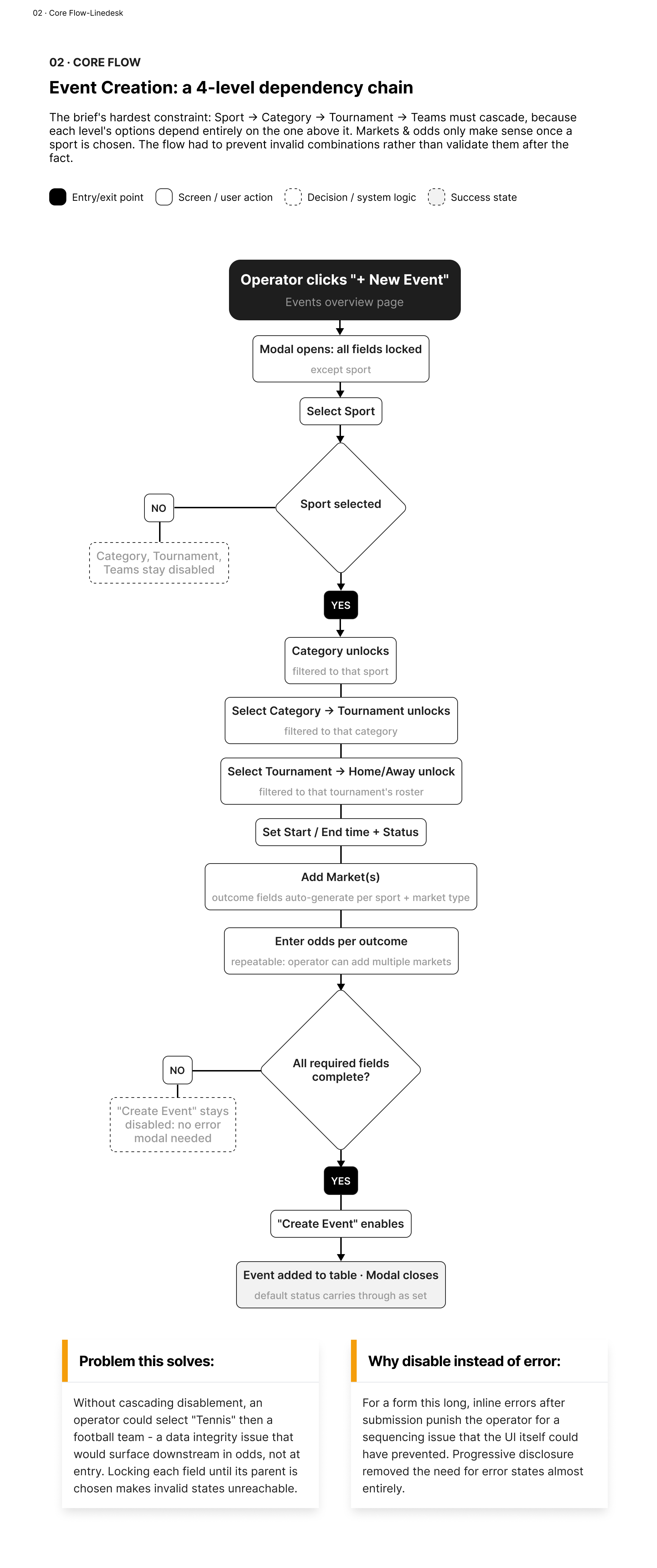
The Event Creation flow, mapped as a decision tree. Each field stays locked until its parent is chosen - invalid combinations aren't caught after submission, they're structurally impossible to reach.
The design decision behind this: disable instead of error. For a form this long, showing validation errors after the fact punishes the operator for a sequencing problem the interface could have prevented in the first place. Progressive disclosure removed the need for most error states entirely.
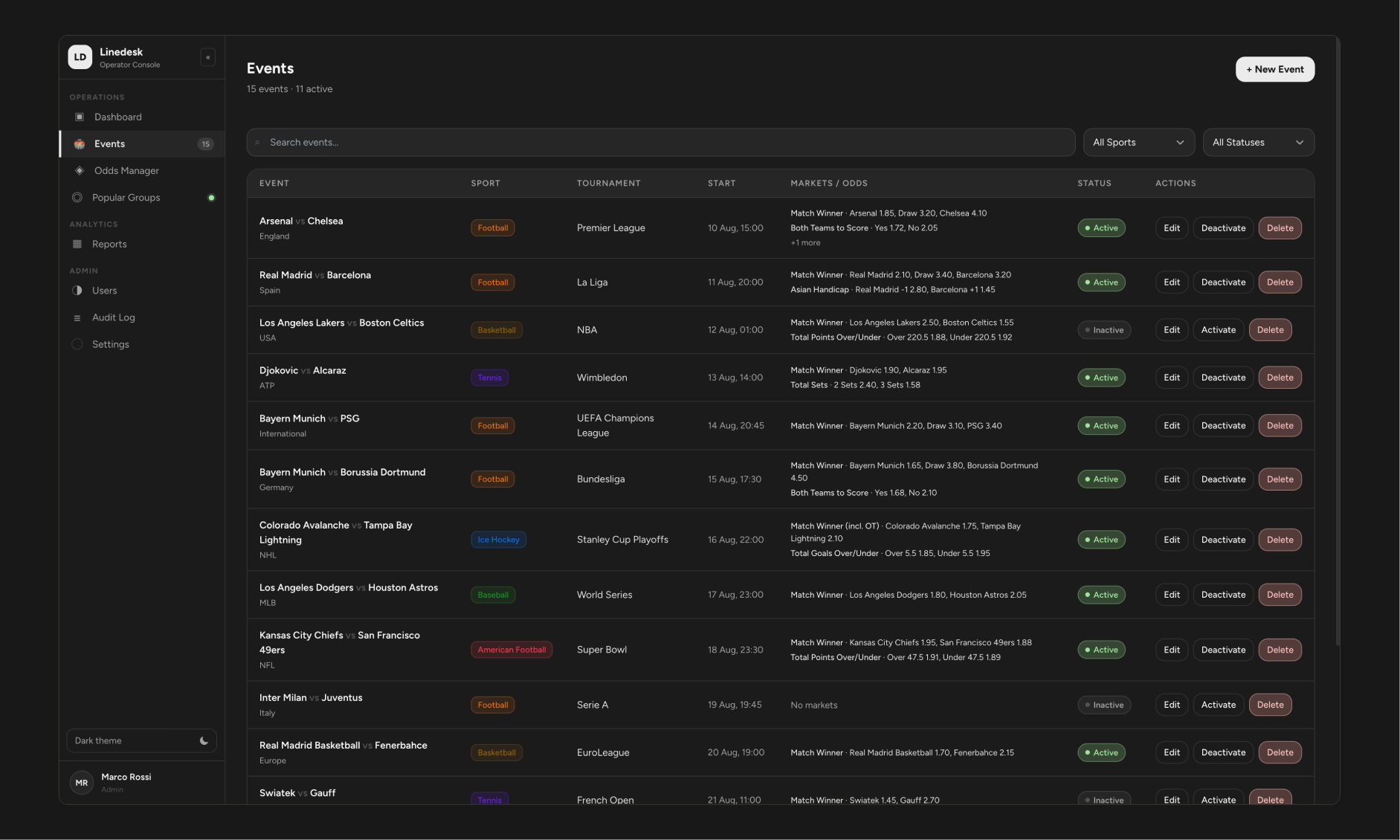
The Events overview: searchable, filterable by sport and status, with odds visible directly in the table so operators don't need to open every row to check pricing.
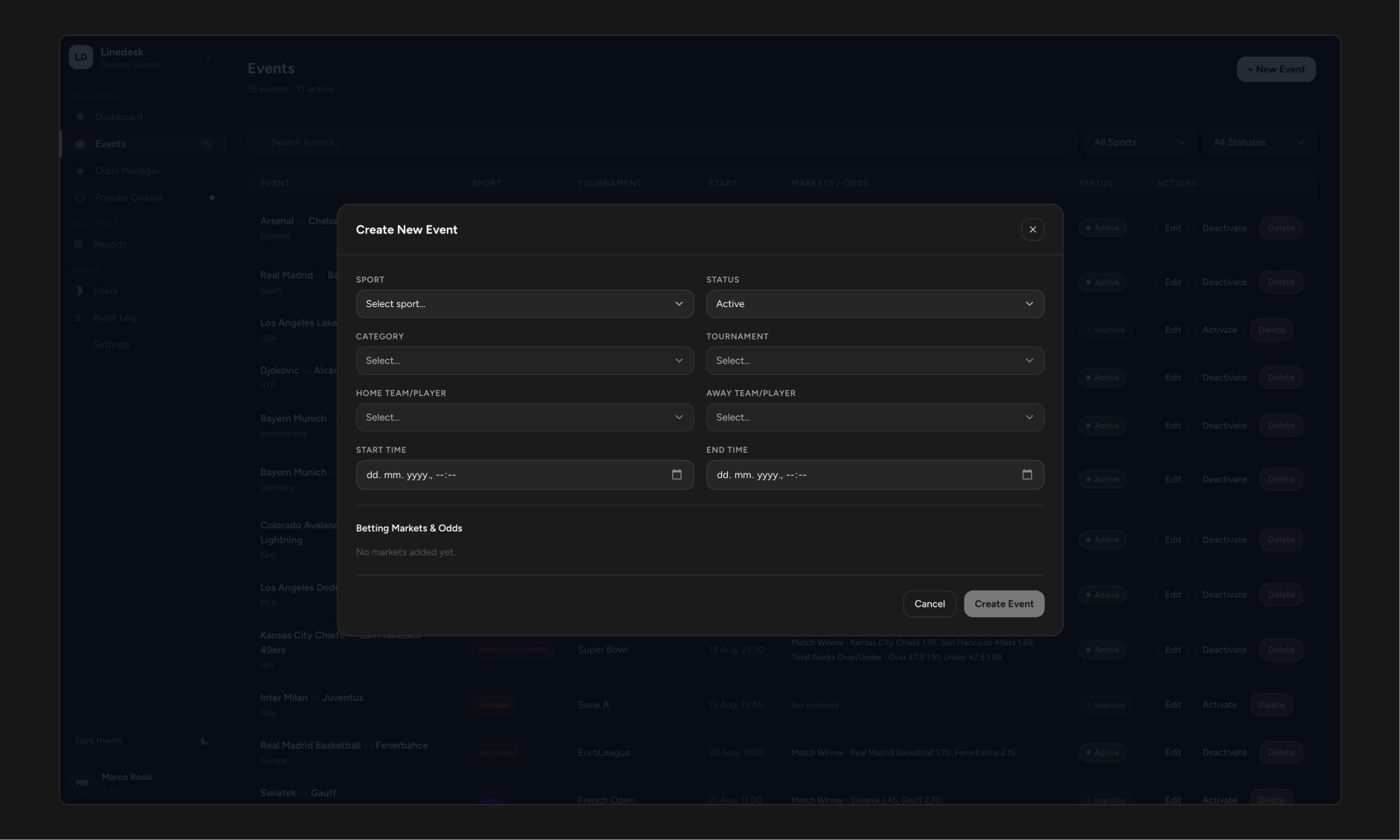
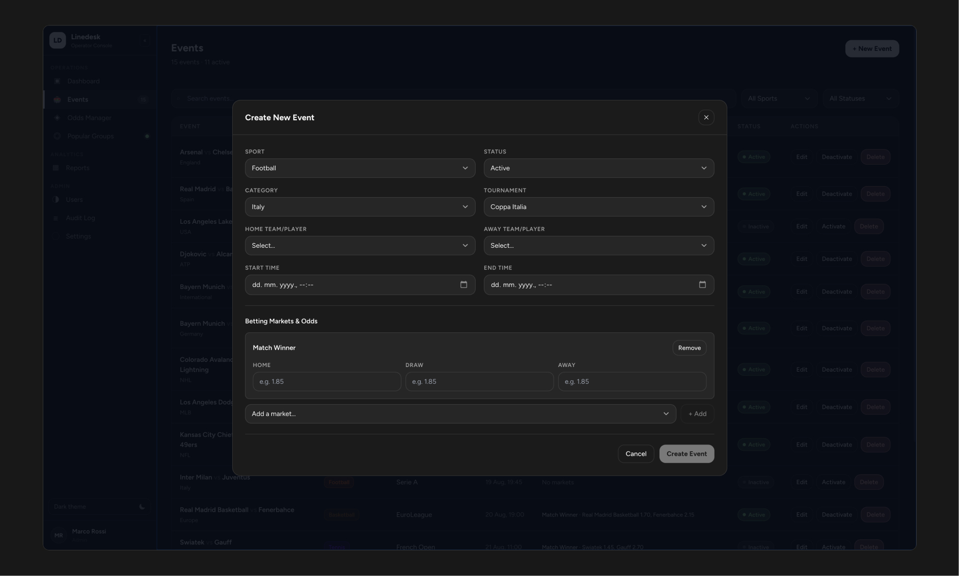
Create Event: every field locked except Sport. Nothing downstream is selectable until its parent exists.
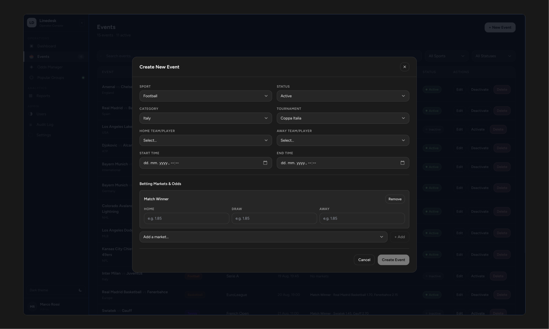
The same form after Sport → Category → Tournament → Teams have cascaded through - markets and odds only appear once the match itself is fully defined.
Core Flow 2 - Promoting Popular Groups
The brief stated a hard business rule: only one Event Group can be Active at any time. The easy version of this feature blocks the operator with an error when they violate the rule. I wanted the interface to surface the consequence before they commit, so activating one group is understood as replacing another - not failing silently and not being blocked outright.
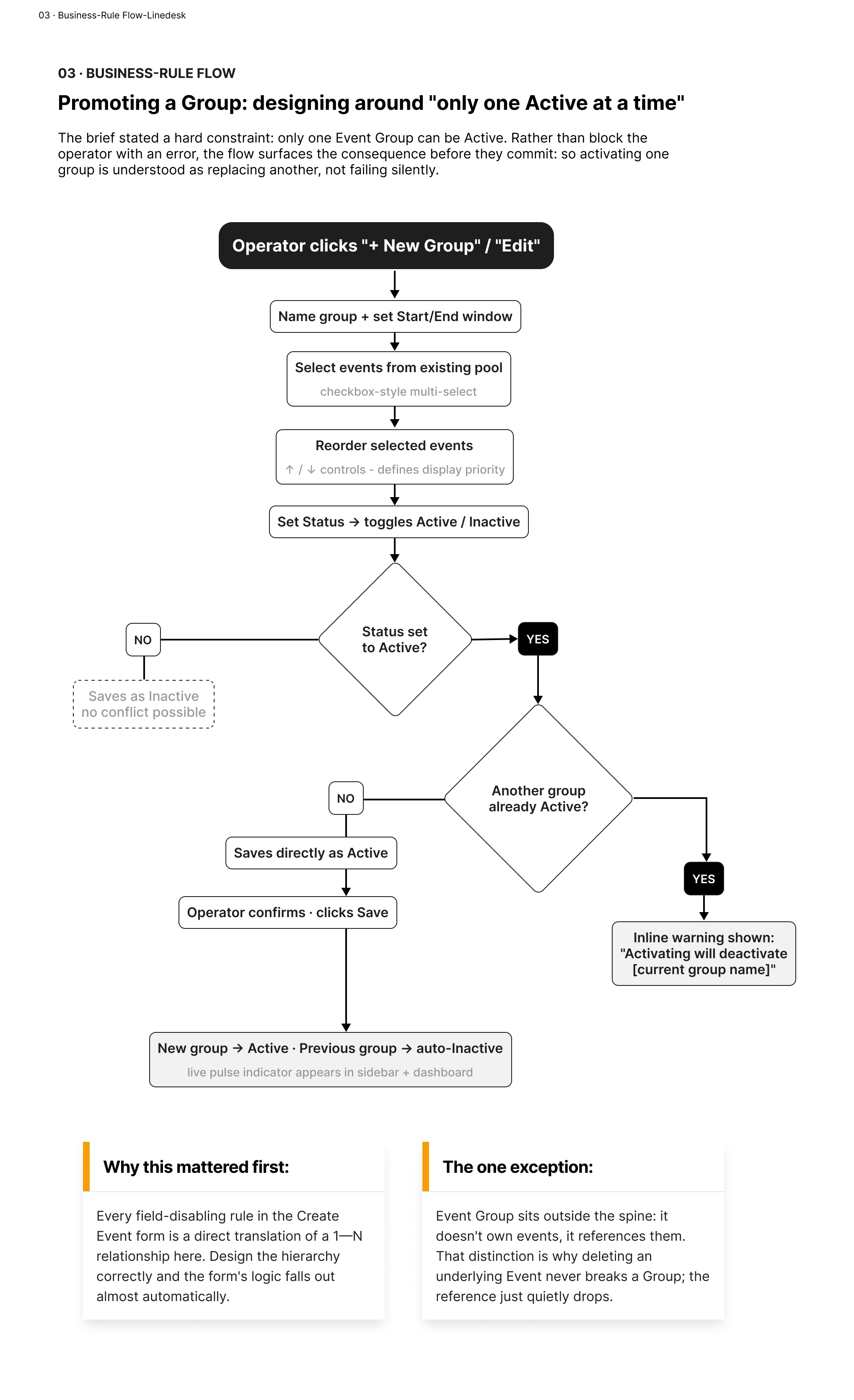
The Promote Group flow. The system checks for a conflicting Active group before save, and shows exactly what will be deactivated - never a silent overwrite, never a hard block.
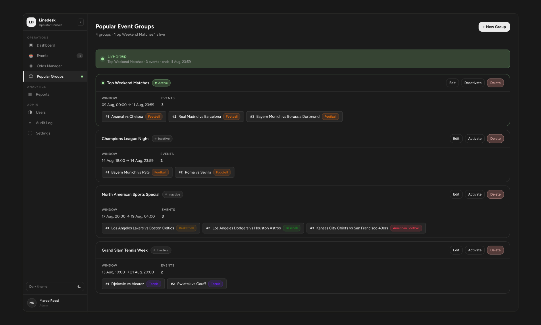
Popular Groups overview. A live pulse indicator marks whichever group is currently promoted to players - visible here, and ambiently visible from the sidebar and Dashboard too.
Creating a Group - operators pick from existing events, then set the display order operators want players to see.
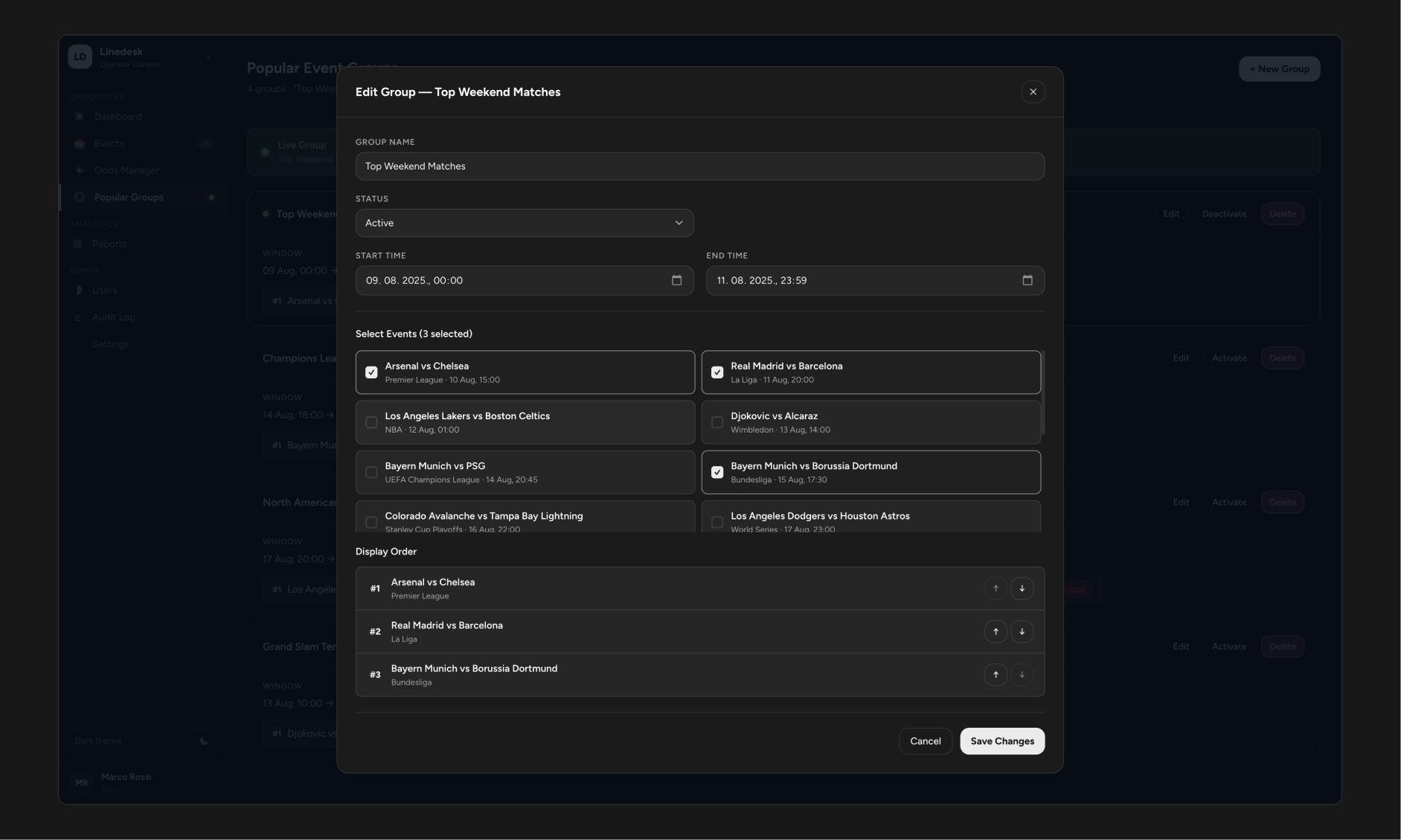
Editing a live Group. Status, event selection, and reordering all live in one view - no separate "reorder mode" to switch into.
Supporting the Full Operation
Event creation and promotion are the two flows the brief was built around, but a working back office needs more than its headline features. I extended the system with the supporting tools a real deployment would need - deliberately scoped as a coherent set, not a features list.
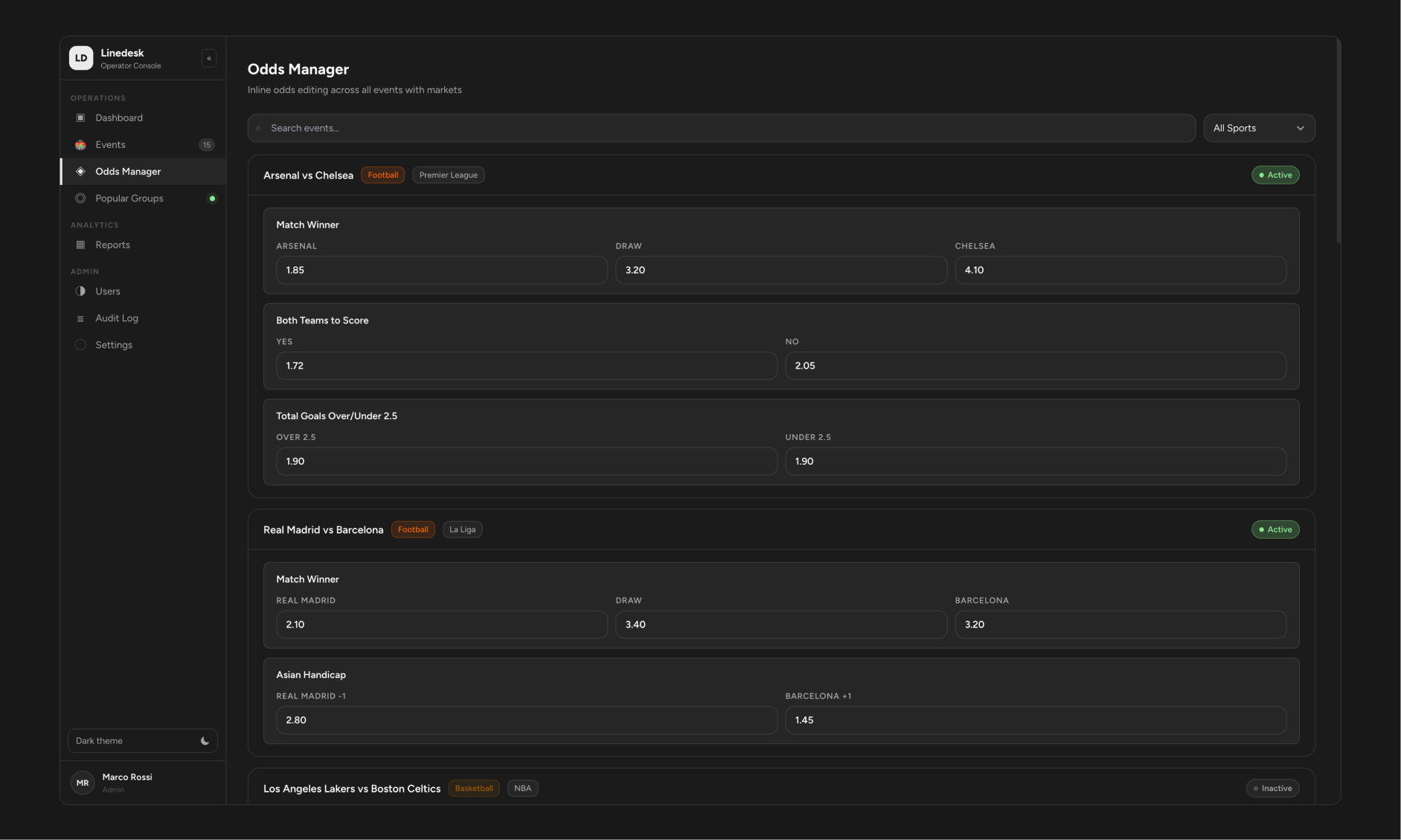
Odds Manager - a dedicated view for adjusting prices fast, separate from the full Event Editor. Dirty fields get an amber border and an explicit "Save Odds" action, so nothing saves by accident mid-edit.
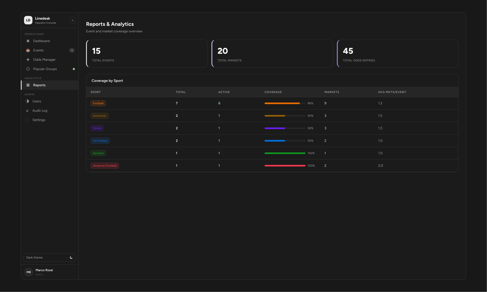
Reports - coverage by sport, with active-event percentage and average markets per event, giving operators a read on where attention is thin.
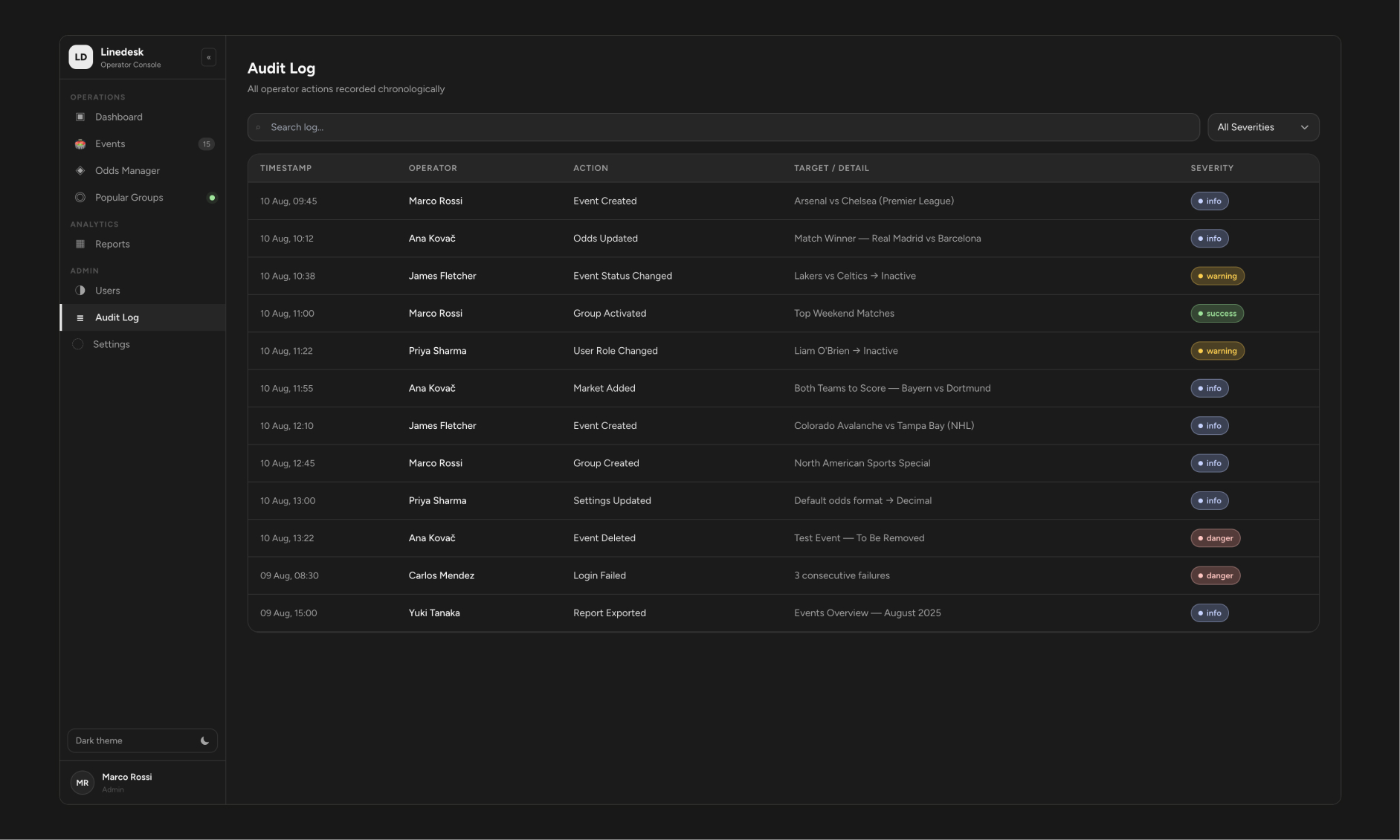
Audit Log - every operator action recorded with severity levels, because a tool that changes what players see needs a paper trail.
Access & Permissions
Rather than build separate views per role, Linedesk uses one shared interface where permissions gate actions, not pages. A Viewer sees exactly the same table an Admin does - just without buttons they can't use.
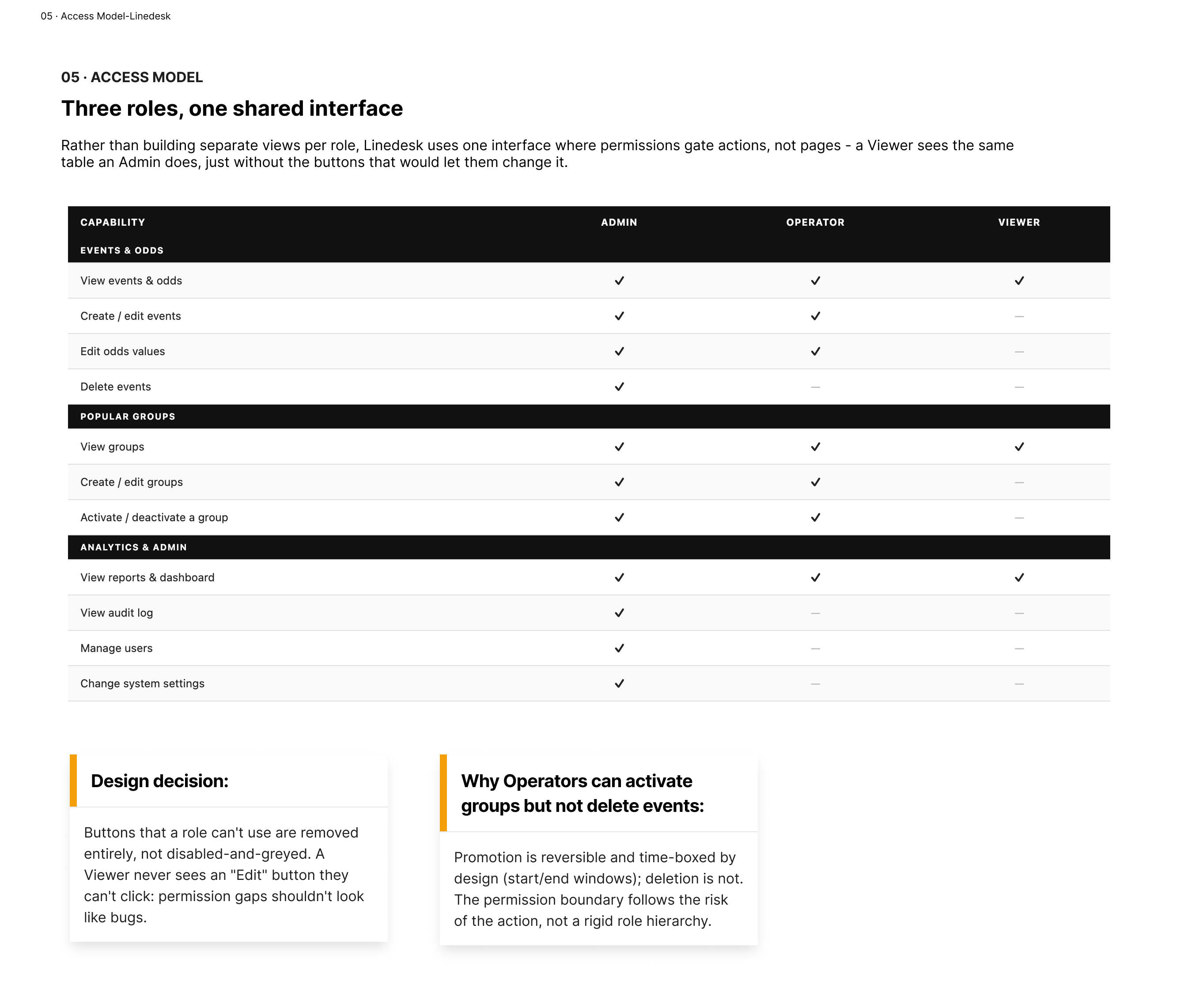
Admin / Operator / Viewer permissions across eleven capabilities. The boundary follows the risk of the action, not a rigid hierarchy - Operators can activate a group (reversible, time-boxed) but can't delete an event (not reversible).
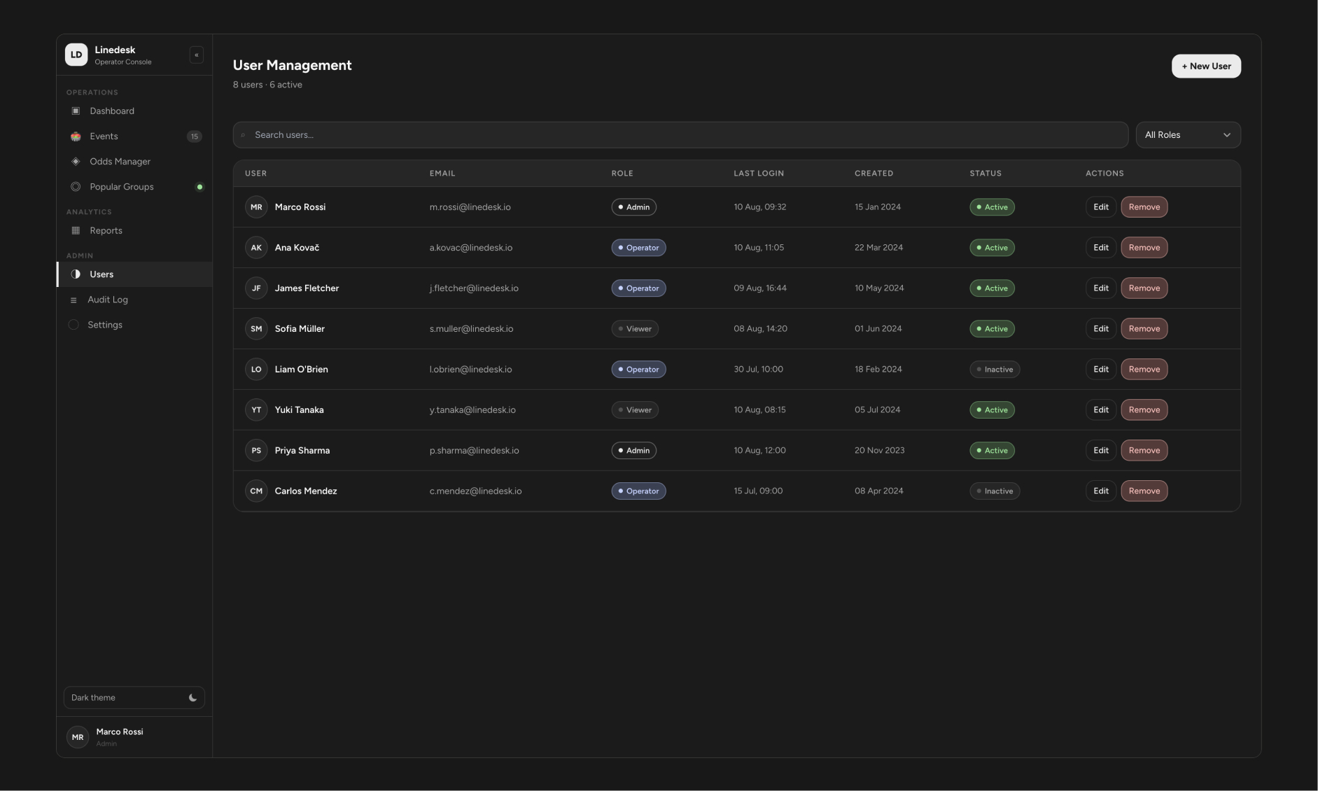
User Management - role and status at a glance, with initials avatars standing in for a future profile-photo system.
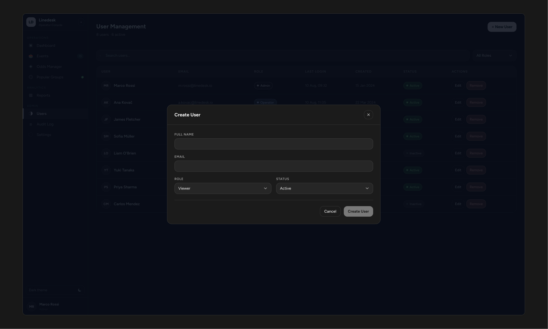
Create User - a deliberately short form. Role and status are the only decisions that matter here.
Designing for Trust - Accessibility & Design System
A back-office tool lives or dies on whether the person using it eight hours a day trusts what they're looking at. Two decisions mattered most here.
Accessibility wasn't a pass at the end. An early version used a red accent that failed contrast checks against the dark background. I replaced it with a warm amber (8.2:1 contrast, AAA-level) and audited every text color against its background - reclassifying anything that was carrying real information (odds values, category labels) out of the "disabled text" tier it had incorrectly been placed in.
The design system is real, not decorative. Linedesk's visual language now runs on Meta's Astryx design system (Neutral theme), using its actual published token architecture - semantic color names, a documented radius and spacing scale, and light/dark tokens wired through a proper theme context rather than hardcoded values. That's what makes the next screenshot possible: a full light/dark toggle that isn't just a filter over the same screen.
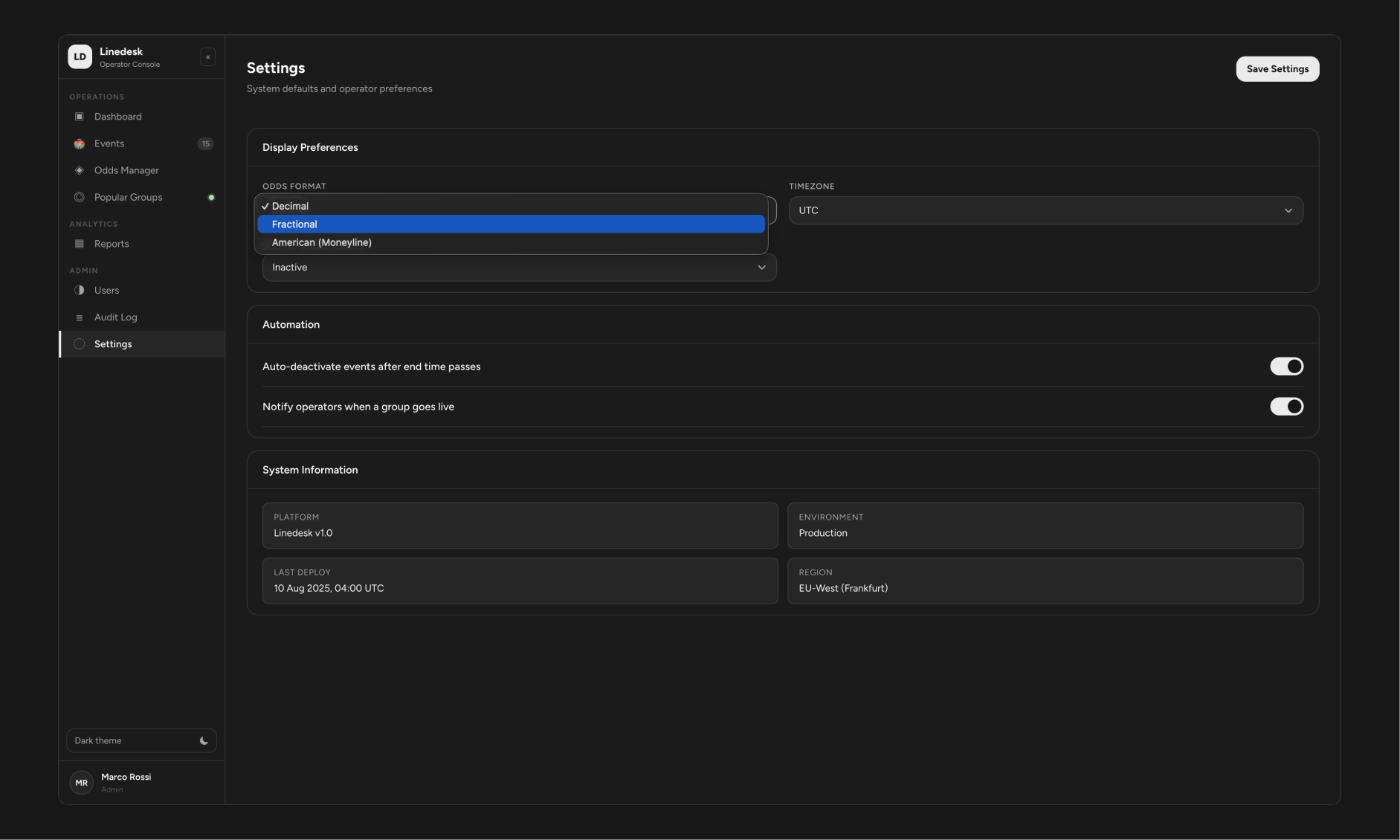
Settings - odds format, timezone, and automation preferences, plus the system-info panel operators would need for support tickets.
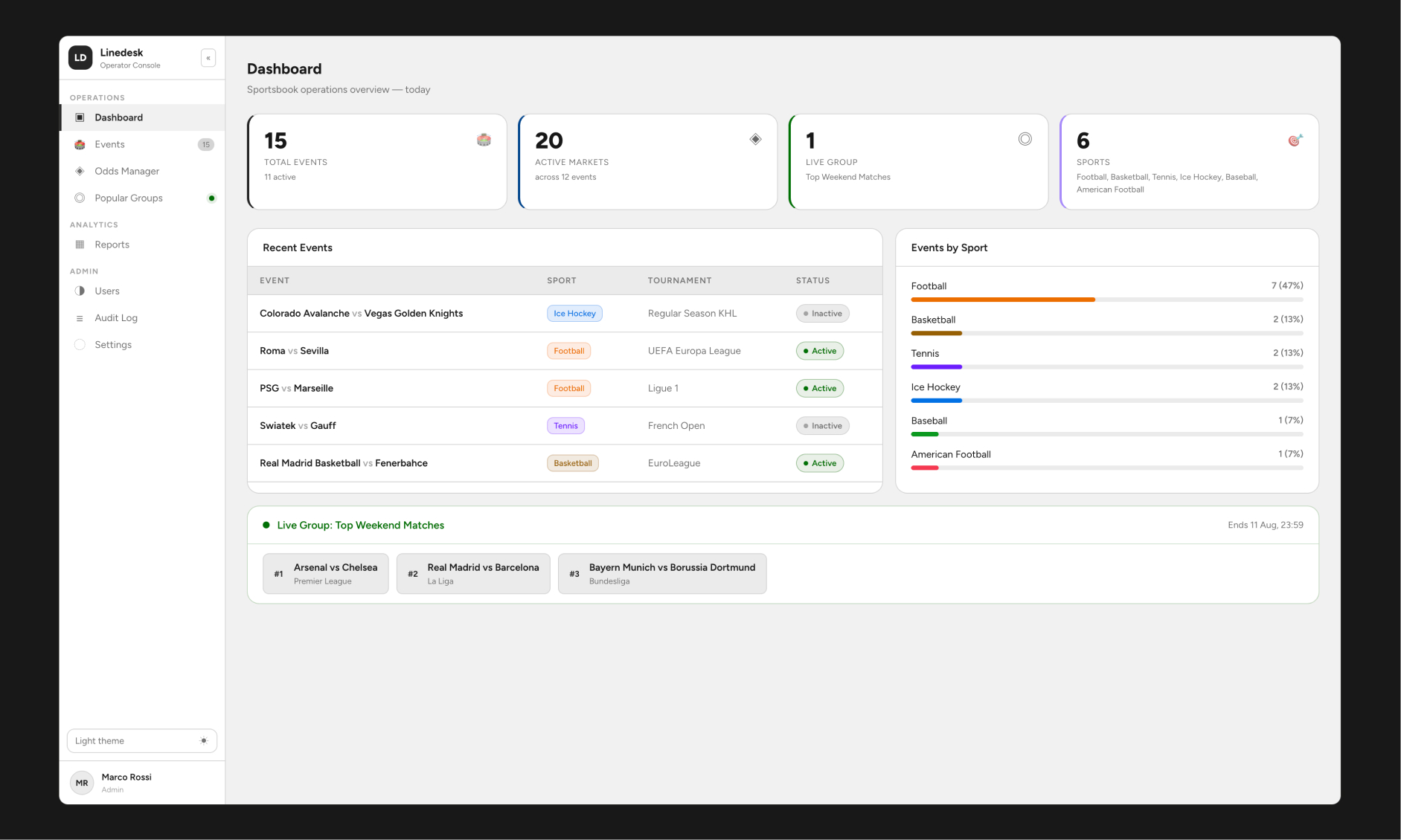
The same Dashboard in light mode. Every token - background, text, accent, status colors - swaps through one context, not a manual re-skin.
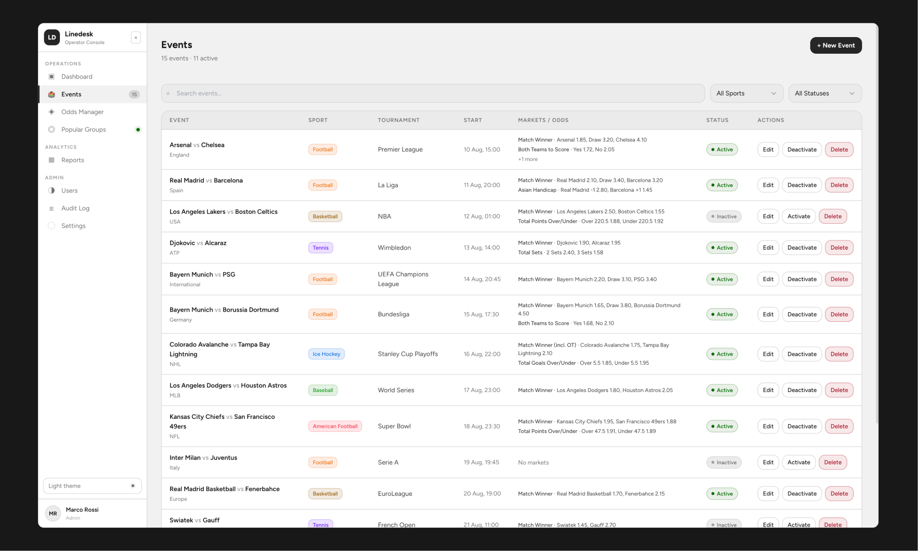
Events in light mode, confirming the custom select-chevron and calendar-icon fixes (built to solve a real inconsistent-icon bug) hold up in both themes.
What Happens When Things Aren't Ideal
A back-office tool is judged by its edge cases more than its happy path - operators hit these states daily, not occasionally. I mapped them early rather than discovering them after the prototype was "done."
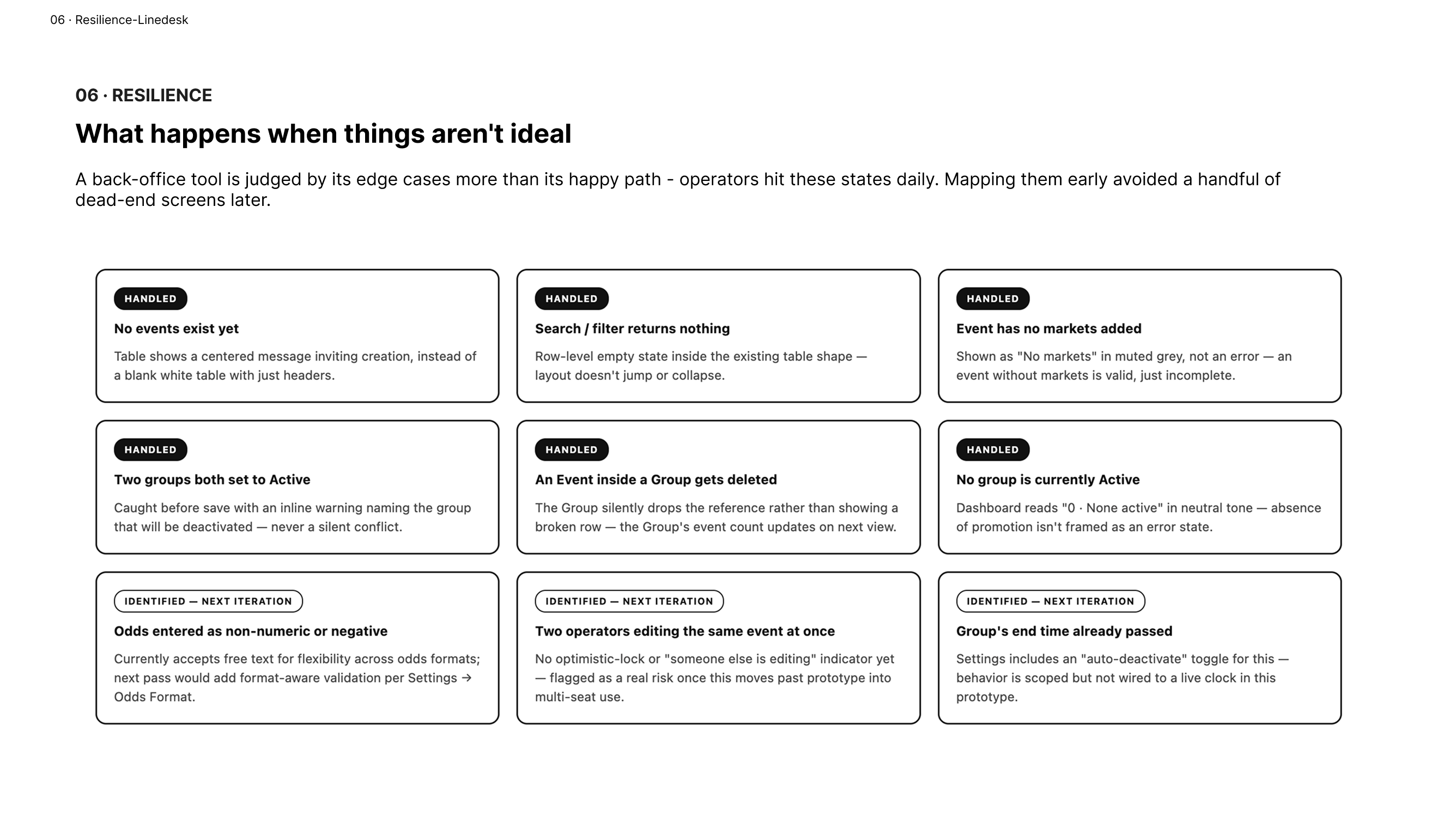
Nine edge cases, honestly split between what's actually handled in this prototype (empty states, group conflicts, orphaned event references) and what's identified but scoped for a next iteration (odds format validation, concurrent editing, auto-deactivation timing).
That second category matters as much as the first. A case study that only shows solved problems reads as staged; naming what's not solved yet is what makes the solved parts credible.
The Operator's Day
To pressure-test the design against something more real than a features list, I mapped a full match-day from an operator's chair - building fixtures in the morning, adjusting odds pre-match, promoting the headline game, monitoring live, and closing out afterward.
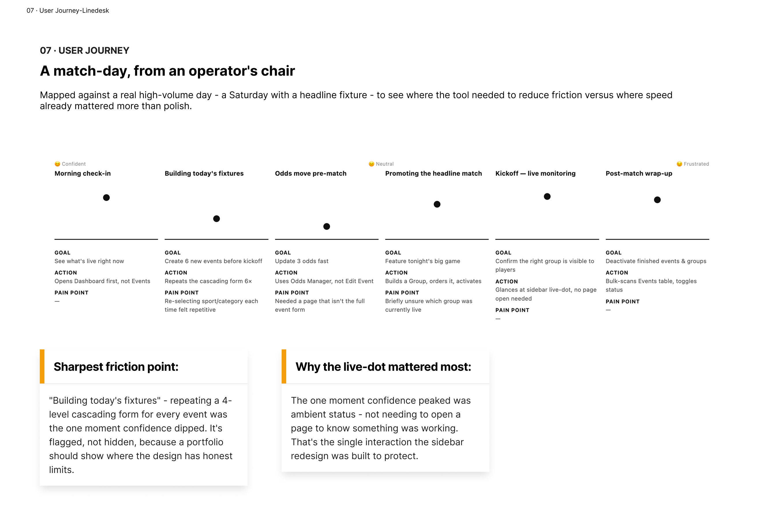
A Saturday match-day, mapped stage by stage with an emotion track. The one deliberate confidence peak: the sidebar's live-dot, which means never needing to open a page to confirm something is working. The one honest dip: repeating the four-level cascading form six times in a row before kickoff.
That dip is flagged, not hidden. It's the clearest opportunity for a "duplicate event" or "quick-create" pattern in a future iteration - a real finding, not a manufactured one.
Case Study Archived
Lorem ipsum dolor sit amet, consectetur adipiscing elit. Sed do eiusmod tempor incididunt ut labore et dolore magna aliqua. Ut enim ad minim veniam, quis nostrud exercitation ullamco laboris nisi ut aliquip ex ea commodo consequat. Duis aute irure dolor in reprehenderit in voluptate velit esse cillum dolore eu fugiat nulla pariatur.
Phasellus euismod nisl eget ultricies tincidunt. Nunc nisl aliquam nisl, nec aliquam nisl nisl sit amet nisl. Sed euismod nisl eget ultricies tincidunt, nunc nisl aliquam nisl, nec aliquam nisl nisl sit amet nisl.
Outcome
What Shipped
· A fully interactive prototype - 8 tools, real state, no dead-end screens
· Two core workflows with actual business-rule enforcement built into the interaction, not bolted on as validation
· A WCAG-audited color system (AAA contrast on all informational text)
· A working design system built on Meta's Astryx (Neutral theme) with a functioning light/dark toggle
· A documented UX process: domain model, IA, two decision-tree flows, a permissions matrix, an edge-case map, and a journey map - the artifacts in this case study are the actual working documents, not a reconstruction for the portfolio
Reflection
The hardest part of this project wasn't any single screen - it was resisting the urge to design the interface before understanding the hierarchy underneath it. Every cascading dropdown, every disabled field, every "only one Active" warning traces back to a diagram I drew before I opened Figma.
If I extended this further, the first thing I'd tackle is the repeated-form friction from the journey map - likely a "duplicate this event" action, since most of a fixture list's fields repeat within the same tournament. The second would be real-time collaboration handling, flagged in the edge-case map but not built: two operators editing the same event is a "when," not an "if," once this leaves prototype and reaches an actual multi-seat team.