Year
2023/2024
Team
1 Designer, 1 PM, 3 Engineers
Contribution
UX Design, Interaction Design, Prototyping
Overview
When I joined Rolla, there was no documentation, no design system applied to health, and the brief was essentially: "We want a health module. Make it good."
That's both the most exciting and most dangerous kind of brief you can get as a designer. Exciting because the canvas is blank. Dangerous because without constraints, you can easily build something technically impressive that nobody actually uses.
Health tech is a crowded space with a well-documented failure pattern: products that drown users in data while delivering zero behavioral change. I'd seen it across the market — Garmin's powerful-but-overwhelming dashboards, the endless graphs that look great in screenshots but confuse people in real life. The question I kept coming back to was: what actually makes someone care about their health metrics tomorrow, not just on day one?
That question became the lens for everything that followed.
Process
Understanding the Market (and What It Gets Wrong)
Before touching a wireframe, I spent weeks actually using the competition — Garmin, Fitbit, Oura, Withings — alongside a small group of colleagues and beta testers. The data fragmentation was real and irritating: steps from Garmin, sleep from Oura, weight from Withings, none of it talking to each other cleanly. Users were doing mental math across three apps just to understand their own day. That's not a technical failure — it's a product philosophy failure.
Fitbit got one thing right that others didn't: streaks and simple visual feedback work. People aren't motivated by raw HRV data; they're motivated by a ring that's almost full. Garmin, on the other hand, is a masterclass in what happens when you design for your most advanced 5% of users and ignore everyone else. I documented both as design constraints: whatever we built had to work for a first-time tracker and someone who checks their recovery scores every morning.
Who We Were Designing For
Three types of people would use this module, and they have almost nothing in common in terms of what they need from it.
Sarah is 25, a student, new to all of this. She doesn't know what HRV means and she shouldn't have to. She wants to feel like she's making progress without needing a manual. If the first week overwhelms her, she's gone.
Mark is 35, has good intentions but a packed calendar. He'll engage if it's fast and clearly useful. He needs the app to surface insights for him rather than expecting him to go looking. He's the kind of user who checks in during his morning commute and wants something actionable in under thirty seconds.
David is 45 and a fitness trainer. He wants the depth. He'll dig into recovery data, adjust training intensity based on HRV trends, and feel frustrated if the app treats him like a beginner.
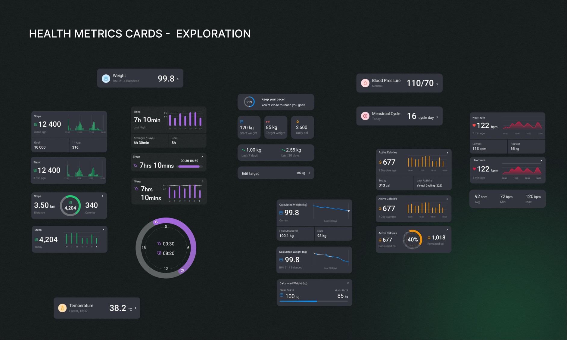
Designing for all three simultaneously is one of the hardest things in consumer health tech. The wrong move is to split the difference and build something mediocre for everyone. The right move is to design progressive disclosure — a surface that's clean and motivating by default, with depth available for those who want it.
The Design Decisions That Actually Mattered
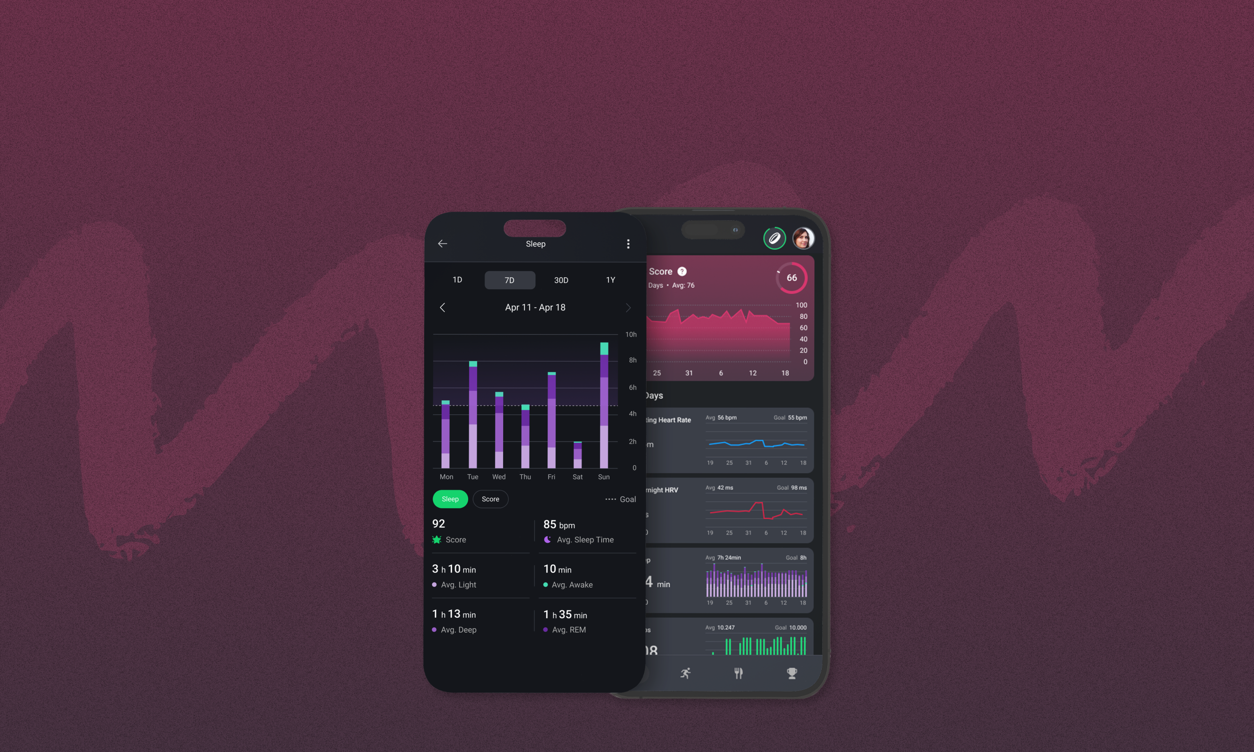
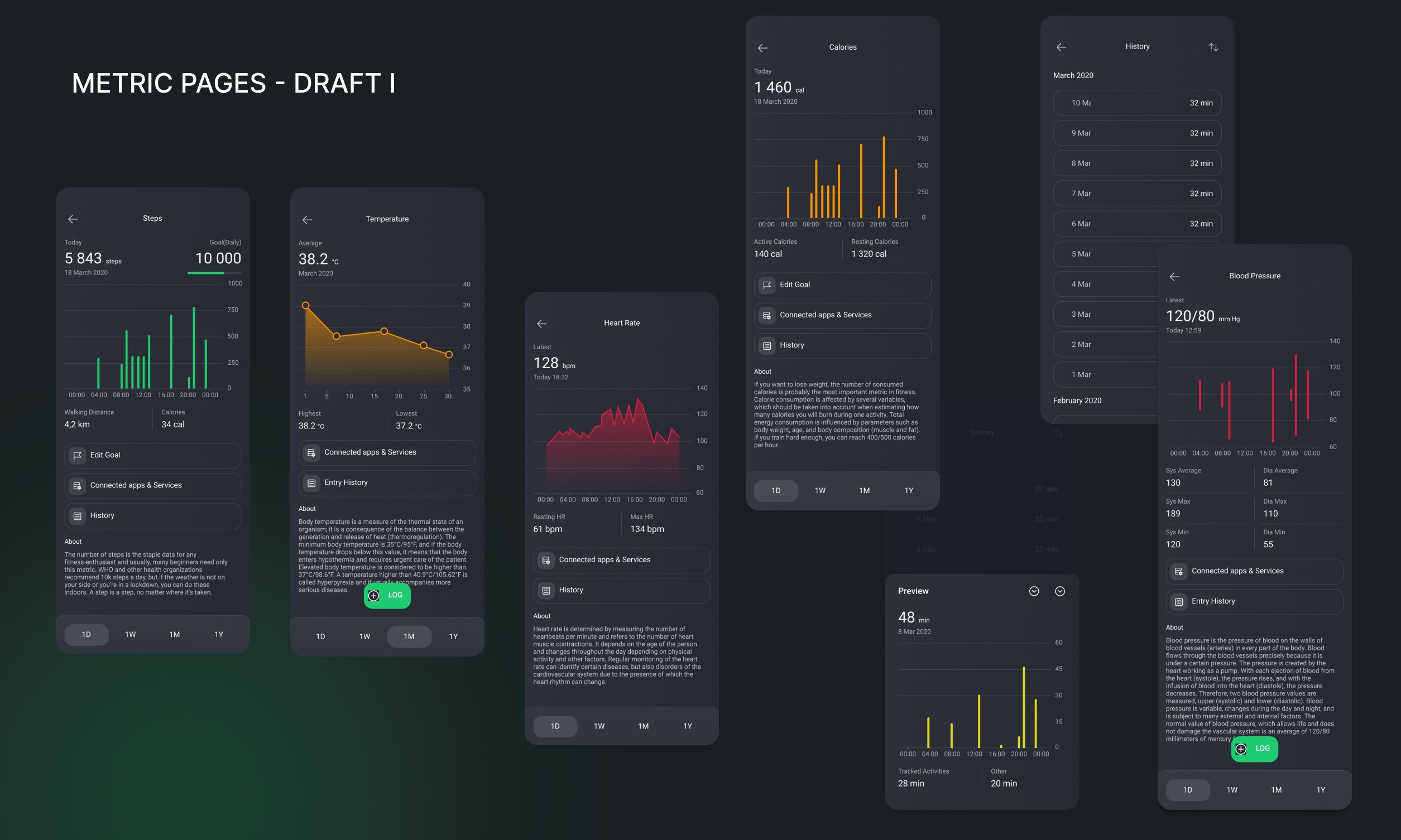
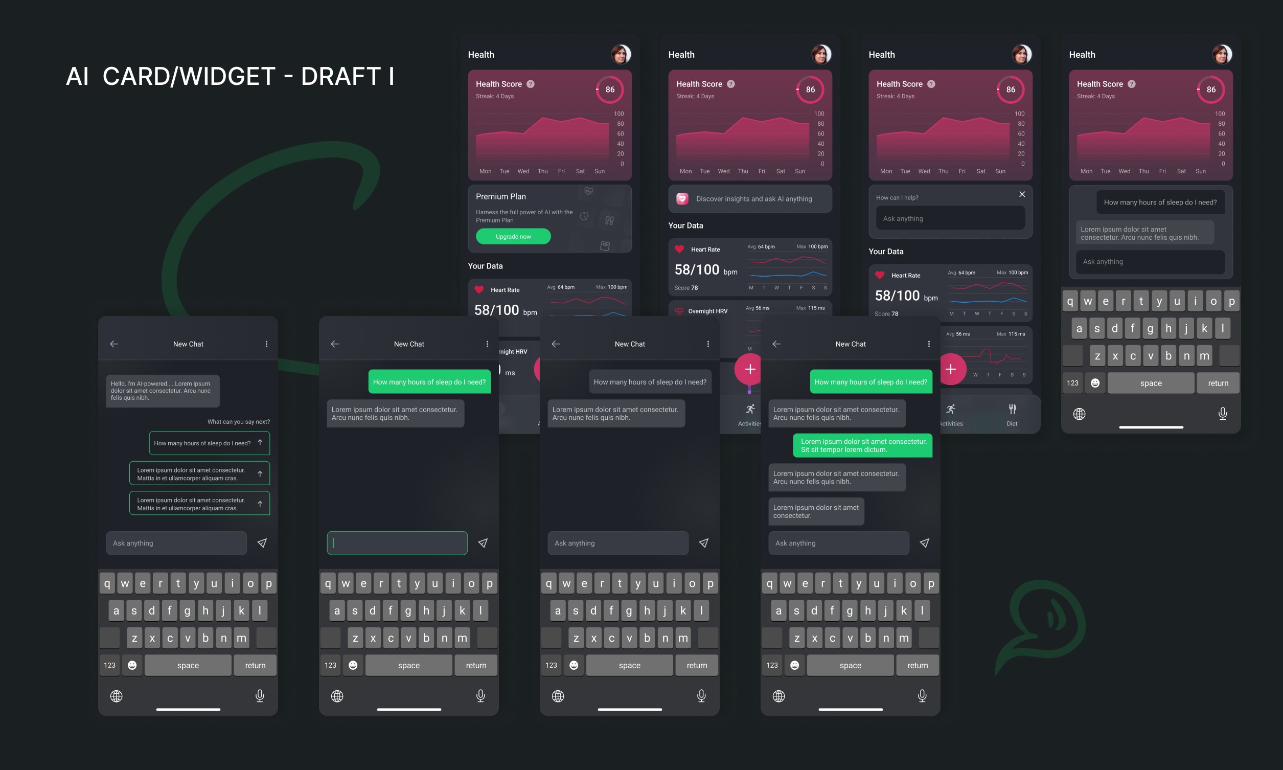
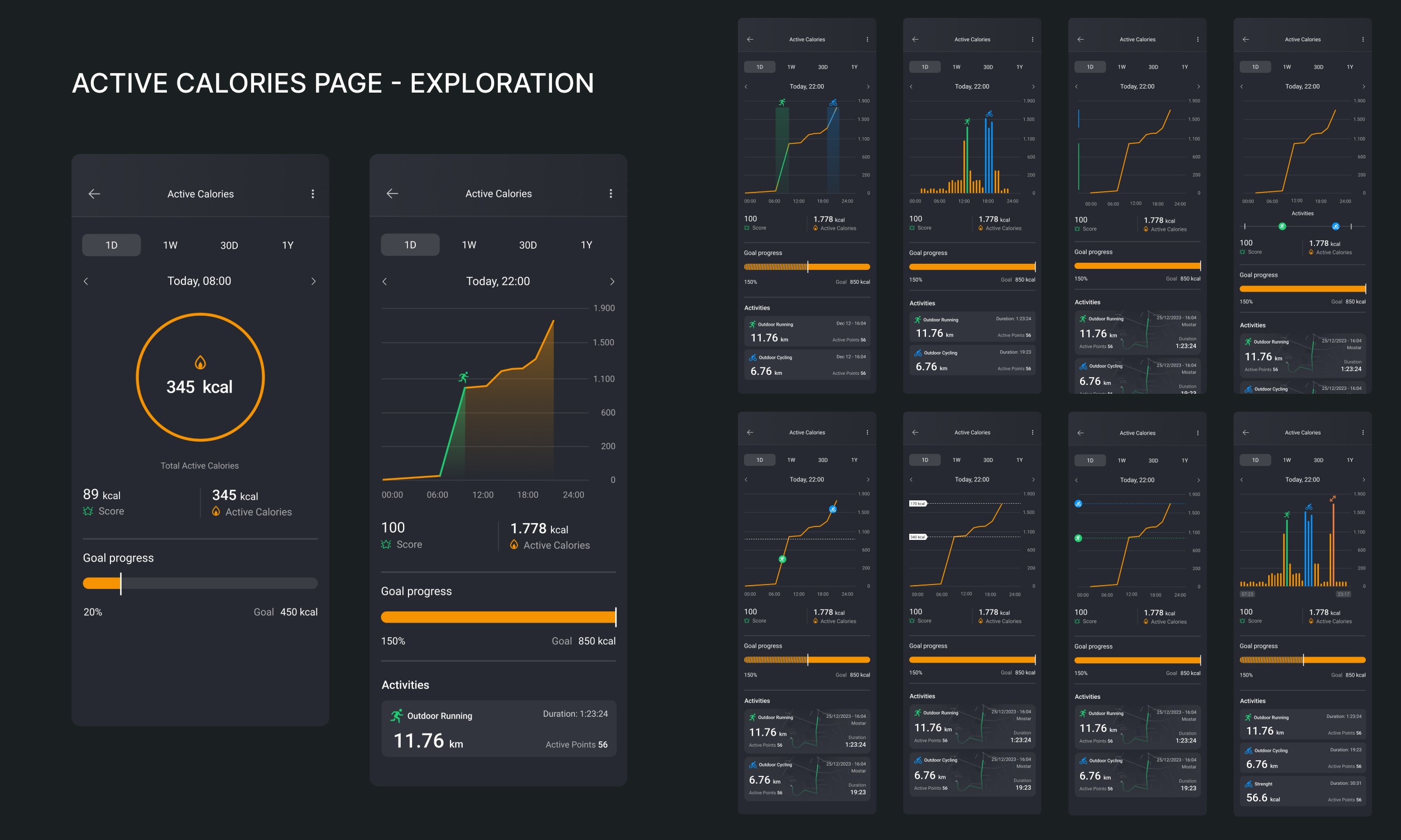
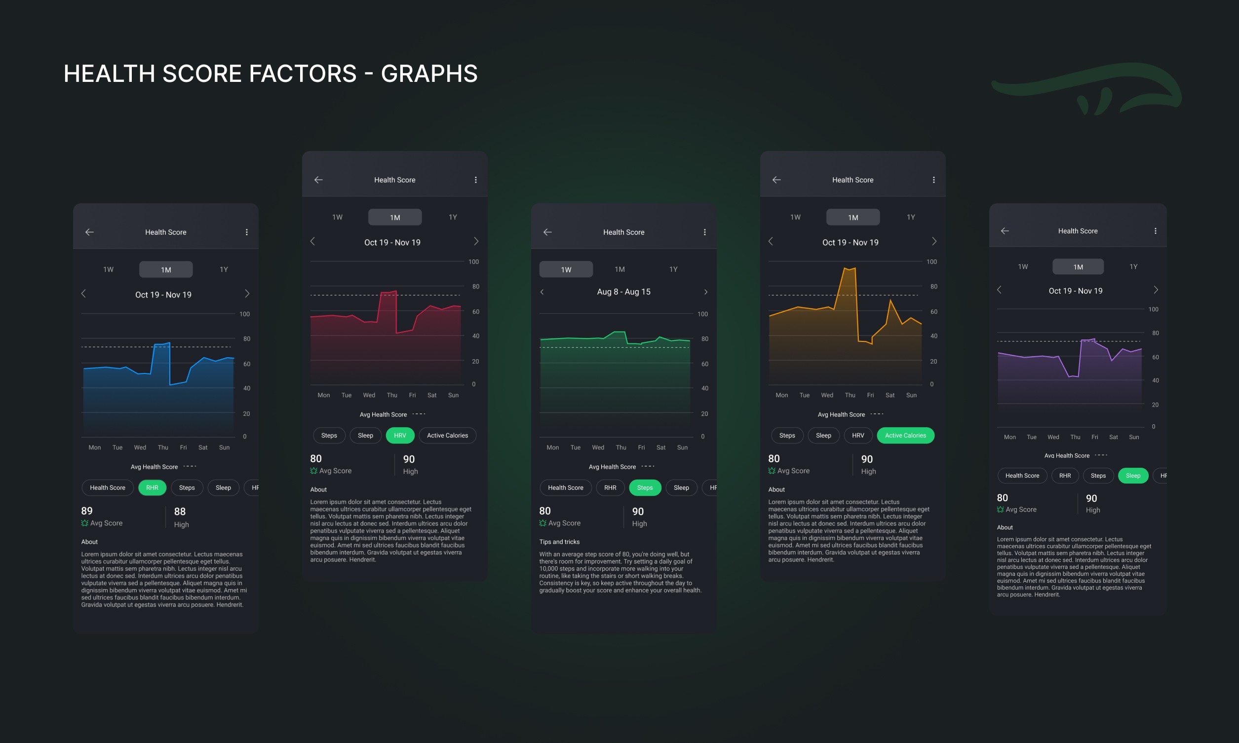
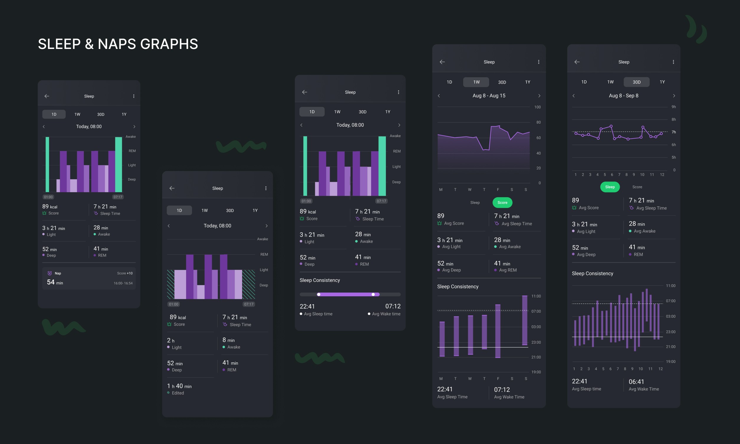
The Health Score was the central bet. Instead of presenting raw numbers, I worked with the team to develop a unified score that reflected daily habits — a single, glanceable signal that your day is trending in the right direction or not. The goal was to make the complex simple without making it simplistic. A score that someone could understand in two seconds but that was backed by real data.
This mirrors what Apple Health attempted with their Activity Rings, but I wanted ours to be more holistic — incorporating sleep quality, heart rate patterns, and activity together rather than tracking them as separate isolated metrics.
Gamification with purpose was the second major thread. Leaderboards and challenges aren't new ideas. The question is whether they serve the user's actual goals or just create anxiety. I focused on challenges that were grounded in health behaviors rather than raw performance, so that a recovering user or a complete beginner could still participate meaningfully. Competing on consistency is more sustainable than competing on raw output.
The band integration had to be invisible. The worst thing a wearable integration can do is remind you it exists through friction — failed syncs, loading states, mismatched data. The design had to make the hardware disappear and let the data feel like it was just... there.
Working Inside a Startup
Something worth naming directly: Rolla is a startup. Roadmaps shifted. Team sizes changed. Features got deprioritized and reprioritized. There were weeks where writing documentation was the most valuable thing I could do because it was the only thing keeping institutional knowledge alive.
I ran the full scope — research, UX writing, wireframes, high-fidelity design, stakeholder meetings, and enough documentation to make future designers' lives easier. In a larger organization, those responsibilities would be split across multiple roles. Here, they weren't.
That context matters for anyone reading this as a founder or hiring manager: a designer who can operate like this is not just a "visual" asset. They're a product thinker who can hold the whole picture when the organization doesn't yet have the structure to do it for them.
Outcome
Working Inside a Startup
Something worth naming directly: Rolla is a startup. Roadmaps shifted. Team sizes changed. Features got deprioritized and reprioritized. There were weeks where writing documentation was the most valuable thing I could do because it was the only thing keeping institutional knowledge alive.
I ran the full scope — research, UX writing, wireframes, high-fidelity design, stakeholder meetings, and enough documentation to make future designers' lives easier. In a larger organization, those responsibilities would be split across multiple roles. Here, they weren't.
That context matters for anyone reading this as a founder or hiring manager: a designer who can operate like this is not just a "visual" asset. They're a product thinker who can hold the whole picture when the organization doesn't yet have the structure to do it for them.
Where It's Going
The module launched as the foundation of something larger. The next iterations will layer in AI-powered insights, more granular personalization, and deeper behavioral nudges informed by real usage data.
The KPIs I care about most aren't installs or screen time. They're goal achievement rate — are users actually hitting the health targets they set? — and weekly retention, which tells you whether the product earned its place in someone's routine or is quietly being ignored.
Health tech succeeds or fails on one question: does it change behavior, or does it just track it? I designed Rolla Health to push toward the first answer. The data will tell us how close we got.