Year
2022–2023
Team
Product Designer
Contribution
End-to-end UX, portal design, sales flow, device activation system
Overview
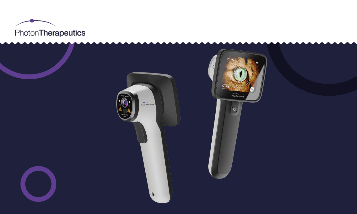
Photon Therapeutics had something genuinely rare — a medical device capable of detecting serious health conditions through a simple eye scan, serving both human healthcare professionals and veterinarians. My job wasn't to design the device. My job was to design everything around it.
In health-tech, the hardware gets the attention and the software is treated as an afterthought. But for a device being deployed across hospitals, clinics, and vet practices in up to 11 global markets, the portal is the product experience. If activation is confusing, the device doesn't get used. That framing shaped every decision I made.
Process
Understanding the Complexity Before Touching Figma
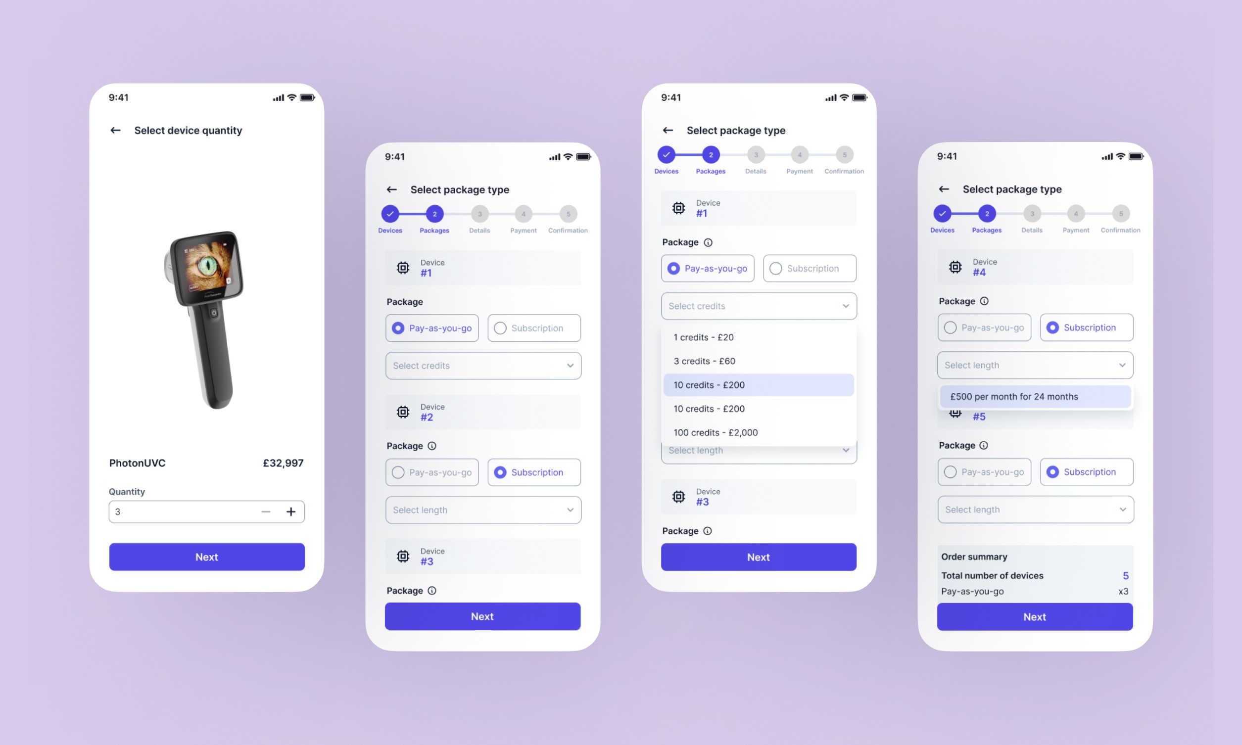
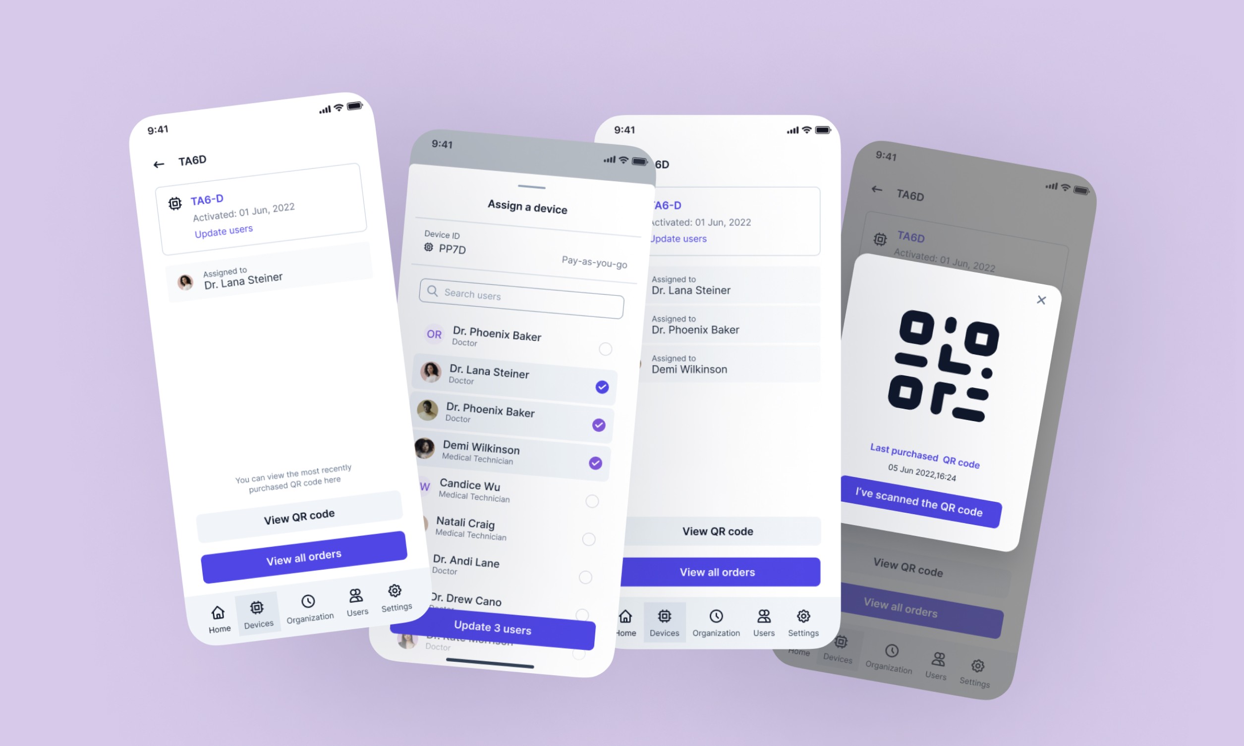
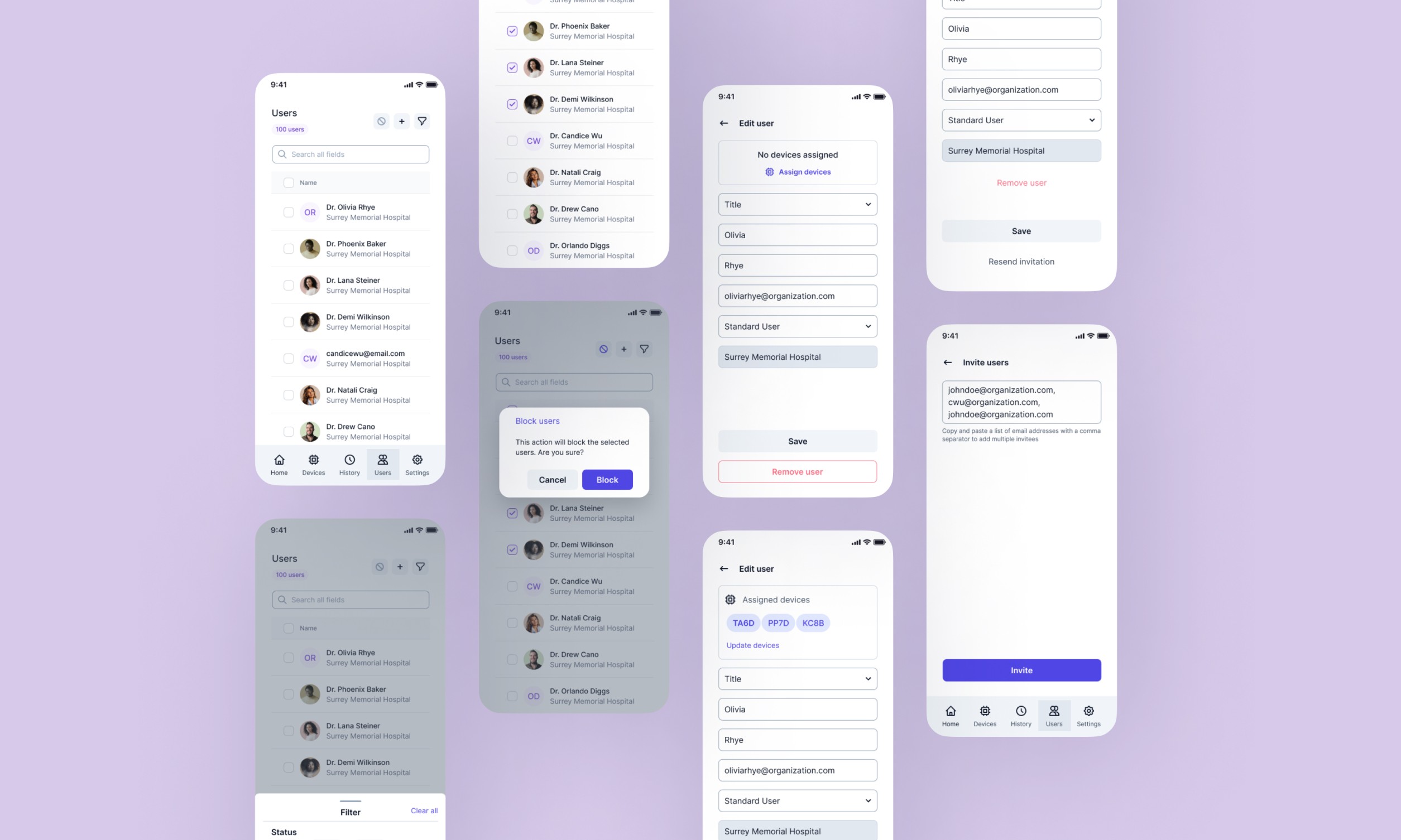
The business model alone required careful thought — direct and distributor sales channels, subscriptions and pay-as-you-go credits, all flowing through one portal. There were also two distinct user types: a Standard User who just needs their assigned device to work, and an Organization User managing a fleet of devices and a team of people. Getting that permission model right mattered. In health-tech, it's not just a UX concern — it's a compliance one.
Research: The Medical Context You Can't Assume
Health-tech is a sector where assumptions are expensive. I conducted user interviews with medical technicians and hospital procurement managers, and one insight stayed with me: complicated activation processes don't just frustrate people — they delay the deployment of critical diagnostic tools. That's not a UX problem, that's a clinical operations problem.
I also ran a competitor analysis, looking specifically at how established players handle the complexities of device management and subscription infrastructure. Philips Healthcare gave me a mental model for fleet management at scale. ICU Medical's approach to credit purchasing showed me how to make pay-as-you-go feel predictable rather than anxious. Agiliti's multi-role admin system was the clearest example I found of handling admin vs. standard user permissions without burying either in menus.
The pattern across all of them was the same: the best medical portals don't try to be clever. They are clear, structured, and don't make the user think about the system — they let them focus on the work.
The Design Thinking Behind the Flow
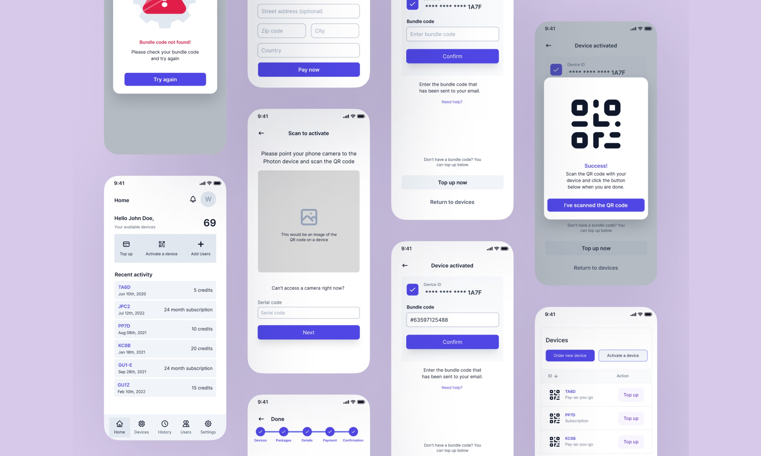
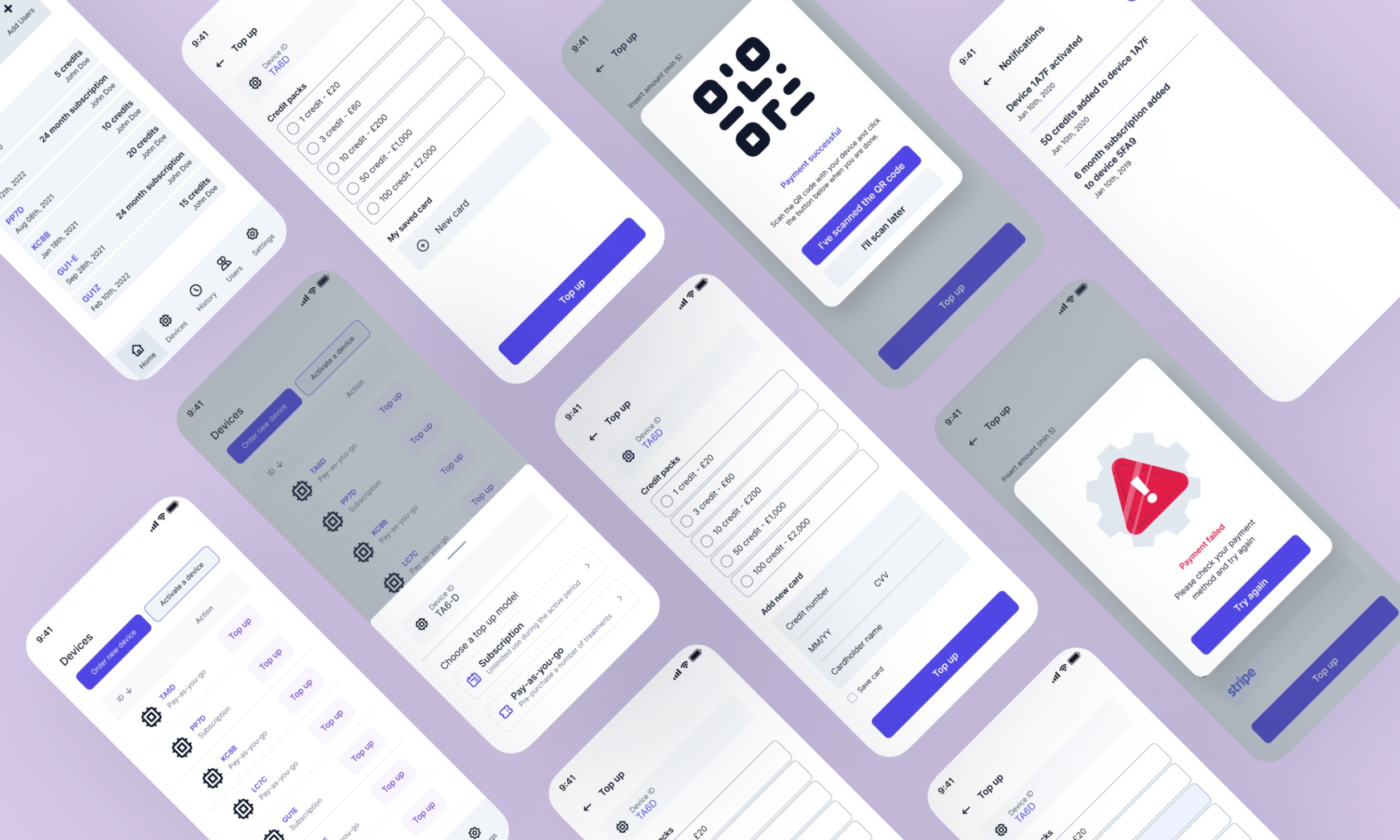
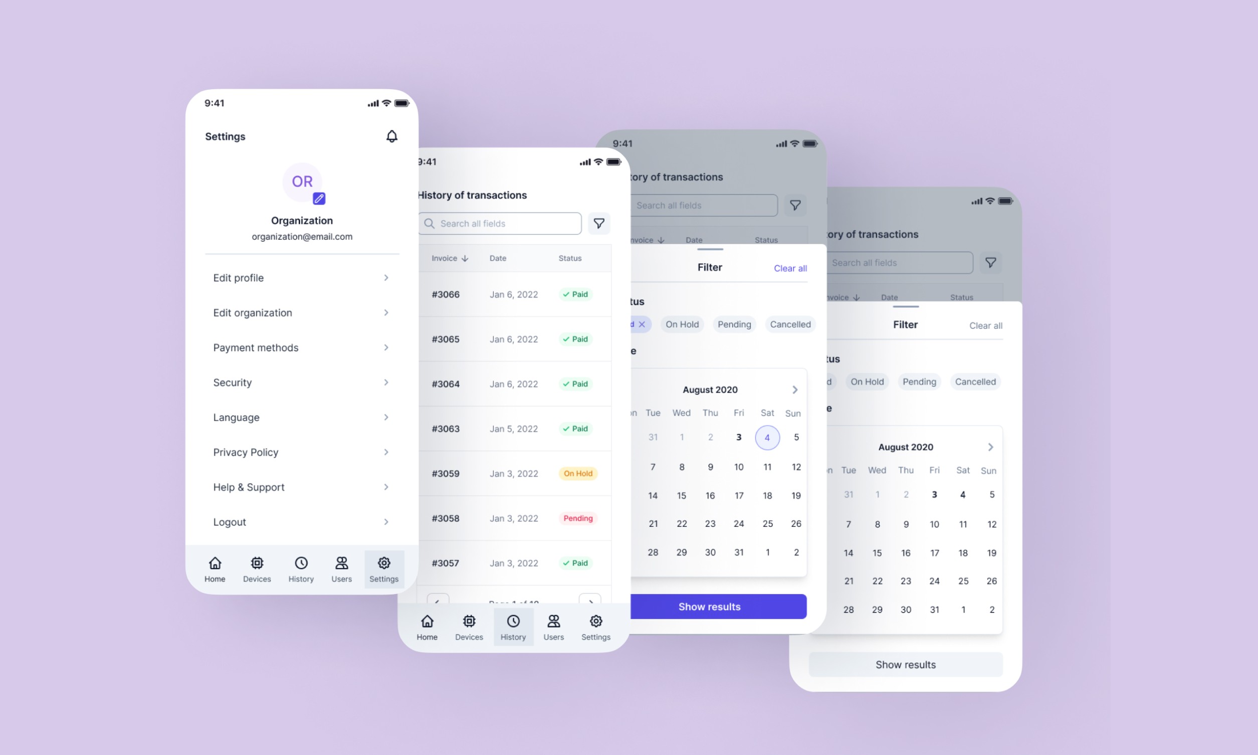
The core onboarding flow I designed worked like this: purchase the device → buy credits → scan the device's QR code → the admin system links it → a unique QR code is generated → scan it back into the device to activate. Done.
The QR code mechanic was a deliberate choice, not a default one. It creates a physical-digital handshake that's fast, familiar (QR codes had become second nature post-pandemic), and removes the risk of manual entry errors — which, in a medical context, you want to eliminate wherever possible. Cook Medical had validated a similar approach; I wasn't reinventing something, I was adapting what already worked and making it fit Photon's specific model.
Crucially, I integrated credit purchasing directly into the activation flow rather than making it a separate step. This is the kind of detail that looks small on a flow diagram but matters enormously in practice. A hospital technician receiving a new device shouldn't have to go back to a dashboard, find a billing section, purchase credits, then come back to activate. That's three opportunities to drop off, get confused, or escalate to support.
Collapsing those steps was a design decision rooted in the research. And it's the kind of thing that never makes the headline of a case study, but is exactly what separates a thoughtful designer from someone who just makes things look nice.
The Portal Itself
The logged-in area was designed around the org structure — because that's how hospitals actually work. An organization like Surrey Memorial Hospital isn't a collection of individual users; it's a hierarchy with accountability. The portal reflected that: admins could add and remove users, reassign devices, monitor subscription statuses, and view purchase history. Standard users got a clean, focused view relevant only to their own device and usage.
The dashboard was built to make the critical information visible at a glance — device status, credit levels, assigned users — without overwhelming the screen. In health-tech, information overload is a real risk. Clinicians and procurement staff are busy people operating in high-stakes environments. The design had to respect that.
Outcome
What This Was Really About
Looking back, the most interesting design challenge on this project wasn't any single feature — it was the balance between two very different user contexts happening on the same platform. A hospital admin in London managing 40 devices across departments has radically different needs from a veterinarian in a single-practice clinic who just needs one device to work, reliably, every time.
Designing for that range — without creating two separate products — required a clear information architecture, a well-thought permission model, and a lot of discipline about what not to show to each user type.
The broader health-tech market is full of portals that try to do everything and end up doing nothing well. Portals that were clearly built by engineers for engineers, or by product managers who'd never watched a medical professional actually use the software. The clinical users I spoke with during research weren't asking for more features. They were asking to stop having to think about the software at all.
That was the north star for this project. And I think we got close.